Wondering how your logo performs? 🧐
Get professional logo reviews in seconds and catch design issues in time.
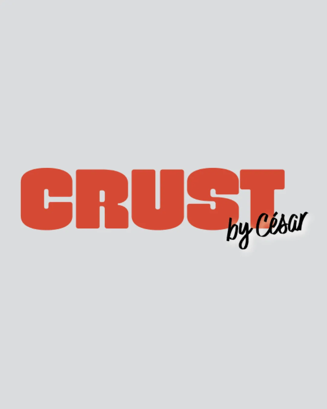
Try it Now!Logo review of CRUST by César
 Logo analysis by AI
Recognized style:
Logo type:
Detected symbol:
Detected text:
Business industry:
Review requested by Hlnedvl
**If AI can recognize or misinterpret it, so can people.
Structured logo review
Legibility
![]() The bold letters of 'CRUST' are easily readable.
The bold letters of 'CRUST' are easily readable.
![]() The script font used for 'by César' is slightly less legible compared to the main text.
The script font used for 'by César' is slightly less legible compared to the main text.
Scalability versatility
![]() The simple design ensures versatility across various media.
The simple design ensures versatility across various media.
200x250 px
100×125 px
50×62 px
Balance alignment
![]() The different font styles create visual interest.
The different font styles create visual interest.
![]() The size difference between 'CRUST' and 'by César' could be more balanced.
The size difference between 'CRUST' and 'by César' could be more balanced.

Originality
![]() Bold typography creates a distinctive primary text.
Bold typography creates a distinctive primary text.
![]() Uses common font styles without unique elements.
Uses common font styles without unique elements.
Aesthetic look
![]() The bold red color and clean font give a modern and appealing look.
The bold red color and clean font give a modern and appealing look.
Cultural sensitivity dual meaning
![]() No cultural sensitivity issues detected.
No cultural sensitivity issues detected.
Color harmony
![]() The red and black colors contrast well, providing clear visibility.
The red and black colors contrast well, providing clear visibility.
![]() Limited color palette might feel too simple for some brands.
Limited color palette might feel too simple for some brands.


