Wondering how your logo performs? 🧐
Get professional logo reviews in seconds and catch design issues in time.
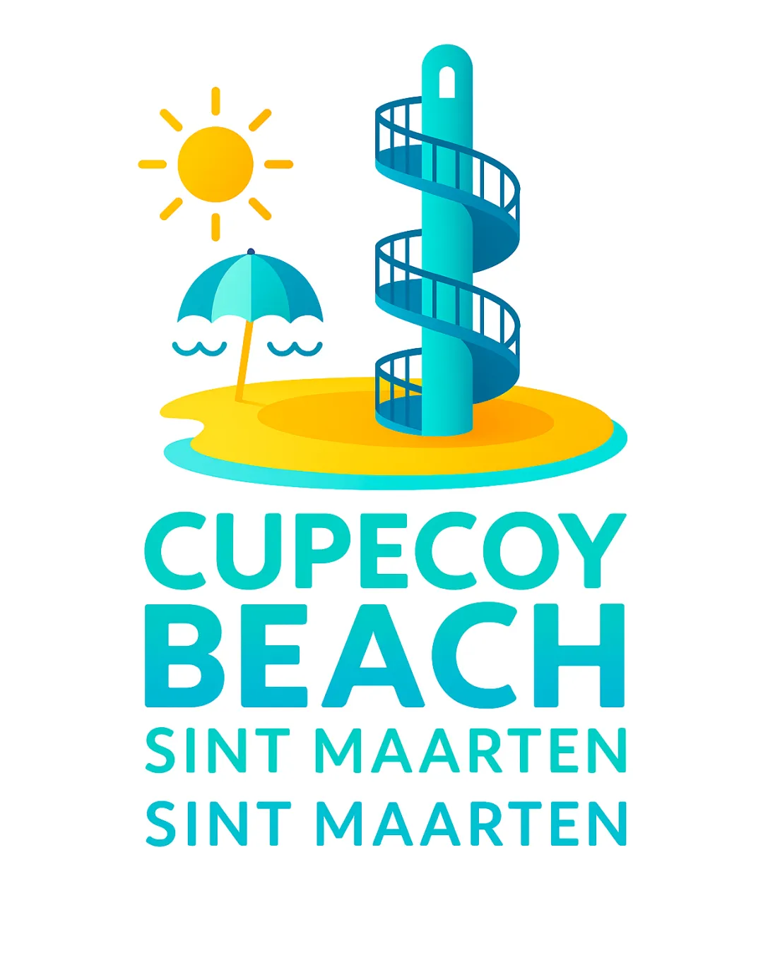
Try it Now!Logo review of CUPECOY BEACH SINT MAARTEN SINT MAARTEN
 Logo analysis by AI
Logo type:
Style:
Detected symbol:
Detected text:
Business industry:
Review requested by RosalynRainbow
**If AI can recognize or misinterpret it, so can people.
Structured logo review
Legibility
Text is large, bold, and clear in both the main and supporting lines.
Good contrast between text color and the white background.
Scalability versatility
Text remains readable down to small sizes.
Simplified illustrative style enhances some scalability.
Complexity of the detailed spiral staircase and beach scene may lose clarity at tiny sizes, such as app icons or embroidery.
Thin lines in the staircase could disappear in small-scale applications.

200x250 px

100×125 px

50×62 px
Balance alignment
Good vertical arrangement with clear separation between symbol and text.
Text and illustrative mark have visual weight balance.
The illustrative elements (sun, umbrella, sand) feel a bit dispersed, making the top part wider than the bottom.


Originality
Unique use of a spiral staircase—a rare feature in beach logos.
Illustrative, playful style adds distinctiveness.
Sun, umbrella, and waves are common beach motifs and feel generic when used together.
Overall composition edges toward the expected feel of a tourism logo.
Logomark wordmark fit
Color palette unifies symbol and wordmark.
Playful, modern typeface pairs well with the illustrative mark.
Aesthetic look
Bright, inviting, and cheerful color scheme.
Modern, cohesive illustration style.
Multiple visual elements create a slightly busy composition, especially for smaller applications or single-color adaptations.
Dual meaning and misinterpretations
No inappropriate dual meanings or visual misinterpretations detected.
Color harmony
Color palette is harmonious, vibrant, and appropriate for a beach setting.
Cyan, yellow, and turquoise are well balanced without overwhelming.
Cyan
#00C0C8
Yellow
#FFC32A
Turquoise
#22D6CB
White
#FFFFFF

