Wondering how your logo performs? 🧐
Get professional logo reviews in seconds and catch design issues in time.
Try it Now!Logo review of de la mano hacia la Educación y el Desarrollo
 Logo analysis by AI
Logo type:
Style:
Detected symbol:
Detected text:
Business industry:
Review requested by Isa2025bel
**If AI can recognize or misinterpret it, so can people.
Structured logo review
Legibility
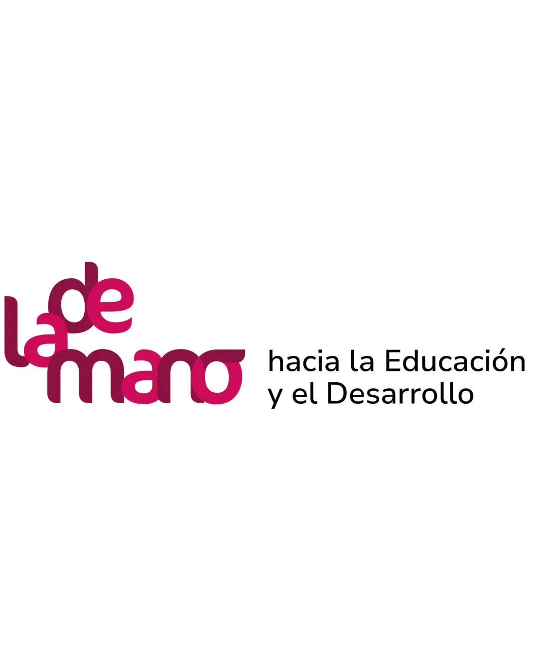
Secondary tagline text 'hacia la Educación y el Desarrollo' is clean and legible
Word 'de' overlaps with 'la' and 'mano,' decreasing clarity and readability
Low color contrast between overlapping magenta shades reduces legibility, especially for those with color vision deficiency
Overlapping stacked arrangement causes confusing reading order
Scalability versatility
Simple geometric forms make the main text adaptable for medium to large applications like brochures or digital banners
Overlapping and tightly packed text would be illegible on business cards, app icons, or small merchandise
Complex message layout makes it difficult to adapt into single-symbol or favicon usage
Fine detail in text overlap might blur in embroidery or low-res settings

200x250 px

100×125 px

50×62 px
Balance alignment
Attempted left alignment of main phrase with tagline
Stacked and overlapping letters create visual chaos, lacking vertical and horizontal balance
Tagline appears disjointed and disconnected from main wordmark, causing imbalance


Originality
The interlocked, layered wordmark approach is unusual and provides visual interest
Distinct color layering and arrangement stands out
No iconic symbol or negative space concept to reinforce memorability
Overlapping style could quickly feel dated or trend-driven
Aesthetic look
Bold magenta palette provides visual energy
Smooth, rounded letterforms are inviting and friendly
Cluttered visual effect and color overlap detracts from an otherwise playful style
Logo looks busy and overdecorated, solution feels forced rather than naturally dynamic
Dual meaning and misinterpretations
No inappropriate or confusing shapes detected
Letter arrangement may slow or confuse reading at a glance
Color harmony
Analogous magenta hues maintain consistency
Tagline uses black for functional separation and clarity
Multiple layered magenta shades can cause visual interference
Low contrast between overlapping tones affects accessibility and clarity
Cerise
#BC1858
PersianRed
#8F1951
Black
#000000
White
#FFFFFF

