 View review
Logo score
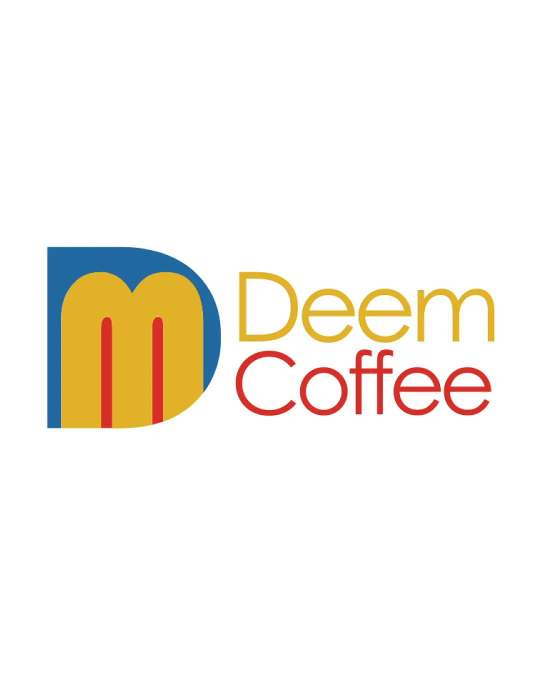
Logo review ofDeem Coffee
Review the detailed scores below to see what is working and what should be refined first.
Legibility
Originality
Balance
Scale
Detailed review
Logo performance breakdown
Legibility
![]() I assume the business name is Graphstorm, with the tagline Branding Agency.
I assume the business name is Graphstorm, with the tagline Branding Agency.
Originality
![]() The interplay of 'D' and 'M' adds a unique touch to the design.
The interplay of 'D' and 'M' adds a unique touch to the design.
![]() The shapes are somewhat common in certain contexts.
The shapes are somewhat common in certain contexts.
Color harmony
![]() The primary colors are well-chosen and evoke energy and freshness.
The primary colors are well-chosen and evoke energy and freshness.
![]() Might appear too bold for certain demographics.
Might appear too bold for certain demographics.
Your palette is close. Explore sharper color combinations with Colorfly.design before updating the logo.
Explore palettesBalance alignment
![]() Overall composition feels balanced.
Overall composition feels balanced.
![]() Slight misalignment between the text and the symbol creates a minor imbalance.
Slight misalignment between the text and the symbol creates a minor imbalance.

Scalability
![]() The bold elements ensure the design remains recognizable when scaled.
The bold elements ensure the design remains recognizable when scaled.
![]() The intricate detail in the 'M' might lose clarity on very small applications.
The intricate detail in the 'M' might lose clarity on very small applications.
200x250 px
100×125 px
50×62 px
Symbol & text fit
![]() The text and symbol complement each other, creating a cohesive unit.
The text and symbol complement each other, creating a cohesive unit.
Try your own review
Review my logo
Wondering how your logo performs?
Get a clear logo score, key risks, and priority fix ideas before your client or audience sees it.
Keep exploring


