 View review
Logo score
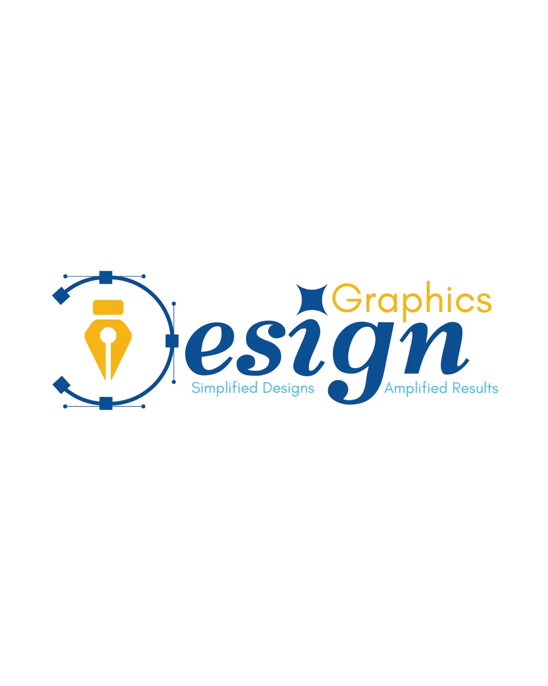
Logo review ofDesign Graphics, Simplified Designs Amplified Resu..
Review the detailed scores below to see what is working and what should be refined first.
Legibility
Originality
Misread
Balance
Scale
Detailed review
Logo performance breakdown
Legibility
![]() Clear main font for 'design'
Clear main font for 'design'![]() Distinct color contrast between text elements
Distinct color contrast between text elements
![]() Smaller tagline text may be hard to read at smaller sizes
Smaller tagline text may be hard to read at smaller sizes
Originality
![]() Integration of design elements like pen nib
Integration of design elements like pen nib
![]() Use of generic vector path symbolism
Use of generic vector path symbolism
Color harmony
![]() Composed of complementary colors
Composed of complementary colors
![]() Some color contrast could be stronger for the tagline
Some color contrast could be stronger for the tagline
Your palette is close. Explore sharper color combinations with Colorfly.design before updating the logo.
Explore palettesBalance alignment
![]() Overall balanced composition
Overall balanced composition
![]() Slight imbalance with the weight of the 'D' and pen nib symbol
Slight imbalance with the weight of the 'D' and pen nib symbol

Scalability
![]() Symbol is relatively simple
Symbol is relatively simple
![]() Complexity in the vector illustration may lose detail at small sizes
Complexity in the vector illustration may lose detail at small sizes![]() Tagline text may not be legible on small applications
Tagline text may not be legible on small applications
200x250 px
100×125 px
50×62 px
Misinterpretations
![]() Clear symbolism
Clear symbolism
Symbol & text fit
![]() Harmonious use of symbolic pen nib with text
Harmonious use of symbolic pen nib with text
Try your own review
Review my logo
Wondering how your logo performs?
Get a clear logo score, key risks, and priority fix ideas before your client or audience sees it.
Keep exploring


