Wondering how your logo performs? 🧐
Get professional logo reviews in seconds and catch design issues in time.
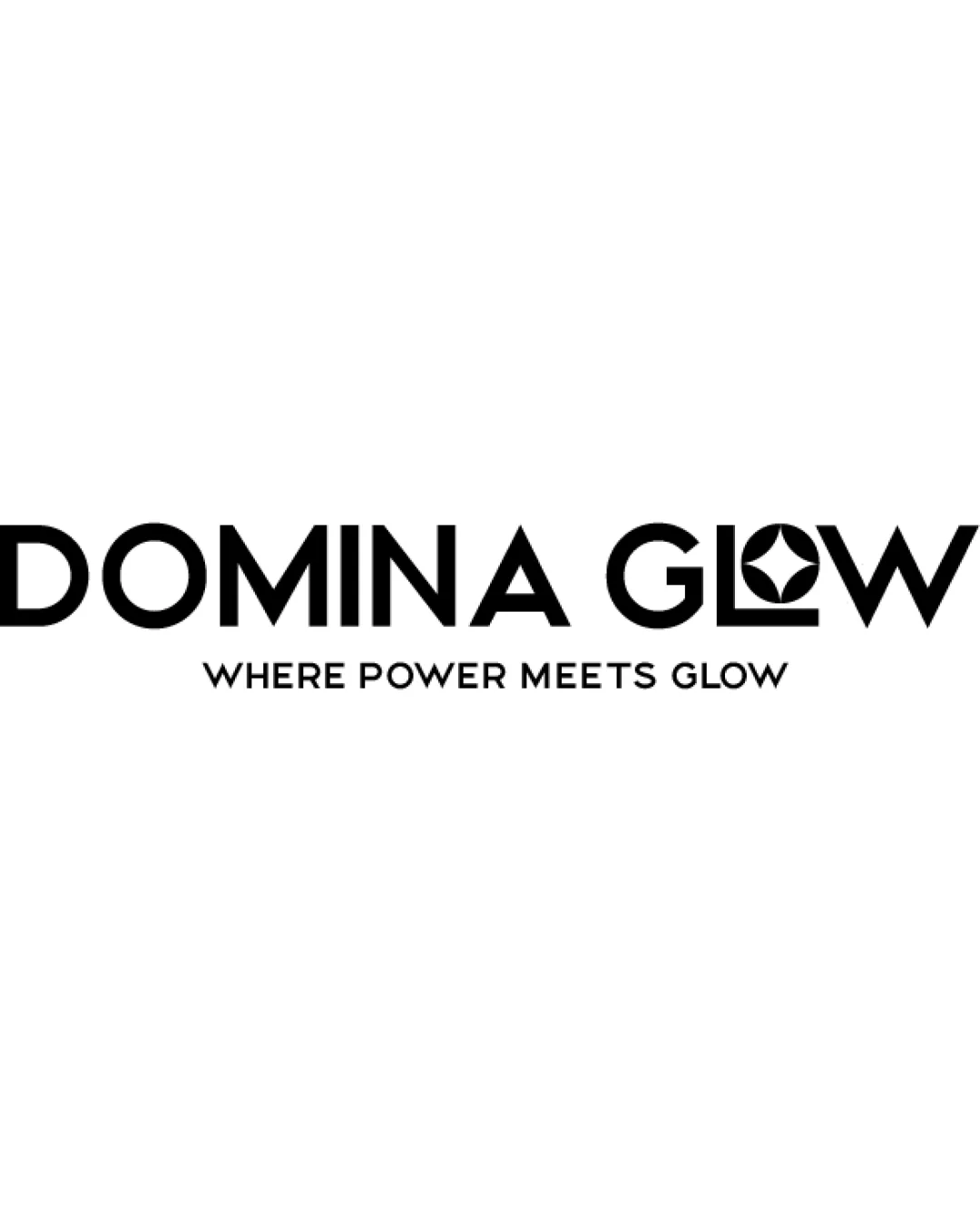
Try it Now!Logo review of DOMINA GLOW, WHERE POWER MEETS GLOW
 Logo analysis by AI
Logo type:
Style:
Detected symbol:
Negative space:
Detected text:
Business industry:
Review requested by MohamedAli96
**If AI can recognize or misinterpret it, so can people.
Structured logo review
Legibility
![]() The main text 'DOMINA GLOW' is bold and highly readable.
The main text 'DOMINA GLOW' is bold and highly readable.![]() Tagline text 'WHERE POWER MEETS GLOW' is clear due to strong and simple font selection.
Tagline text 'WHERE POWER MEETS GLOW' is clear due to strong and simple font selection.
![]() Merging the symbol into the 'O' may slightly hinder quick text recognition, especially at smaller sizes.
Merging the symbol into the 'O' may slightly hinder quick text recognition, especially at smaller sizes.
Scalability versatility
![]() Bold, geometric forms maintain clarity at a variety of scales.
Bold, geometric forms maintain clarity at a variety of scales.![]() Logo remains legible and recognizable on business cards, digital outputs, and signage.
Logo remains legible and recognizable on business cards, digital outputs, and signage.
![]() The intricate details within the 'O' may be lost or become indistinct at favicon or embroidery size.
The intricate details within the 'O' may be lost or become indistinct at favicon or embroidery size.![]() Tagline may not be readable or usable in small-scale applications.
Tagline may not be readable or usable in small-scale applications.
200x250 px
100×125 px
50×62 px
Balance alignment
![]() Well-centered, harmonious alignment between the logotype and tagline.
Well-centered, harmonious alignment between the logotype and tagline.![]() Weight distribution between text and symbol feels even and unified.
Weight distribution between text and symbol feels even and unified.

Originality
![]() Integration of a geometric, petal/star symbol within the 'O' is a unique touch.
Integration of a geometric, petal/star symbol within the 'O' is a unique touch.![]() Wordmark avoids common, overused icons.
Wordmark avoids common, overused icons.
![]() The abstract star/petal form is a broadly used visual device in the beauty and wellness industry, making the mark slightly less distinctive.
The abstract star/petal form is a broadly used visual device in the beauty and wellness industry, making the mark slightly less distinctive.
Logomark wordmark fit
![]() Symbol is seamlessly built into the 'O', providing cohesion between logomark and wordmark.
Symbol is seamlessly built into the 'O', providing cohesion between logomark and wordmark.![]() Visual style and thickness between symbol and type are synced.
Visual style and thickness between symbol and type are synced.
Aesthetic look
![]() Modern, minimal, and sophisticated look.
Modern, minimal, and sophisticated look.![]() No visual clutter or unnecessary decoration.
No visual clutter or unnecessary decoration.
Dual meaning and misinterpretations
![]() No inappropriate or confusing secondary symbolism detected.
No inappropriate or confusing secondary symbolism detected.
Color harmony
![]() Classic, high-contrast black and white colorway is timeless and highly adaptable.
Classic, high-contrast black and white colorway is timeless and highly adaptable.
Black
#000000
White
#FFFFFF


