 View review
Logo score
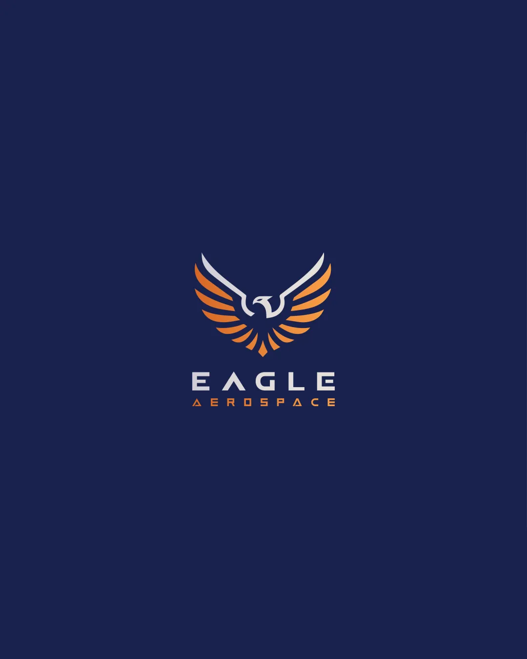
Logo review ofEagle Aerospace
Review the detailed scores below to see what is working and what should be refined first.
Legibility
Originality
Misread
Balance
Scale
Detailed review
Logo performance breakdown
Legibility
![]() Main brand name 'EAGLE' is highly readable with distinct, modern sans-serif typography.
Main brand name 'EAGLE' is highly readable with distinct, modern sans-serif typography.![]() Good contrast between text and background.
Good contrast between text and background.
![]() The word 'AEROSPACE' in orange on deep blue is somewhat thinner, which could lose legibility at smaller sizes or from a distance.
The word 'AEROSPACE' in orange on deep blue is somewhat thinner, which could lose legibility at smaller sizes or from a distance.
Originality
![]() Stylized eagle is sleek with a distinct geometric flair.
Stylized eagle is sleek with a distinct geometric flair.![]() Negative space within eagle adds some cleverness to the design.
Negative space within eagle adds some cleverness to the design.
![]() Eagle symbols are highly common in aerospace and technology—visual approach is well-executed but not truly unique.
Eagle symbols are highly common in aerospace and technology—visual approach is well-executed but not truly unique.
Color harmony
![]() Effective use of two main contrasting colors (deep blue and orange) for energy and professionalism.
Effective use of two main contrasting colors (deep blue and orange) for energy and professionalism.![]() Color palette is appropriate for the target industry.
Color palette is appropriate for the target industry.
![]() Gradient on wings, while well executed, could pose printing and branding consistency issues.
Gradient on wings, while well executed, could pose printing and branding consistency issues.
Prussian Blue
#112055
Vivid Orange
#FF9500
White
#FFFFFF
Your palette is close. Explore sharper color combinations with Colorfly.design before updating the logo.
Explore palettesBalance alignment
![]() Overall composition is vertically balanced with eagle mark and centered wordmark.
Overall composition is vertically balanced with eagle mark and centered wordmark.![]() Spacing between elements feels harmonious.
Spacing between elements feels harmonious.
![]() There is a slight visual heaviness above due to dominant wings versus thinner text; could feel slightly top-heavy compared to the typography.
There is a slight visual heaviness above due to dominant wings versus thinner text; could feel slightly top-heavy compared to the typography.

Scalability
![]() Bold geometric shapes make the eagle icon recognizable at multiple sizes.
Bold geometric shapes make the eagle icon recognizable at multiple sizes.![]() Logo would be clear on billboards, print media, and digital applications.
Logo would be clear on billboards, print media, and digital applications.
![]() Detailed gradients and thin line weights in 'AEROSPACE' risk loss of clarity in small-scale or monotone applications such as app icons or embroidery.
Detailed gradients and thin line weights in 'AEROSPACE' risk loss of clarity in small-scale or monotone applications such as app icons or embroidery.![]() Gradient may not translate well to all printing and monochrome environments.
Gradient may not translate well to all printing and monochrome environments.
200x250 px
100×125 px
50×62 px
Misinterpretations
![]() No inappropriate shapes or misleading symbolism; straightforward eagle representation.
No inappropriate shapes or misleading symbolism; straightforward eagle representation.
Symbol & text fit
![]() Consistent modern style between eagle symbol and custom typeface.
Consistent modern style between eagle symbol and custom typeface.
![]() Color scheme links symbol and text, reinforcing unity.
Color scheme links symbol and text, reinforcing unity.
Try your own review
Review my logo
Wondering how your logo performs?
Get a clear logo score, key risks, and priority fix ideas before your client or audience sees it.
Keep exploring


