 View review
Logo score
Logo review ofEb, Graphic Designer
Review the detailed scores below to see what is working and what should be refined first.
Legibility
Originality
Misread
Balance
Scale
Detailed review
Logo performance breakdown
Legibility
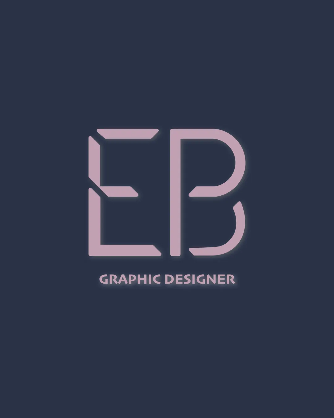
![]() Main letters 'EB' are distinct and easy to recognize.
Main letters 'EB' are distinct and easy to recognize.![]() 'GRAPHIC DESIGNER' is clear and readable despite its smaller size.
'GRAPHIC DESIGNER' is clear and readable despite its smaller size.
![]() Letterform stylization on 'E' may reduce clarity at smaller scales.
Letterform stylization on 'E' may reduce clarity at smaller scales.![]() Spacing and stylized cuts could create minor confusion quickly at a glance.
Spacing and stylized cuts could create minor confusion quickly at a glance.
Originality
![]() Uses stylized cuts and geometry to create a unique take on the EB monogram.
Uses stylized cuts and geometry to create a unique take on the EB monogram.![]() Slightly modernized twist on a common lettermark approach.
Slightly modernized twist on a common lettermark approach.
![]() Geometric monograms are very common in the graphic design field, making this less distinct overall.
Geometric monograms are very common in the graphic design field, making this less distinct overall.![]() Lacks a strong, memorable or innovative element.
Lacks a strong, memorable or innovative element.
Color harmony
![]() Limited color palette – soft contrasting pastel and dark blue work well together.
Limited color palette – soft contrasting pastel and dark blue work well together.![]() Consistent color treatment across both logo and text.
Consistent color treatment across both logo and text.
Pale Lilac
#E6C0DE
Prussian Blue
#23273A
Balance alignment
![]() The EB monogram is generally well-centered with respect to the wordmark.
The EB monogram is generally well-centered with respect to the wordmark.![]() Overall geometric proportions of the letters are harmonious.
Overall geometric proportions of the letters are harmonious.
![]() Visual weight differs between 'E' (open, with negative space) and 'B' (more solid), causing slight imbalance.
Visual weight differs between 'E' (open, with negative space) and 'B' (more solid), causing slight imbalance.![]() Alignment between monogram and wordmark can appear slightly off if scrutinized.
Alignment between monogram and wordmark can appear slightly off if scrutinized.

Scalability
![]() Strong, bold lines provide decent scalability for most uses.
Strong, bold lines provide decent scalability for most uses.![]() The design is simple enough for print and web applications.
The design is simple enough for print and web applications.
![]() Thin gaps and cut details in 'E' may not be visible in small scales, such as favicons or embroidery.
Thin gaps and cut details in 'E' may not be visible in small scales, such as favicons or embroidery.![]() Background glow/blur effect could be troublesome for signage or single-color printing.
Background glow/blur effect could be troublesome for signage or single-color printing.
200x250 px
100×125 px
50×62 px
Misinterpretations
![]() No inappropriate or confusing secondary shapes present.
No inappropriate or confusing secondary shapes present.
Symbol & text fit
![]() Consistent weight and style between the logomark and 'GRAPHIC DESIGNER' wordmark.
Consistent weight and style between the logomark and 'GRAPHIC DESIGNER' wordmark.
![]() Color and finish match well between both elements.
Color and finish match well between both elements.
![]() Font choice for 'GRAPHIC DESIGNER' may feel generic compared to the custom monogram.
Font choice for 'GRAPHIC DESIGNER' may feel generic compared to the custom monogram.
Try your own review
Review my logo
Wondering how your logo performs?
Get a clear logo score, key risks, and priority fix ideas before your client or audience sees it.
Keep exploring


