Wondering how your logo performs? 🧐
Get professional logo reviews in seconds and catch design issues in time.
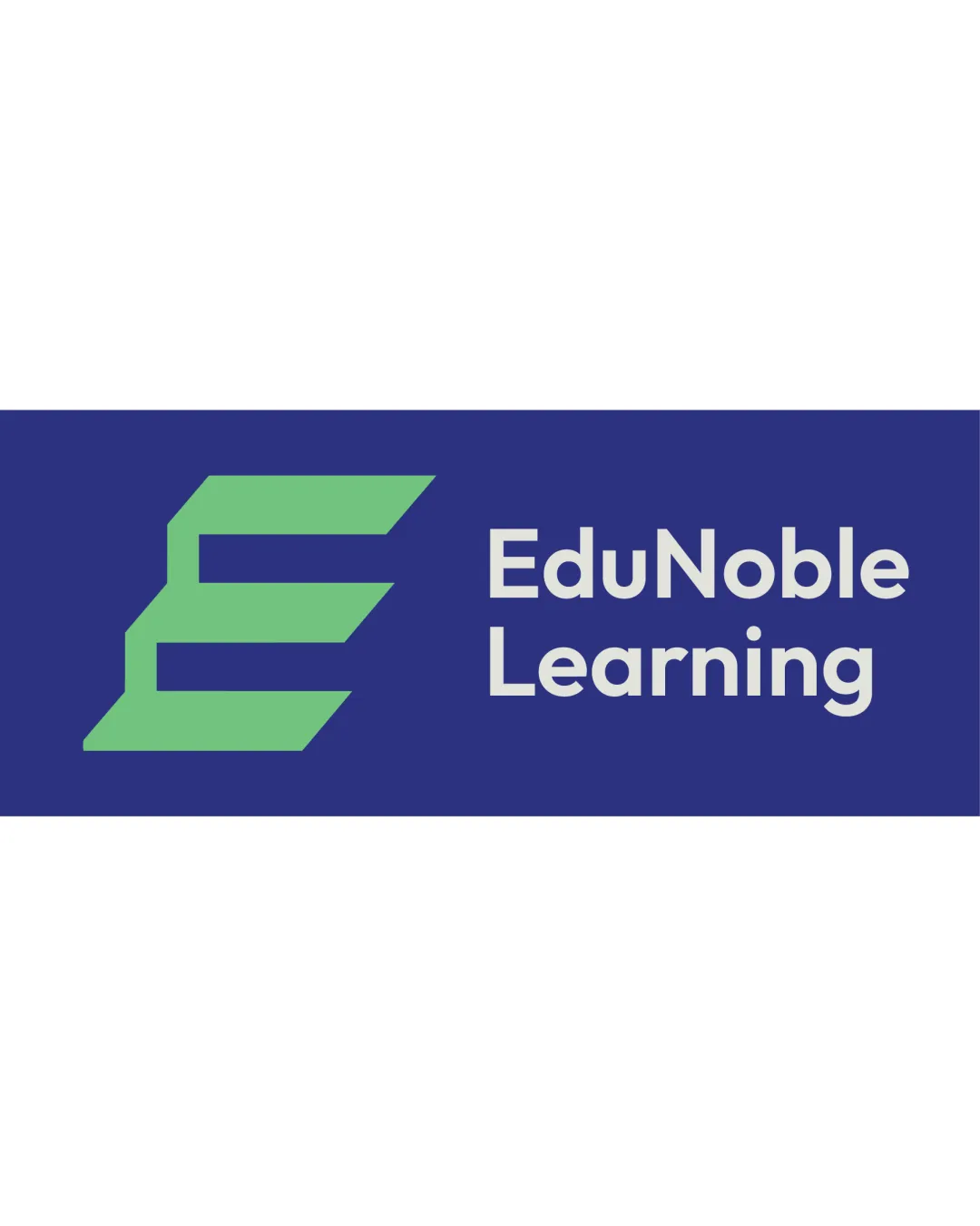
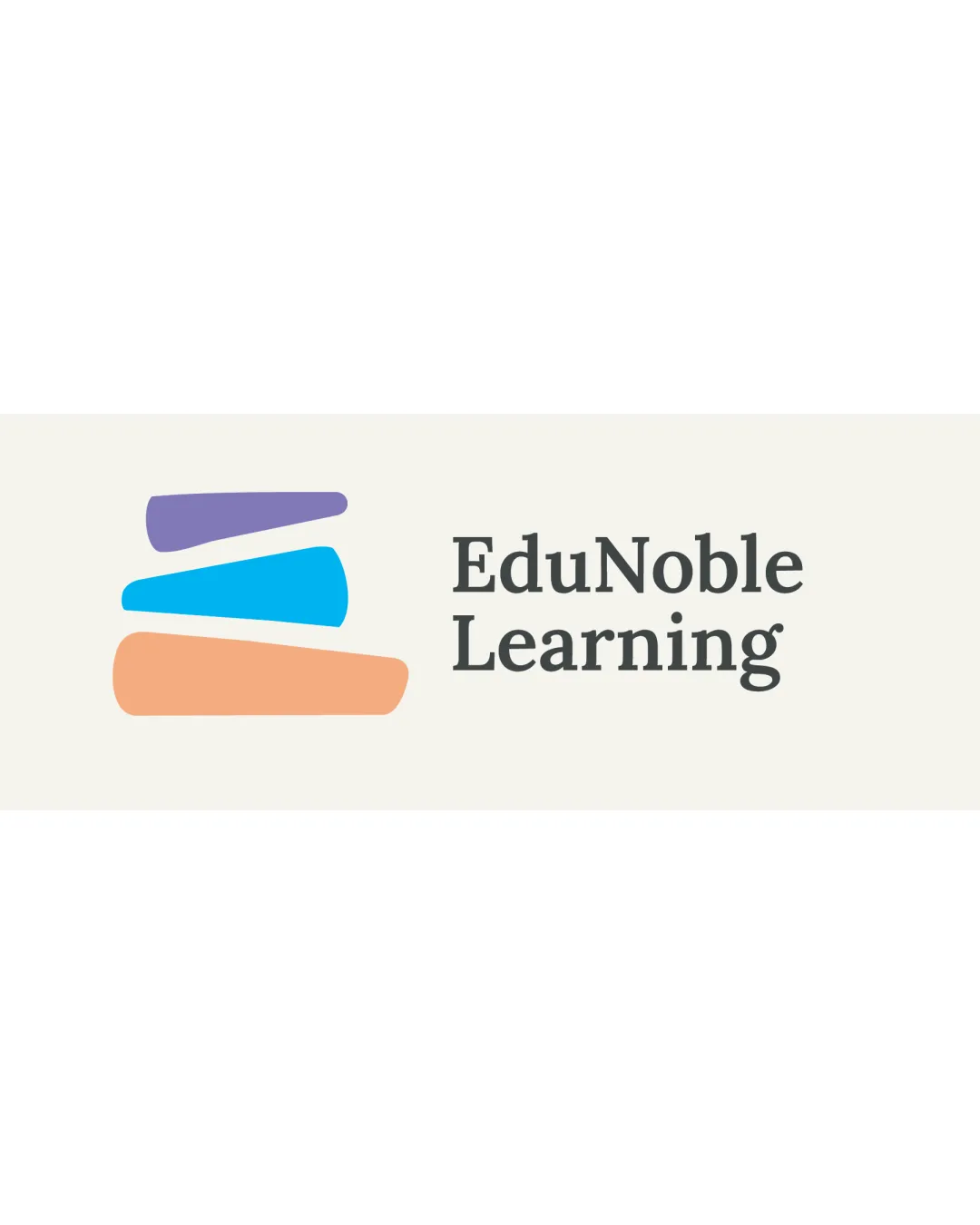
Try it Now!Logo review of EduNoble Learning
 Logo analysis by AI
Logo type:
Style:
Detected symbol:
Detected text:
Business industry:
Review requested by Gobizzz
**If AI can recognize or misinterpret it, so can people.
Structured logo review
Legibility
![]() Text is highly readable with excellent contrast between the font and background.
Text is highly readable with excellent contrast between the font and background.![]() Classic serif typeface enhances professionalism and readability.
Classic serif typeface enhances professionalism and readability.
Scalability versatility
![]() Simple shapes and clear text allow for decent scalability.
Simple shapes and clear text allow for decent scalability.![]() Logo can be used on business cards, website headers, and social media.
Logo can be used on business cards, website headers, and social media.
![]() Fine serifs may lose detail in very small sizes, such as embroidery or tiny favicons.
Fine serifs may lose detail in very small sizes, such as embroidery or tiny favicons.![]() Multi-color symbol may not reproduce well in black and white or low-resolution print.
Multi-color symbol may not reproduce well in black and white or low-resolution print.
200x250 px
100×125 px
50×62 px
Balance alignment
![]() Symbol and type are cleanly separated, creating a clear visual hierarchy.
Symbol and type are cleanly separated, creating a clear visual hierarchy.
![]() Visual weight of the stacked symbol feels heavier than the relatively light wordmark.
Visual weight of the stacked symbol feels heavier than the relatively light wordmark.![]() Alignment between the symbol and text feels off—symbol feels slightly dominant over the text, disrupting balance.
Alignment between the symbol and text feels off—symbol feels slightly dominant over the text, disrupting balance.

Originality
![]() Book stack symbol is contextually relevant and uses abstract forms for a modern twist.
Book stack symbol is contextually relevant and uses abstract forms for a modern twist.
![]() Symbol of stacked books is a very common and overused concept in the education industry.
Symbol of stacked books is a very common and overused concept in the education industry.![]() Lacks an innovative or unexpected visual element to differentiate from competitors.
Lacks an innovative or unexpected visual element to differentiate from competitors.
Logomark wordmark fit
![]() Stylistic consistency between the rounded, minimal symbol and the professional serif font.
Stylistic consistency between the rounded, minimal symbol and the professional serif font.
![]() Symbol visually outweighs the wordmark, causing a slight mismatch in hierarchy.
Symbol visually outweighs the wordmark, causing a slight mismatch in hierarchy.![]() Symbol's playful abstraction contrasts with the conservative feel of the serif, leading to a mild stylistic mismatch.
Symbol's playful abstraction contrasts with the conservative feel of the serif, leading to a mild stylistic mismatch.
Aesthetic look
![]() Clean design with a pleasant, modern color palette.
Clean design with a pleasant, modern color palette.![]() Minimal and approachable look.
Minimal and approachable look.
![]() Aesthetic is generic; could benefit from a more unique visual hook or detail.
Aesthetic is generic; could benefit from a more unique visual hook or detail.
Dual meaning and misinterpretations
![]() No offensive or inappropriate imagery detected in the symbol or composition.
No offensive or inappropriate imagery detected in the symbol or composition.
Color harmony
![]() Color palette is soft and harmonious without being overwhelming.
Color palette is soft and harmonious without being overwhelming.![]() Good contrast between colors for clarity.
Good contrast between colors for clarity.
![]() Use of three distinct colors in the symbol may complicate reproduction in some formats.
Use of three distinct colors in the symbol may complicate reproduction in some formats.![]() Logo may not be as effective in single-color or black-and-white applications.
Logo may not be as effective in single-color or black-and-white applications.
Amethyst
#8672B7
Picton Blue
#27AAE1
Light Orange
#F6B284
Alabaster
#F6F4EF