 View review
Logo score
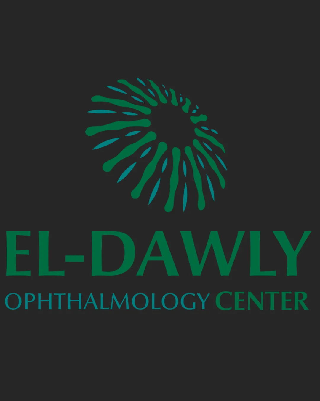
Logo review ofEl Dawly Ophthalmology Center
Review the detailed scores below to see what is working and what should be refined first.
Legibility
Originality
Misread
Balance
Scale
Detailed review
Logo performance breakdown
Legibility
![]() Clear and readable text
Clear and readable text![]() Good contrast between text and background
Good contrast between text and background
![]() The font style could be bolder for better legibility, especially in smaller applications
The font style could be bolder for better legibility, especially in smaller applications
Originality
![]() Symbol is unique and fits the industry
Symbol is unique and fits the industry
![]() Abstract eye shape is a common theme in ophthalmology logos, which reduces originality
Abstract eye shape is a common theme in ophthalmology logos, which reduces originality
Color harmony
![]() Consistent use of color throughout the logo
Consistent use of color throughout the logo![]() Colors are appropriate for a medical field
Colors are appropriate for a medical field
![]() Lack of color variation makes it less adaptable to different backgrounds
Lack of color variation makes it less adaptable to different backgrounds
Your palette is close. Explore sharper color combinations with Colorfly.design before updating the logo.
Explore palettesBalance alignment
![]() The alignment of the text and symbol is visually balanced
The alignment of the text and symbol is visually balanced![]() Hierarchy is clear
Hierarchy is clear
![]() Slight misalignment in the vertical arrangement of the text may cause a visual shift
Slight misalignment in the vertical arrangement of the text may cause a visual shift

Scalability
![]() Simple design suitable for larger formats
Simple design suitable for larger formats![]() Distinctive elements
Distinctive elements
![]() Complexity might reduce clarity when scaled down significantly
Complexity might reduce clarity when scaled down significantly![]() Thin lines in the symbol may not print well on small formats like business cards
Thin lines in the symbol may not print well on small formats like business cards
200x250 px
100×125 px
50×62 px
Misinterpretations
![]() No inappropriate symbols or suggestive shapes
No inappropriate symbols or suggestive shapes
Symbol & text fit
![]() Symbol and typography complement each other
Symbol and typography complement each other
![]() Consistent color scheme
Consistent color scheme
![]() Symbol could be reduced in dominance to highlight the name more
Symbol could be reduced in dominance to highlight the name more
Try your own review
Review my logo
Wondering how your logo performs?
Get a clear logo score, key risks, and priority fix ideas before your client or audience sees it.
Keep exploring


