 View review
Logo score
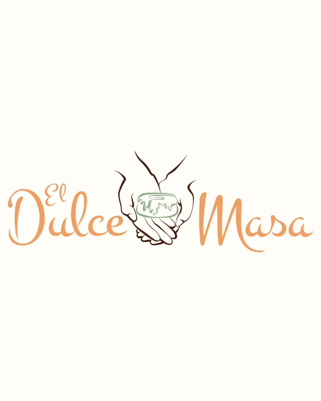
Logo review ofEl Dulce Masa
Review the detailed scores below to see what is working and what should be refined first.
Legibility
Originality
Balance
Scale
Detailed review
Logo performance breakdown
Legibility
![]() The text is mostly legible with a decorative script font.
The text is mostly legible with a decorative script font.
![]() The word 'El' is slightly less clear due to a smaller size.
The word 'El' is slightly less clear due to a smaller size.
Originality
![]() The hand-drawn style and dessert theme add uniqueness.
The hand-drawn style and dessert theme add uniqueness.
![]() The concept of hands holding food is somewhat common.
The concept of hands holding food is somewhat common.
Color harmony
![]() The colors are warm and suitable for a dessert brand.
The colors are warm and suitable for a dessert brand.
![]() The pastel shades might require more contrast for impact.
The pastel shades might require more contrast for impact.
Your palette is close. Explore sharper color combinations with Colorfly.design before updating the logo.
Explore palettesBalance alignment
![]() The logo has a balanced composition with the text on either side of the symbol.
The logo has a balanced composition with the text on either side of the symbol.
![]() The symbol might feel slightly disconnected from the text.
The symbol might feel slightly disconnected from the text.

Scalability
![]() The simple design of the symbol aids scalability.
The simple design of the symbol aids scalability.
![]() Some intricate details might be lost at smaller sizes.
Some intricate details might be lost at smaller sizes.
200x250 px
100×125 px
50×62 px
Try your own review
Review my logo
Wondering how your logo performs?
Get a clear logo score, key risks, and priority fix ideas before your client or audience sees it.
Keep exploring


