 View review
Logo score
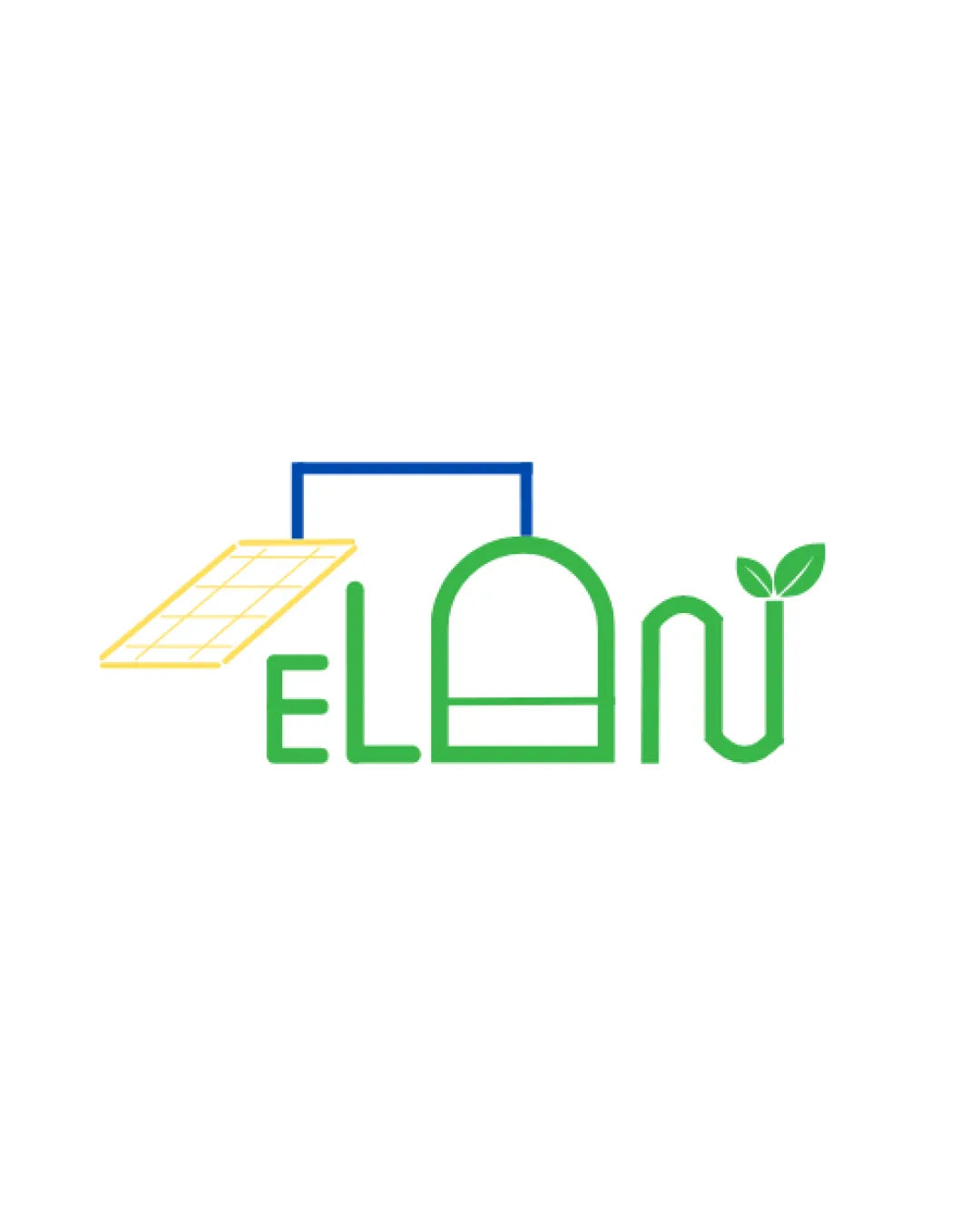
Logo review ofElan
Review the detailed scores below to see what is working and what should be refined first.
Legibility
Originality
Misread
Balance
Scale
Detailed review
Logo performance breakdown
Legibility
![]() Text is generally distinguishable.
Text is generally distinguishable.![]() Consistent line weight helps cohesion.
Consistent line weight helps cohesion.
![]() The 'A' shape is unconventional and could confuse some viewers.
The 'A' shape is unconventional and could confuse some viewers.![]() Leaf on the 'N' slightly distracts from letterform clarity.
Leaf on the 'N' slightly distracts from letterform clarity.
Originality
![]() Creative integration of solar panel and leaf elements into the wordmark.
Creative integration of solar panel and leaf elements into the wordmark.![]() Greenhouse shape in 'A' provides a custom touch.
Greenhouse shape in 'A' provides a custom touch.
![]() Fusion of stereotypical eco-symbols (leaves, solar panel) feels somewhat expected for the industry.
Fusion of stereotypical eco-symbols (leaves, solar panel) feels somewhat expected for the industry.![]() Could benefit from a more unexpected or abstract approach.
Could benefit from a more unexpected or abstract approach.
Color harmony
![]() Limited color palette communicates eco message and energy.
Limited color palette communicates eco message and energy.![]() Good contrast between yellow, blue, and green.
Good contrast between yellow, blue, and green.
![]() More than two accent colors may complicate reproduction in some brand contexts.
More than two accent colors may complicate reproduction in some brand contexts.
Green
#43B02A
Yellow
#FFDD44
Blue
#195DAB
Your palette is close. Explore sharper color combinations with Colorfly.design before updating the logo.
Explore palettesBalance alignment
![]() Horizontal balance is present, giving a stable look.
Horizontal balance is present, giving a stable look.![]() Vertical elements (leaf, solar panel) create visual hierarchy.
Vertical elements (leaf, solar panel) create visual hierarchy.
![]() Solar panel and frame float above text, making the overall weight top heavy.
Solar panel and frame float above text, making the overall weight top heavy.![]() Letterforms feel uneven due to different shapes and design incorporation.
Letterforms feel uneven due to different shapes and design incorporation.

Scalability
![]() Simple lines theoretically allow for shrinking if vectorized.
Simple lines theoretically allow for shrinking if vectorized.![]() Logo works well on white backgrounds, e.g. on letterhead.
Logo works well on white backgrounds, e.g. on letterhead.
![]() Fine gridlines on solar panel will be lost at small sizes like favicons or embroidery.
Fine gridlines on solar panel will be lost at small sizes like favicons or embroidery.![]() Thin lines might fail in black-and-white printing or on complex backgrounds.
Thin lines might fail in black-and-white printing or on complex backgrounds.![]() Multiple details hinder application on small merchandise or digital app icons.
Multiple details hinder application on small merchandise or digital app icons.
200x250 px
100×125 px
50×62 px
Misinterpretations
![]() No obvious inappropriate dual meanings or suggestive imagery.
No obvious inappropriate dual meanings or suggestive imagery.
Symbol & text fit
![]() Symbolism is tightly integrated into the wordmark.
Symbolism is tightly integrated into the wordmark.
![]() Cohesion between eco-theme and typography style.
Cohesion between eco-theme and typography style.
![]() Solar panel/additional framing feels slightly detached, not as fluidly embedded as other elements.
Solar panel/additional framing feels slightly detached, not as fluidly embedded as other elements.
Try your own review
Review my logo
Wondering how your logo performs?
Get a clear logo score, key risks, and priority fix ideas before your client or audience sees it.
Keep exploring


