Wondering how your logo performs? 🧐
Get professional logo reviews in seconds and catch design issues in time.
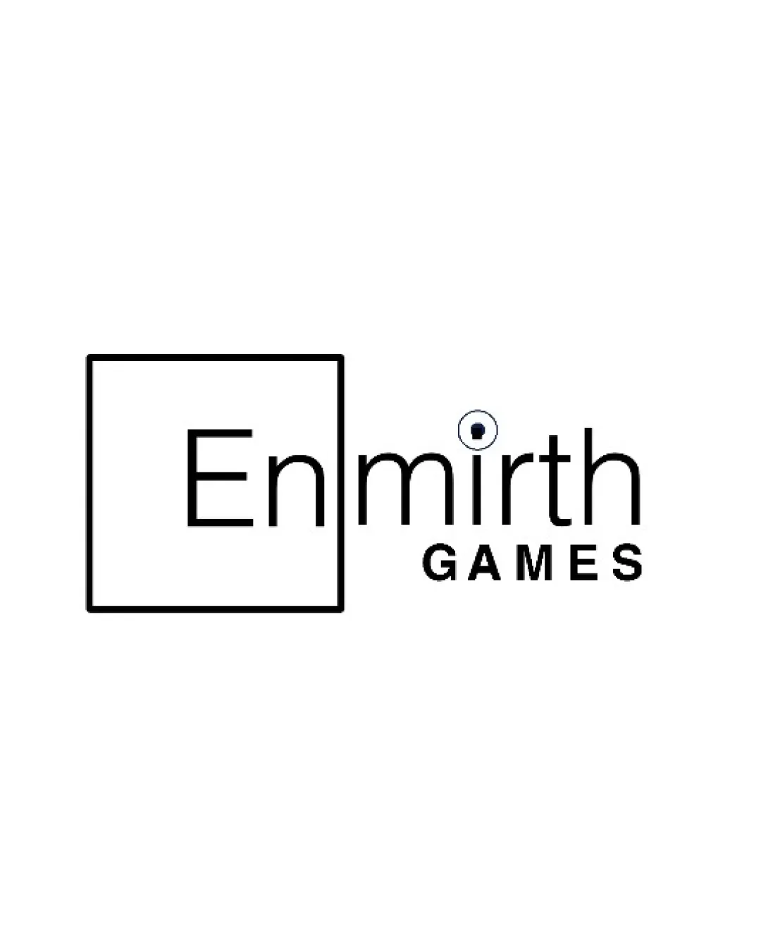
Try it Now!Logo review of Enmirth GAMES
 Logo analysis by AI
Logo type:
Style:
Detected symbol:
Detected text:
Business industry:
Review requested by Alluveon
**If AI can recognize or misinterpret it, so can people.
Structured logo review
Legibility
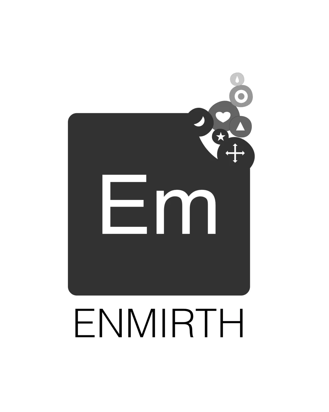
![]() Primary text 'Enmirth GAMES' is clear and easy to read.
Primary text 'Enmirth GAMES' is clear and easy to read.![]() 'GAMES' in uppercase provides a strong visual anchor.
'GAMES' in uppercase provides a strong visual anchor.
![]() Small icon within the 'i' dot may not be legible at smaller scales.
Small icon within the 'i' dot may not be legible at smaller scales.![]() The differing text sizes between 'Enmirth' and 'GAMES' create minor imbalance.
The differing text sizes between 'Enmirth' and 'GAMES' create minor imbalance.
Scalability versatility
![]() Simple, clean lines maintain clarity when scaled.
Simple, clean lines maintain clarity when scaled.![]() Works on white/light backgrounds and digital applications.
Works on white/light backgrounds and digital applications.
![]() Tiny symbol in 'i' will be illegible in favicon/embroidery applications.
Tiny symbol in 'i' will be illegible in favicon/embroidery applications.![]() Thin square outline may disappear at very small sizes or on colored backgrounds.
Thin square outline may disappear at very small sizes or on colored backgrounds.![]() Could become lost on busy backgrounds or merchandise.
Could become lost on busy backgrounds or merchandise.
200x250 px
100×125 px
50×62 px
Balance alignment
![]() Square border attempts to anchor the left side.
Square border attempts to anchor the left side.![]() Text is horizontally aligned.
Text is horizontally aligned.
![]() Heavy focus on the left with the square causes a right-weighted feeling.
Heavy focus on the left with the square causes a right-weighted feeling.![]() 'En' placed inside the square disconnects it from the full word.
'En' placed inside the square disconnects it from the full word.![]() Small icon in 'i' creates a subtle but noticeable focal point away from the core composition.
Small icon in 'i' creates a subtle but noticeable focal point away from the core composition.

Originality
![]() Utilizes the 'i' as a subtle nod to gaming with a unique miniature mark.
Utilizes the 'i' as a subtle nod to gaming with a unique miniature mark.![]() Square framing for 'En' is less common in gaming brands.
Square framing for 'En' is less common in gaming brands.
![]() Square-and-text motif is fairly safe and lacks a strong conceptual twist.
Square-and-text motif is fairly safe and lacks a strong conceptual twist.![]() Mini icon in 'i' could be seen as a generic game reference if not more distinguishable.
Mini icon in 'i' could be seen as a generic game reference if not more distinguishable.
Logomark wordmark fit
![]() Attempts integration between square mark and 'En' text.
Attempts integration between square mark and 'En' text.
![]() Styles between square outline and modern sans-serif text do not fully harmonize.
Styles between square outline and modern sans-serif text do not fully harmonize.![]() The square visually detaches 'En' from the rest of the word, making the flow odd.
The square visually detaches 'En' from the rest of the word, making the flow odd.
Aesthetic look
![]() Minimalist and visually clean.
Minimalist and visually clean.![]() Monochromatic palette looks professional.
Monochromatic palette looks professional.
![]() Square feels arbitrary and interrupts the reading flow.
Square feels arbitrary and interrupts the reading flow.![]() Visual weight is awkwardly distributed.
Visual weight is awkwardly distributed.![]() Tiny icon detail may be aesthetically distracting.
Tiny icon detail may be aesthetically distracting.
Dual meaning and misinterpretations
![]() No unintentional or inappropriate imagery detected.
No unintentional or inappropriate imagery detected.
Color harmony
![]() Consistent monochrome treatment keeps the logo refined and professional.
Consistent monochrome treatment keeps the logo refined and professional.
White
#FFFFFF
Black
#000000