 View review
Logo score
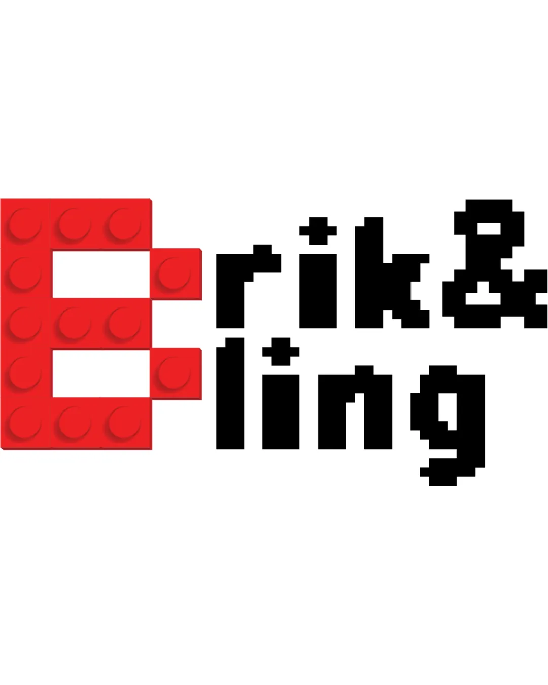
Logo review ofErik & Ling
Review the detailed scores below to see what is working and what should be refined first.
Legibility
Originality
Misread
Balance
Scale
Detailed review
Logo performance breakdown
Legibility
![]() Text is clear at a moderate size.
Text is clear at a moderate size.
![]() Pixelated font may become hard to read at smaller sizes.
Pixelated font may become hard to read at smaller sizes.
Originality
![]() Creative use of brick-like elements.
Creative use of brick-like elements.
Color harmony
![]() Good contrast between red and black.
Good contrast between red and black.
Your palette is close. Explore sharper color combinations with Colorfly.design before updating the logo.
Explore palettesBalance alignment
![]() Balanced integration of symbol and text.
Balanced integration of symbol and text.

Scalability
![]() Simple elements should print well on larger formats.
Simple elements should print well on larger formats.
![]() Details in the brick texture might be lost in small or embroidered applications.
Details in the brick texture might be lost in small or embroidered applications.
200x250 px
100×125 px
50×62 px
Misinterpretations
![]() No inappropriate symbols detected.
No inappropriate symbols detected.
Try your own review
Review my logo
Wondering how your logo performs?
Get a clear logo score, key risks, and priority fix ideas before your client or audience sees it.
Keep exploring


