Wondering how your logo performs? 🧐
Get professional logo reviews in seconds and catch design issues in time.
Try it Now!Logo review of Espace Vert Agadir, Arabic script, mirrored/malfor..
 Logo analysis by AI
Logo type:
Style:
Detected symbol:
Negative space:
Detected text:
Business industry:
Review requested by Camil
**If AI can recognize or misinterpret it, so can people.
Structured logo review
Legibility
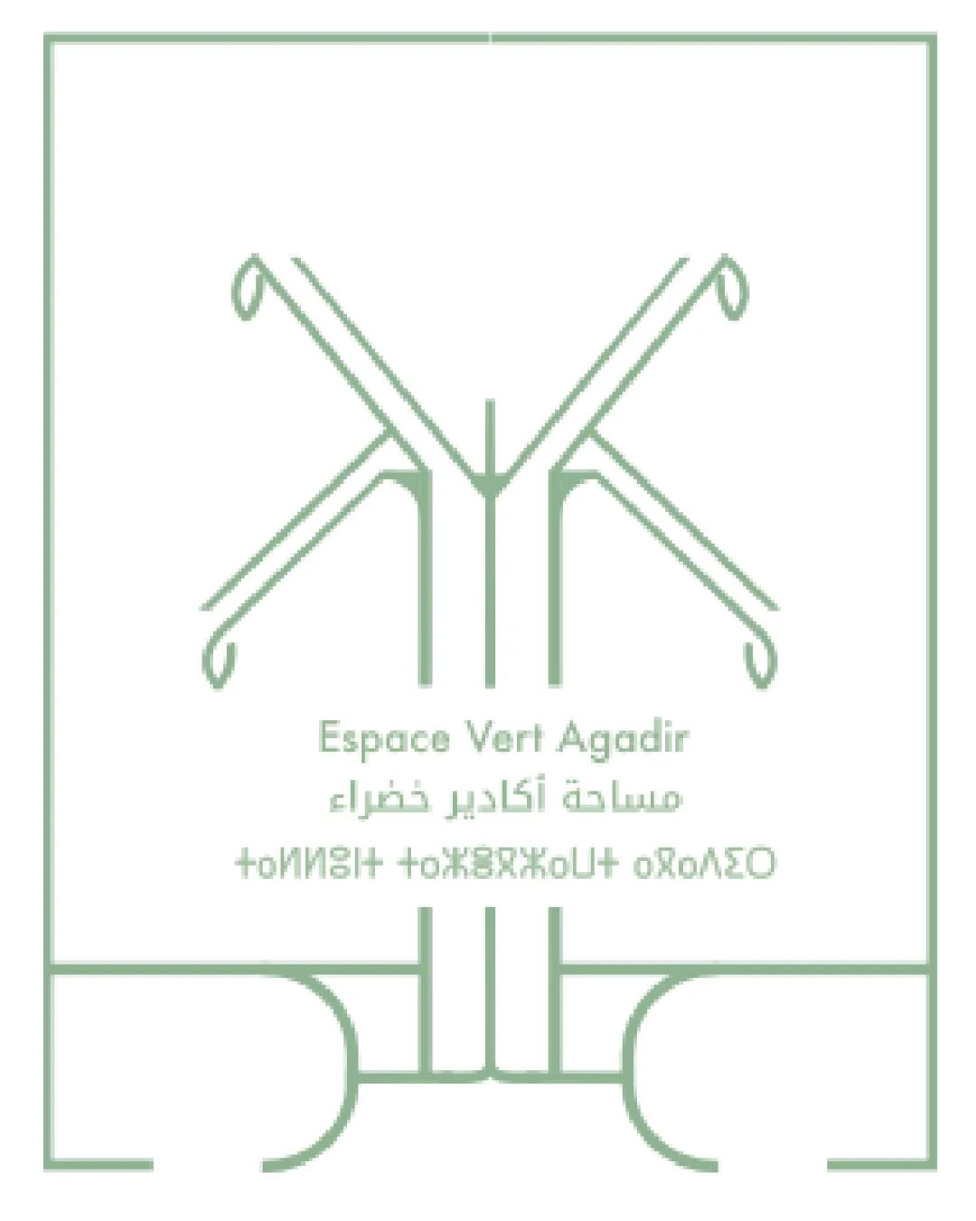
Primary Latin and Arabic text is mostly readable due to clean font choices.
Bottom line of text is mirrored or formatted incorrectly, making it completely illegible.
Thin type and light color reduce emphasis and readability at a glance and in small applications.
Scalability versatility
Minimalist line art scales reasonably well to digital and large print applications.
Very thin lines risk losing detail or becoming invisible at small sizes or on certain materials, e.g., embroidery, stamps, or business cards.
Extensive thin lines may not reproduce well on textured surfaces or at low resolutions.

200x250 px

100×125 px

50×62 px
Balance alignment
Overall symmetry provides some balance.
Central placement of text under the symbol aligns visually.
The lower geometric form feels detached from the upper symbol, breaking unity.
Internal spacing feels inconsistent: the bottom element is heavy relative to the very light top, creating a disconnect.


Originality
Stylized tree interpretation with geometric abstraction is visually distinctive.
Use of Arabic and Latin typography adds multicultural uniqueness.
Abstract trees are somewhat common motifs in landscaping/green/eco design.
Mirrored/malformed line of text undermines professional uniqueness.
Logomark wordmark fit
Font weight and line weight of symbol are complementary.
Text feels slightly out of place and secondary to the graphic above, with little interplay or integration.
The malformed/mirrored text distracts from harmony between symbol and wordmark.
Aesthetic look
Minimal, modern, and calming color palette fits the intended industry.
Overly thin lines create a fragile impression.
Unusual bottom form and text formatting disrupt clean visual flow.
Alignment between geometric forms and text areas could be tighter for more cohesion.
Dual meaning and misinterpretations
No major inappropriate or unintended imagery detected.
Lower geometric figure is ambiguous and confusing in meaning; could be interpreted as unrelated to nature or landscaping.
Color harmony
Single soft green and white color use creates strong harmony and is industry-appropriate.
Monochromatic look ensures brand consistency and simplicity.
Cambridge Green
#A6BEA4
White
#FFFFFF

