 View review
Logo score
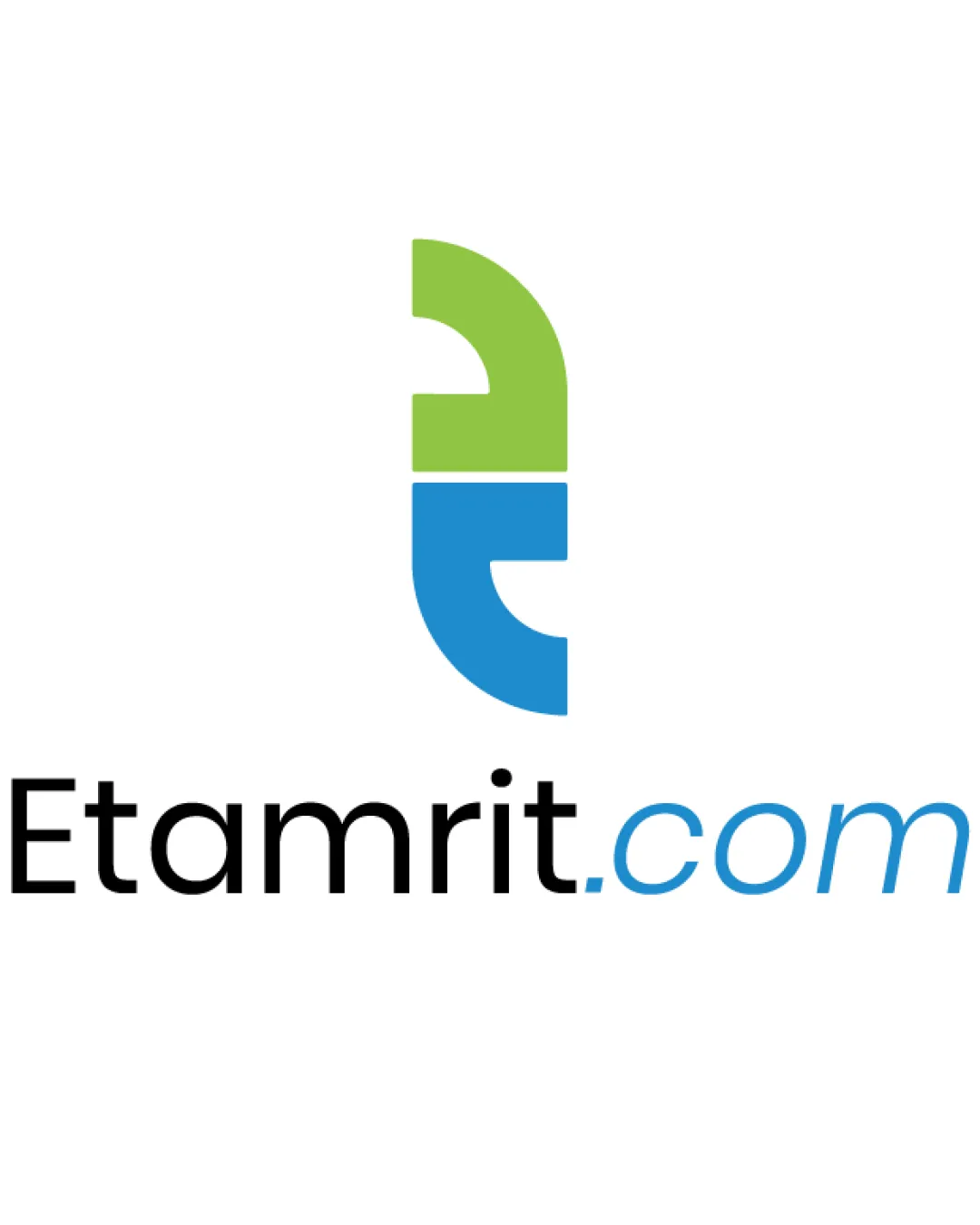
Logo review ofEtamrit.com
Review the detailed scores below to see what is working and what should be refined first.
Legibility
Originality
Misread
Balance
Scale
Detailed review
Logo performance breakdown
Legibility
![]() Clean, sans-serif typeface ensures clarity.
Clean, sans-serif typeface ensures clarity.![]() Distinct color contrast between 'Etamrit' and '.com' aids readability.
Distinct color contrast between 'Etamrit' and '.com' aids readability.
Originality
![]() Creative blend of lowercase 'e' and 't' in the logomark adds uniqueness.
Creative blend of lowercase 'e' and 't' in the logomark adds uniqueness.![]() Distinct color usage helps separate the elements.
Distinct color usage helps separate the elements.
![]() The approach of merging simple letterforms is moderately common in tech branding.
The approach of merging simple letterforms is moderately common in tech branding.
Color harmony
![]() Green and blue are harmonious and evoke trust and growth, fitting for the tech industry.
Green and blue are harmonious and evoke trust and growth, fitting for the tech industry.![]() Black adds clear legibility to the primary brand name.
Black adds clear legibility to the primary brand name.
![]() Use of three distinct colors in one wordmark can limit simplicity in single-color applications.
Use of three distinct colors in one wordmark can limit simplicity in single-color applications.
green
#7AC143
blue
#2196F3
black
#000000
white
#FFFFFF
Your palette is close. Explore sharper color combinations with Colorfly.design before updating the logo.
Explore palettesBalance alignment
![]() Symbol is vertically centered above the wordmark, creating a clear hierarchy.
Symbol is vertically centered above the wordmark, creating a clear hierarchy.![]() Wordmark is well-aligned horizontally.
Wordmark is well-aligned horizontally.
![]() Minor tension between the visual weight of the logomark and the lightness of the '.com' section, which may make the right side feel weaker.
Minor tension between the visual weight of the logomark and the lightness of the '.com' section, which may make the right side feel weaker.

Scalability
![]() Simple shapes and clean lines allow for scaling to small and large sizes.
Simple shapes and clean lines allow for scaling to small and large sizes.![]() No intricate details, making it suitable for digital and print applications.
No intricate details, making it suitable for digital and print applications.
![]() Color differentiation in text may get lost in small-scale monochrome applications.
Color differentiation in text may get lost in small-scale monochrome applications.![]() The combination mark’s thin spacing between green and blue may blur at micro sizes (e.g., favicon).
The combination mark’s thin spacing between green and blue may blur at micro sizes (e.g., favicon).
200x250 px
100×125 px
50×62 px
Misinterpretations
![]() Abstract shapes are safe, avoiding inappropriate associations.
Abstract shapes are safe, avoiding inappropriate associations.
Symbol & text fit
![]() The logomark conceptually connects with the first two letters of the brand, reinforcing the name.
The logomark conceptually connects with the first two letters of the brand, reinforcing the name.
![]() Modern, clean style complements the geometric symbol.
Modern, clean style complements the geometric symbol.
Try your own review
Review my logo
Wondering how your logo performs?
Get a clear logo score, key risks, and priority fix ideas before your client or audience sees it.
Keep exploring