 View review
Logo score
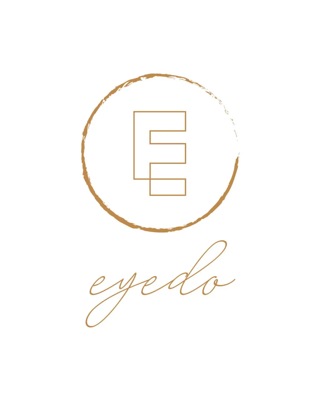
Logo review ofEyedo
Review the detailed scores below to see what is working and what should be refined first.
Legibility
Originality
Misread
Balance
Scale
Detailed review
Logo performance breakdown
Legibility
![]() Text is clear and readable
Text is clear and readable![]() Contrasting color enhances text visibility
Contrasting color enhances text visibility
![]() Script font may reduce readability at smaller sizes
Script font may reduce readability at smaller sizes
Originality
![]() Simple yet distinctive E monogram
Simple yet distinctive E monogram
![]() Circle element is somewhat generic
Circle element is somewhat generic
Color harmony
![]() Consistent color scheme
Consistent color scheme![]() Color adds to luxurious feel
Color adds to luxurious feel
Balance alignment
![]() Visual elements are well-centered
Visual elements are well-centered![]() Consistent use of color
Consistent use of color
![]() Slight imbalance due to circle's uneven stroke
Slight imbalance due to circle's uneven stroke

Scalability
![]() Simple design aids scalability
Simple design aids scalability![]() Suitable for larger formats like signage
Suitable for larger formats like signage
![]() Thin lines may lose clarity at small sizes
Thin lines may lose clarity at small sizes![]() Circle detail might blur in small applications
Circle detail might blur in small applications
200x250 px
100×125 px
50×62 px
Misinterpretations
![]() No misinterpretations detected
No misinterpretations detected
Try your own review
Review my logo
Wondering how your logo performs?
Get a clear logo score, key risks, and priority fix ideas before your client or audience sees it.
Keep exploring


