 View review
Logo score
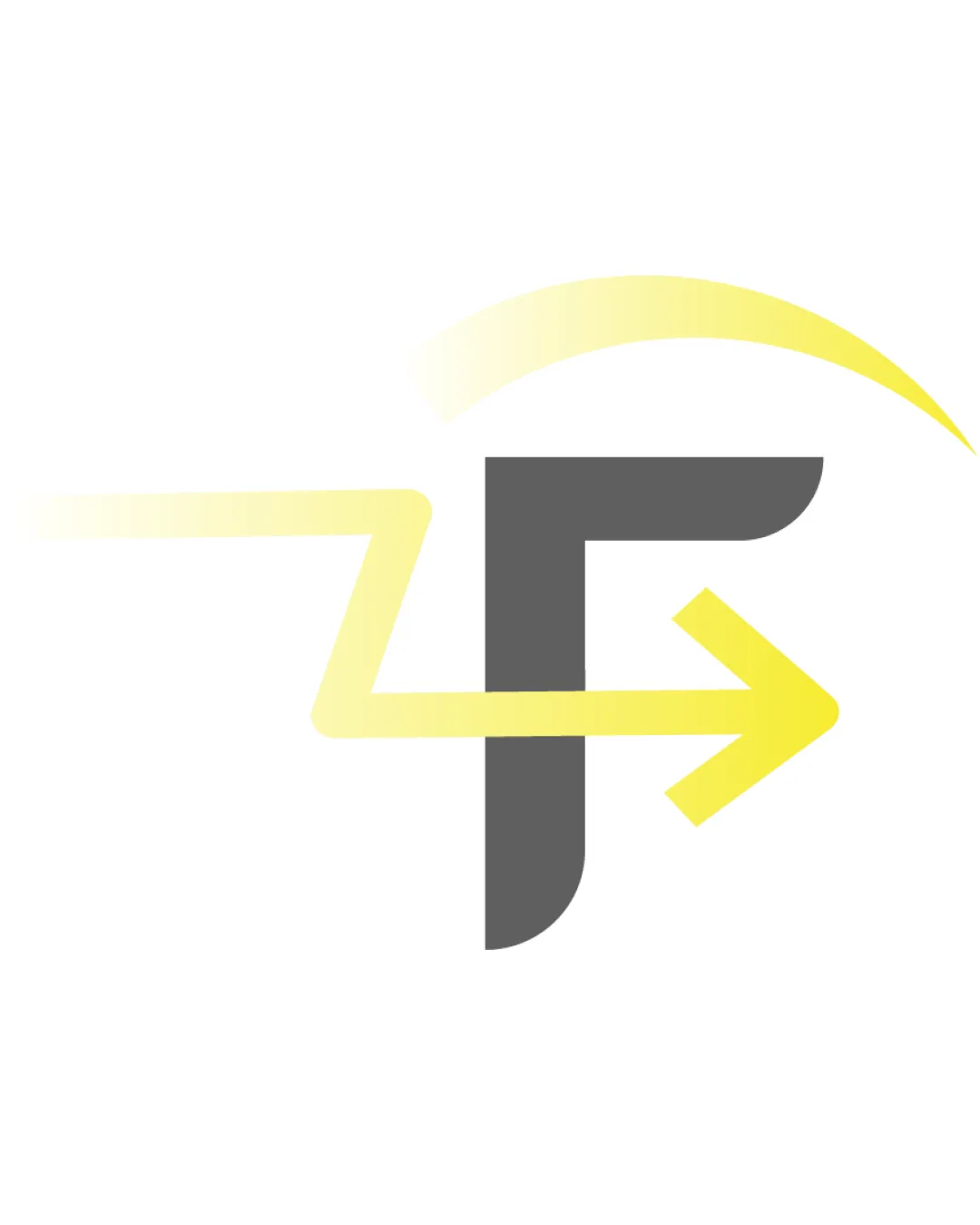
Logo review ofF
Review the detailed scores below to see what is working and what should be refined first.
Originality
Misread
Balance
Scale
Detailed review
Logo performance breakdown
Originality
![]() Combination of 'F' and arrow is slightly distinctive
Combination of 'F' and arrow is slightly distinctive![]() Use of an abstract swoosh adds a unique touch
Use of an abstract swoosh adds a unique touch
![]() Arrow and swoosh motifs are extremely common in tech and logistics logos
Arrow and swoosh motifs are extremely common in tech and logistics logos![]() Dark gray geometric 'F' lacks unique personality
Dark gray geometric 'F' lacks unique personality![]() Overall construction could be mistaken for other brands with similar abstract or letter-arrow themes
Overall construction could be mistaken for other brands with similar abstract or letter-arrow themes
Color harmony
![]() Yellow and gray can create a vibrant, energetic mood when used skillfully
Yellow and gray can create a vibrant, energetic mood when used skillfully![]() Color contrast between the two main hues helps define the shapes
Color contrast between the two main hues helps define the shapes
![]() Gradient reduces the strength of the yellow, leading to inconsistent visibility in varied applications
Gradient reduces the strength of the yellow, leading to inconsistent visibility in varied applications![]() Very light yellows are close to white and lose readability on light backgrounds
Very light yellows are close to white and lose readability on light backgrounds
Gray
#494949
Light Yellow
#FFF9C4
Bright Yellow
#FFEB3B
White
#FFFFFF
Color may be holding this logo back. Explore stronger palette options with Colorfly.design before updating the logo.
Explore palettesBalance alignment
![]() The gray 'F' provides a solid visual anchor
The gray 'F' provides a solid visual anchor![]() Yellow movement brings directional energy
Yellow movement brings directional energy
![]() Arrow and zigzag disrupt spatial symmetry, making overall logo look visually top-heavy and unbalanced
Arrow and zigzag disrupt spatial symmetry, making overall logo look visually top-heavy and unbalanced![]() The curved swoosh feels detached and not well integrated with the main form
The curved swoosh feels detached and not well integrated with the main form![]() Elements appear loosely assembled, lacking visual cohesion
Elements appear loosely assembled, lacking visual cohesion

Scalability
![]() Simple core structure aids clarity at medium sizes
Simple core structure aids clarity at medium sizes![]() Limited color palette can work in flat adaptation for certain print uses
Limited color palette can work in flat adaptation for certain print uses
![]() Gradient fades reduce clarity and legibility in small sizes, such as app icons or embroidery
Gradient fades reduce clarity and legibility in small sizes, such as app icons or embroidery![]() Thin and faded yellow portions will disappear on light backgrounds
Thin and faded yellow portions will disappear on light backgrounds![]() Swoosh and arrow may look disconnected or unclear in tiny applications
Swoosh and arrow may look disconnected or unclear in tiny applications
200x250 px
100×125 px
50×62 px
Misinterpretations
![]() No inappropriate visual associations or misleading alternate meanings detected
No inappropriate visual associations or misleading alternate meanings detected
Try your own review
Review my logo
Wondering how your logo performs?
Get a clear logo score, key risks, and priority fix ideas before your client or audience sees it.
Keep exploring


