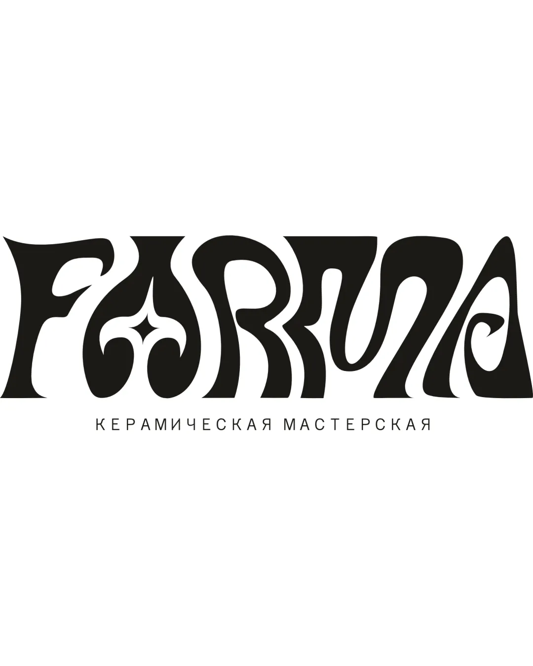
FARMNA (may intend 'FARINA' or 'FARMA', but legibi.. logo review
3.3 / 5
Logo score

Logo review ofFarmna (may Intend 'farina' Or 'farma', But Legibi..

Review the detailed scores below to see what is working and what should be refined first.

Wordmark Psychedelic, Retro-inspired, Highly Decorative Crafts
2/5
Legibility
4/5
Originality
4/5
Misread
3/5
Balance
2/5
Scale
Review next
Action plan

What to fix first

The most important fixes to handle before polishing the full presentation.

1

Fix possible misinterpretation

High priority

Ornamented 'A' could be misread as multiple possible letters or symbols
Impact: High · Effort: Medium

Detailed review

Logo performance breakdown

2/5

Legibility

Checkmark icon Distinctive, eye-catching custom lettering
Checkmark icon Evocative of artistic, hand-made themes

Warning icon Severely compromised letter clarity, especially with letters 'I', 'N', 'A', and 'R'
Warning icon Starburst element within 'A' distracts and may confuse the actual letter form
Warning icon Some viewers will struggle to easily interpret the brand name, especially at a glance

4/5

Originality

Checkmark icon Highly unique and memorable use of psychedelic, retro type design
Checkmark icon Bespoke shapes and custom ligatures

Warning icon Ornamentation may resemble generic retro-psychedelic trends, limiting timelessness

5/5

Color harmony

Checkmark icon Restrained black-and-white palette is classic, versatile, and non-distracting

Black
#000000

White
#FFFFFF

3/5

Balance alignment

Checkmark icon Strong visual center provided by symmetrical elements, such as 'A' and decorative motifs
Checkmark icon Overall horizontal presence gives some balance

Warning icon Organic, wavy letter construction causes uneven weight distribution
Warning icon Letter sizes and negative space vary unpredictably, creating a visually chaotic effect

logo 200x250 pixels scalability test alignment grid overlay
2/5

Scalability

Checkmark icon Simple black-and-white palette aids reproduction in monochrome applications

Warning icon Fine details and tightly spaced, stylized text can easily blur or disappear at small sizes
Warning icon Highly decorative style will not scale well to small merchandise, social icons, or embroidery
Warning icon Legibility collapses in reduced formats such as business cards, tags, or mobile icons

logo 200x250 pixels scalability test

200x250 px

logo 100x125 pixels scalability test

100×125 px

logo 50x62 pixels scalability test

50×62 px

4/5

Misinterpretations

Checkmark icon No overtly inappropriate or accidentally offensive shapes detected

Warning icon Ornamented 'A' could be misread as multiple possible letters or symbols

Try your own review

Wondering how your logo performs?

Get a clear logo score, key risks, and priority fix ideas before your client or audience sees it.

Review my logo




