 View review
Logo score
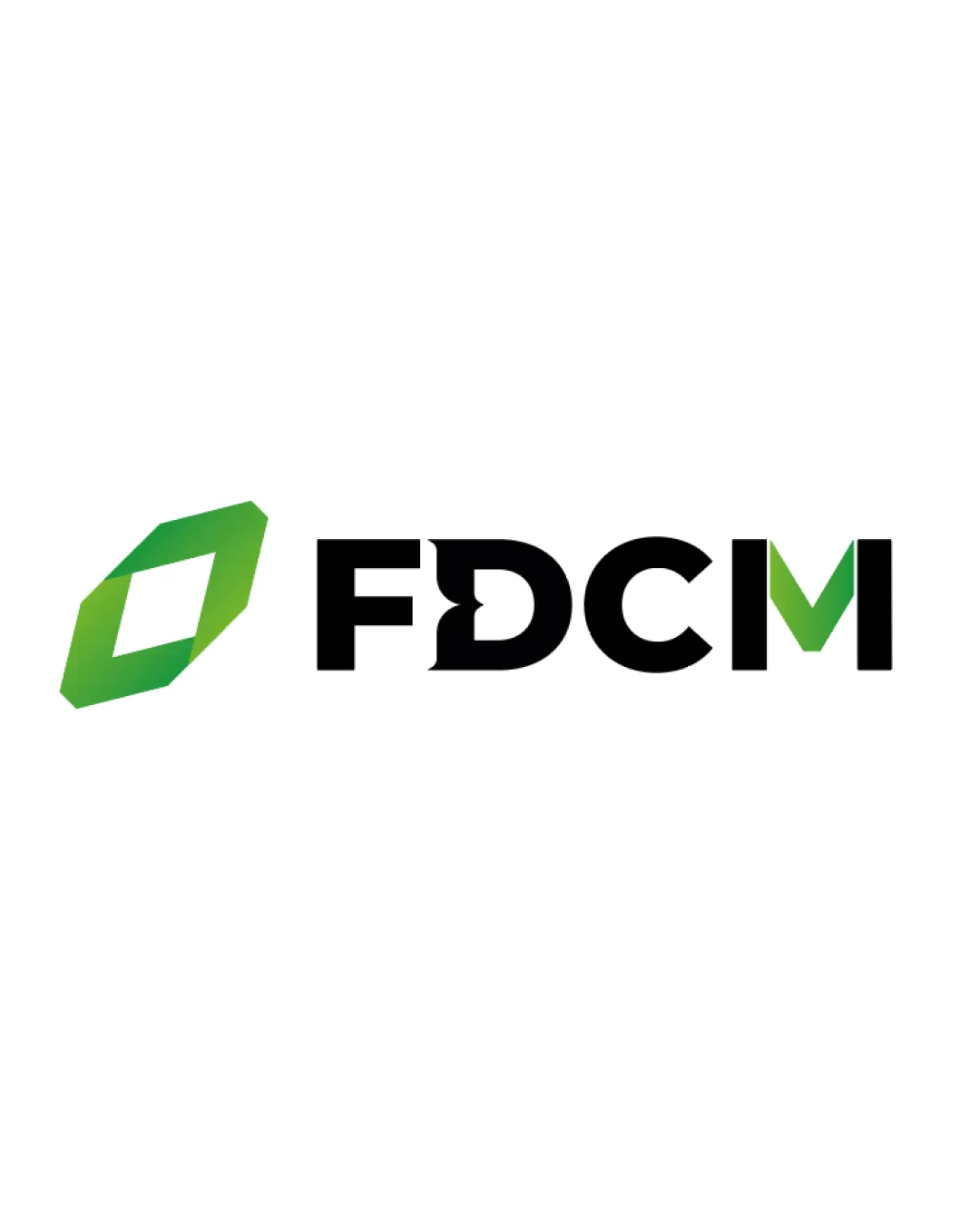
Logo review ofFdcm
Review the detailed scores below to see what is working and what should be refined first.
Legibility
Originality
Misread
Balance
Scale
Detailed review
Logo performance breakdown
Legibility
![]() Clear and bold typography
Clear and bold typography![]() Good contrast between text and background
Good contrast between text and background
![]() Slight complexity in the letter 'D' may reduce clarity
Slight complexity in the letter 'D' may reduce clarity
Originality
![]() Unique integration of letter 'D' into the design
Unique integration of letter 'D' into the design
![]() The angular shape is somewhat generic
The angular shape is somewhat generic
Color harmony
![]() Good use of green for emphasis and modernity
Good use of green for emphasis and modernity
Balance alignment
![]() Good alignment between symbol and text
Good alignment between symbol and text
![]() The angular symbol is slightly aggressive compared to the smooth text
The angular symbol is slightly aggressive compared to the smooth text

Scalability
![]() Simple and clean design that can scale well
Simple and clean design that can scale well![]() Works in both small and large formats
Works in both small and large formats
200x250 px
100×125 px
50×62 px
Misinterpretations
![]() No inappropriate elements
No inappropriate elements
Symbol & text fit
![]() The symbol and wordmark feel connected through color
The symbol and wordmark feel connected through color
![]() Slight difference in style between dynamic symbol and stable wordmark
Slight difference in style between dynamic symbol and stable wordmark
Try your own review
Review my logo
Wondering how your logo performs?
Get a clear logo score, key risks, and priority fix ideas before your client or audience sees it.
Keep exploring


