Wondering how your logo performs? 🧐
Get professional logo reviews in seconds and catch design issues in time.
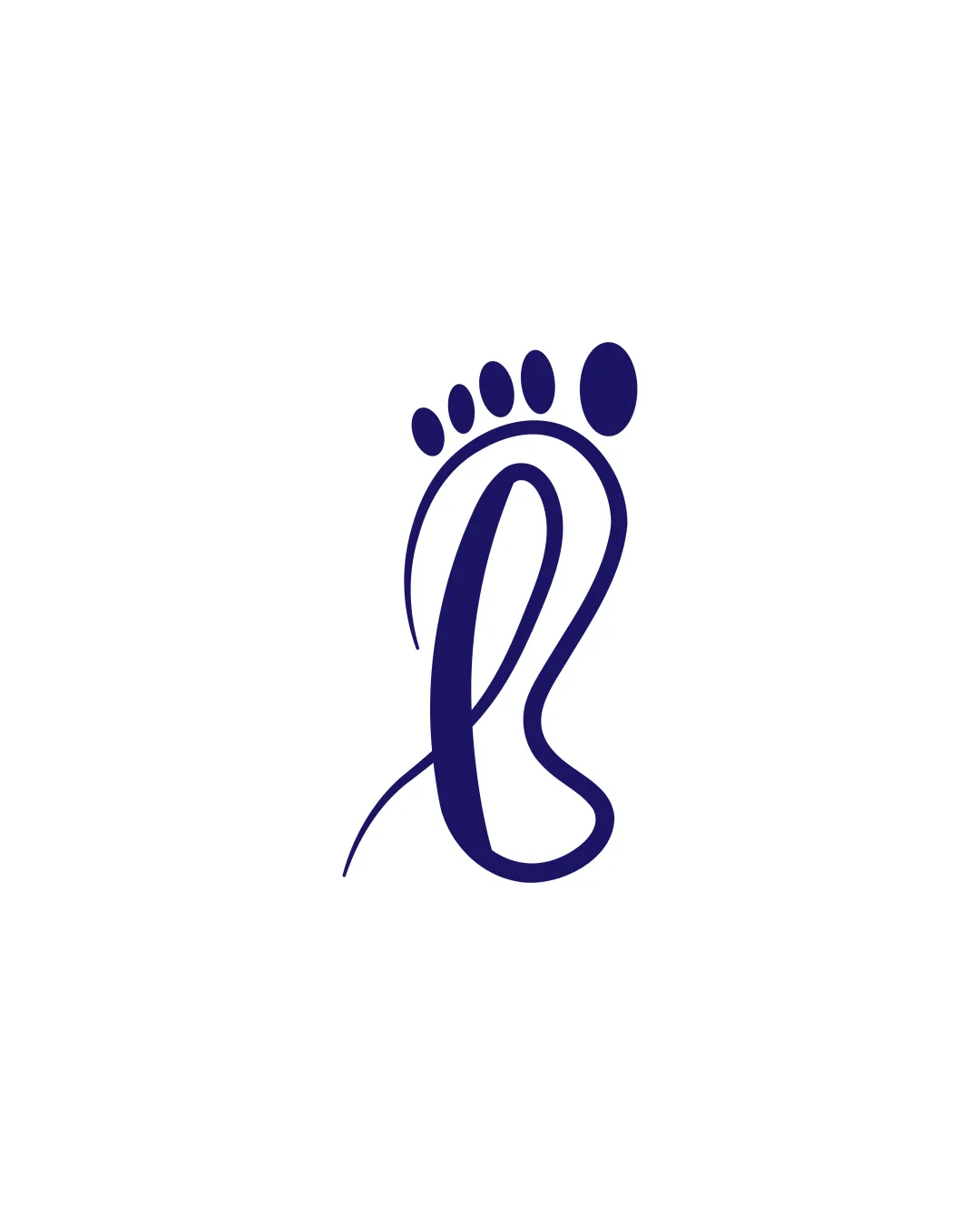
Try it Now!Logo review of Footprint with letter B
 Logo analysis by AI
Logo type:
Style:
Detected symbol:
Business industry:
Review requested by Loma
**If AI can recognize or misinterpret it, so can people.
Structured logo review
Scalability versatility
![]() Simple design ensures clarity at small sizes.
Simple design ensures clarity at small sizes.![]() Works well in monochrome.
Works well in monochrome.
![]() Curved lines may lose definition at very small sizes.
Curved lines may lose definition at very small sizes.
200x250 px
100×125 px
50×62 px
Balance alignment
![]() Well-balanced with even weight distribution.
Well-balanced with even weight distribution.
![]() Slightly top-heavy due to the larger toe shape.
Slightly top-heavy due to the larger toe shape.

Originality
![]() Clever integration of a footprint and letter B.
Clever integration of a footprint and letter B.
![]() Footprint symbols are somewhat common in the industry.
Footprint symbols are somewhat common in the industry.
Aesthetic look
![]() Clean and modern appearance.
Clean and modern appearance.![]() Visually appealing curves.
Visually appealing curves.
![]() Overall shape could be refined for more uniqueness.
Overall shape could be refined for more uniqueness.
Dual meaning and misinterpretations
![]() Clear representation of intended concepts.
Clear representation of intended concepts.
Color harmony
![]() Solid single color enhances versatility.
Solid single color enhances versatility.


