 View review
Logo score
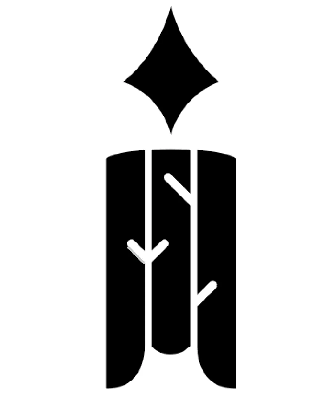
Logo review ofFountain Pen Nib Forming Stylized Trees/branches
Review the detailed scores below to see what is working and what should be refined first.
Originality
Misread
Balance
Scale
Detailed review
Logo performance breakdown
Originality
![]() Creative combination of a fountain pen nib and tree elements.
Creative combination of a fountain pen nib and tree elements.![]() Negative space is used skillfully, resulting in a memorable and unique mark.
Negative space is used skillfully, resulting in a memorable and unique mark.
![]() Concept of blending pen and tree has some precedents in publishing/creative industries, but execution here is still above average.
Concept of blending pen and tree has some precedents in publishing/creative industries, but execution here is still above average.
Color harmony
![]() Monochrome palette guarantees excellent contrast and broad adaptability.
Monochrome palette guarantees excellent contrast and broad adaptability.![]() Black-and-white look ensures timelessness and high visibility.
Black-and-white look ensures timelessness and high visibility.
Black
#000000
White
#FFFFFF
Balance alignment
![]() Symmetrical and well-proportioned, creating a cohesive and stable appearance.
Symmetrical and well-proportioned, creating a cohesive and stable appearance.![]() All elements are vertically aligned, contributing to a harmonious look.
All elements are vertically aligned, contributing to a harmonious look.

Scalability
![]() Simple, bold lines ensure excellent readability even at small scales.
Simple, bold lines ensure excellent readability even at small scales.![]() Works on a wide range of applications—from business cards to billboards and digital favicons.
Works on a wide range of applications—from business cards to billboards and digital favicons.
200x250 px
100×125 px
50×62 px
Misinterpretations
![]() Visual cues are clear and do not resemble inappropriate or unintended symbols.
Visual cues are clear and do not resemble inappropriate or unintended symbols.
Try your own review
Review my logo
Wondering how your logo performs?
Get a clear logo score, key risks, and priority fix ideas before your client or audience sees it.
Keep exploring


