Wondering how your logo performs? 🧐
Get professional logo reviews in seconds and catch design issues in time.
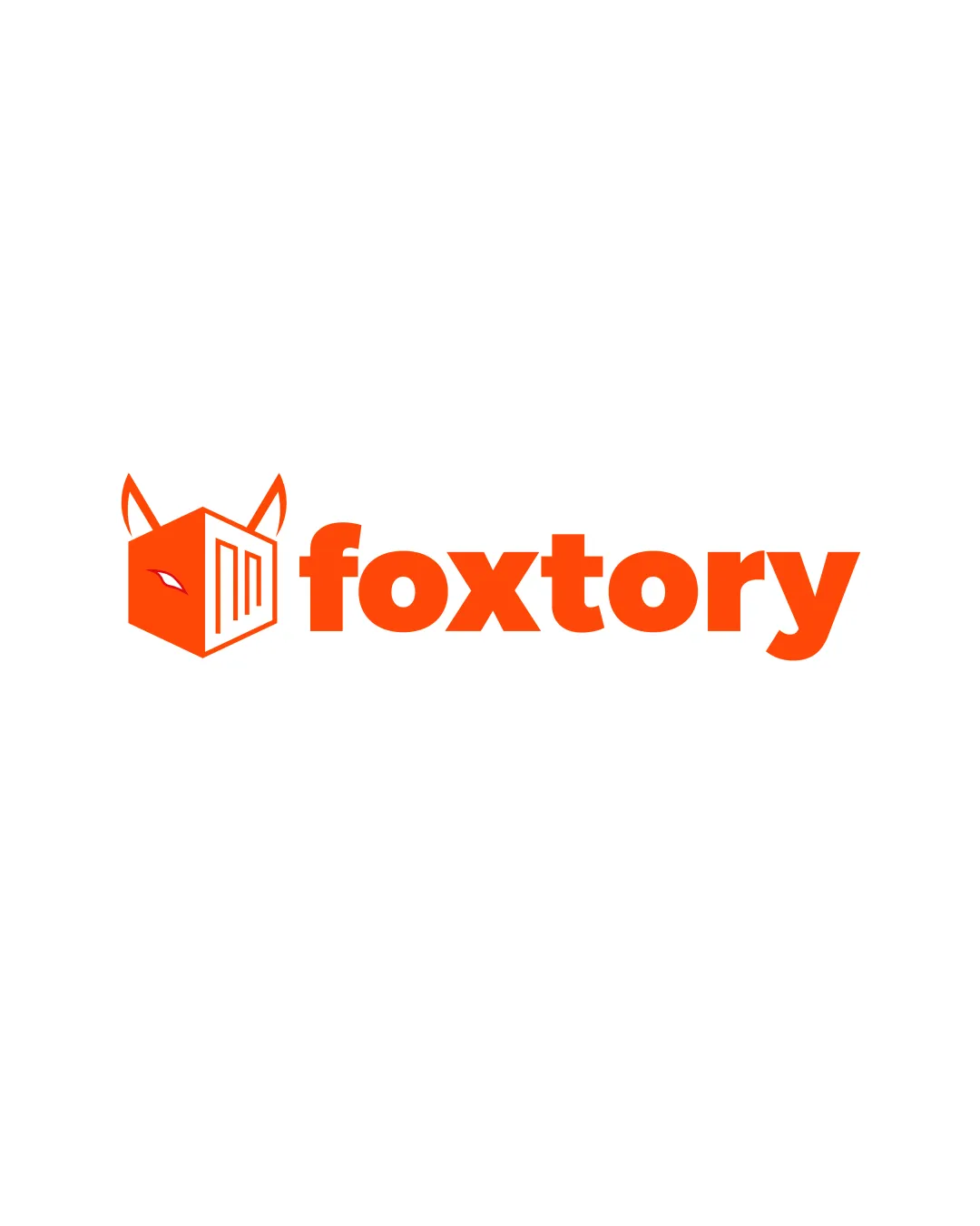
Try it Now!Logo review of foxtory
 Logo analysis by AI
Logo type:
Style:
Detected symbol:
Detected text:
Business industry:
Review requested by M17hun_
**If AI can recognize or misinterpret it, so can people.
Structured logo review
Legibility
![]() The text 'foxtory' is bold and easy to read against the white background.
The text 'foxtory' is bold and easy to read against the white background.![]() Consistent use of one color provides strong contrast.
Consistent use of one color provides strong contrast.
Scalability versatility
![]() Simple geometric forms support scalability for most digital uses, print, and merchandise.
Simple geometric forms support scalability for most digital uses, print, and merchandise.![]() Distinctive enough for social media avatars and app icons.
Distinctive enough for social media avatars and app icons.
![]() Fine line details inside the cube (e.g., the eye and line pattern) may be lost at very small scales like 16x16 favicons or small embroidery.
Fine line details inside the cube (e.g., the eye and line pattern) may be lost at very small scales like 16x16 favicons or small embroidery.
200x250 px
100×125 px
50×62 px
Balance alignment
![]() The logomark and wordmark are proportionate, aligned horizontally, and visually harmonious.
The logomark and wordmark are proportionate, aligned horizontally, and visually harmonious.![]() Visual weight of the fox head is balanced with the bold text.
Visual weight of the fox head is balanced with the bold text.

Originality
![]() Creative fusion of a fox head and a box, inspired by the brand name.
Creative fusion of a fox head and a box, inspired by the brand name.![]() Custom geometric structure, distinct from generic animal marks.
Custom geometric structure, distinct from generic animal marks.
![]() Animal-cube mashups are trending, so the concept, while executed well, borders on familiar.
Animal-cube mashups are trending, so the concept, while executed well, borders on familiar.
Logomark wordmark fit
![]() Angular edges of logomark complement the rounded bold font well.
Angular edges of logomark complement the rounded bold font well.![]() Color consistency ties both elements together effectively.
Color consistency ties both elements together effectively.
Aesthetic look
![]() Striking, playful, and appealing use of orange.
Striking, playful, and appealing use of orange.![]() Modern, clean lines and friendly font exude approachability and confidence.
Modern, clean lines and friendly font exude approachability and confidence.
Dual meaning and misinterpretations
![]() Cube-and-fox design is clear, with no misleading imagery.
Cube-and-fox design is clear, with no misleading imagery.
Color harmony
![]() Consistent use of a highly saturated orange against white creates a strong, memorable visual identity.
Consistent use of a highly saturated orange against white creates a strong, memorable visual identity.
VividOrange
#FF5001
White
#FFFFFF


