 View review
Logo score
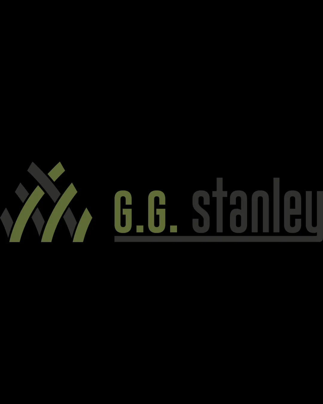
Logo review ofG.g. Stanley
Review the detailed scores below to see what is working and what should be refined first.
Legibility
Originality
Misread
Balance
Scale
Detailed review
Logo performance breakdown
Legibility
![]() The text 'G.G. Stanley' is generally clear and the font is simple sans-serif, which supports legibility.
The text 'G.G. Stanley' is generally clear and the font is simple sans-serif, which supports legibility.![]() Color contrast between text and background is mostly strong for the green portion.
Color contrast between text and background is mostly strong for the green portion.
![]() Gray text for 'stanley' is less legible against a black background, especially in smaller applications.
Gray text for 'stanley' is less legible against a black background, especially in smaller applications.![]() Subtle variation in shades could further reduce clarity for viewers with low vision.
Subtle variation in shades could further reduce clarity for viewers with low vision.
Originality
![]() The mark uses an abstract approach with interwoven shapes that is less common than basic house icons in real estate.
The mark uses an abstract approach with interwoven shapes that is less common than basic house icons in real estate.![]() Variation in colors gives some distinctiveness.
Variation in colors gives some distinctiveness.
![]() Overall mark feels somewhat generic due to overused geometric motifs in the industry.
Overall mark feels somewhat generic due to overused geometric motifs in the industry.![]() No truly unique or memorable twist that sets it immediately apart from competitors.
No truly unique or memorable twist that sets it immediately apart from competitors.
Color harmony
![]() Consistent use of green and neutral tones.
Consistent use of green and neutral tones.![]() Good discipline in restricting the palette to two complementary colors.
Good discipline in restricting the palette to two complementary colors.
![]() Gray for 'stanley' may blend too much into dark backgrounds, impacting overall visibility.
Gray for 'stanley' may blend too much into dark backgrounds, impacting overall visibility.![]() Color contrast between sections of the logo could be improved.
Color contrast between sections of the logo could be improved.
Olive Green
#788054
Black
#252724
Your palette is close. Explore sharper color combinations with Colorfly.design before updating the logo.
Explore palettesBalance alignment
![]() Logo is horizontally balanced, with mark placed on the left and text extending to the right.
Logo is horizontally balanced, with mark placed on the left and text extending to the right.![]() Strong line beneath text ties the wordmark together.
Strong line beneath text ties the wordmark together.
![]() The alignment between the geometric mark and the start of the wording could be tightened for even more visual harmony.
The alignment between the geometric mark and the start of the wording could be tightened for even more visual harmony.

Scalability
![]() Simple, bold shapes and condensed font could translate reasonably well for signage and digital formats.
Simple, bold shapes and condensed font could translate reasonably well for signage and digital formats.![]() Combination mark format offers the option to use symbol independently when space is limited.
Combination mark format offers the option to use symbol independently when space is limited.
![]() Thin outlining and spacing in the logomark may lose clarity at small sizes, such as embroidery or small icons.
Thin outlining and spacing in the logomark may lose clarity at small sizes, such as embroidery or small icons.![]() Legibility of gray text will suffer on dark backgrounds at reduced scales.
Legibility of gray text will suffer on dark backgrounds at reduced scales.
200x250 px
100×125 px
50×62 px
Misinterpretations
![]() No inappropriate or controversial shapes detected in the logomark.
No inappropriate or controversial shapes detected in the logomark.![]() Abstract geometric patterns do not suggest unwanted alternate meanings.
Abstract geometric patterns do not suggest unwanted alternate meanings.
Symbol & text fit
![]() The geometric style of the mark complements the modern sans-serif font in the wordmark.
The geometric style of the mark complements the modern sans-serif font in the wordmark.
![]() Consistent use of color between the symbol and the 'G.G.' text ties the two elements together.
Consistent use of color between the symbol and the 'G.G.' text ties the two elements together.
![]() There is a slight disparity in visual weight between the bold geometric mark and the thinner wordmark, which may create mild imbalance.
There is a slight disparity in visual weight between the bold geometric mark and the thinner wordmark, which may create mild imbalance.
Try your own review
Review my logo
Wondering how your logo performs?
Get a clear logo score, key risks, and priority fix ideas before your client or audience sees it.
Keep exploring


