Wondering how your logo performs? 🧐
Get professional logo reviews in seconds and catch design issues in time.
Try it Now!Logo review of G
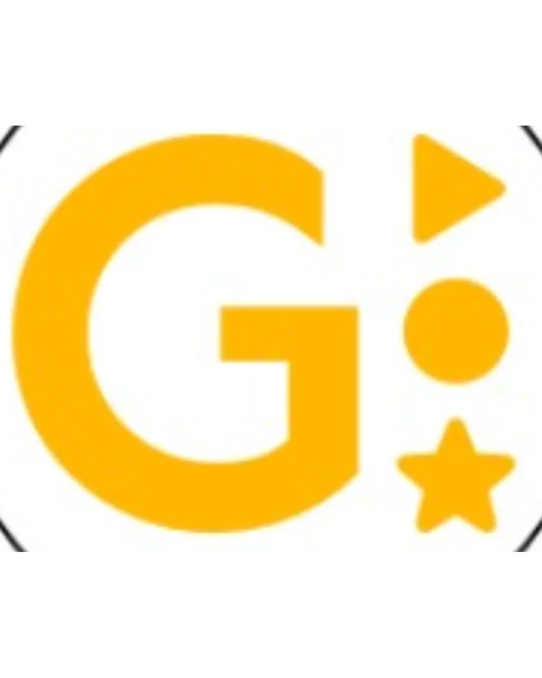
 Logo analysis by AI
Logo type:
Style:
Detected symbol:
Detected text:
Business industry:
Review requested by GoldenOutcome
**If AI can recognize or misinterpret it, so can people.
Structured logo review
Legibility
The 'G' is bold and highly readable.
Simple geometric shapes do not interfere with legibility.
Scalability versatility
Simple shapes and bold lines maintain clarity when scaled down.
Works well for digital avatars and mobile app icons.
Star detail may be lost at very small sizes such as embroidery or favicons.

200x250 px

100×125 px

50×62 px
Balance alignment
The vertical composition creates a visual rhythm.
The right side (triangle, circle, star) feels visually heavier, leading to a right imbalance.
Elements are not vertically centered to the G, creating awkward negative space.


Originality
Combination of shapes is playful and somewhat memorable.
Use of triangle, circle, and star with a single letter is somewhat generic in entertainment contexts.
The shapes are standard, not customized or distinctive.
Aesthetic look
Modern, clean execution.
Monochrome yellow keeps the palette cohesive.
Arrangement of shapes feels a bit forced and not fully cohesive.
The design could benefit from more creative integration of the elements.
Dual meaning and misinterpretations
No inappropriate or confusing double meanings detected.
Color harmony
Single color yields a strong identity.
Excellent contrast on white background.
Orange
#FFC107
White
#FFFFFF

