 View review
Logo score
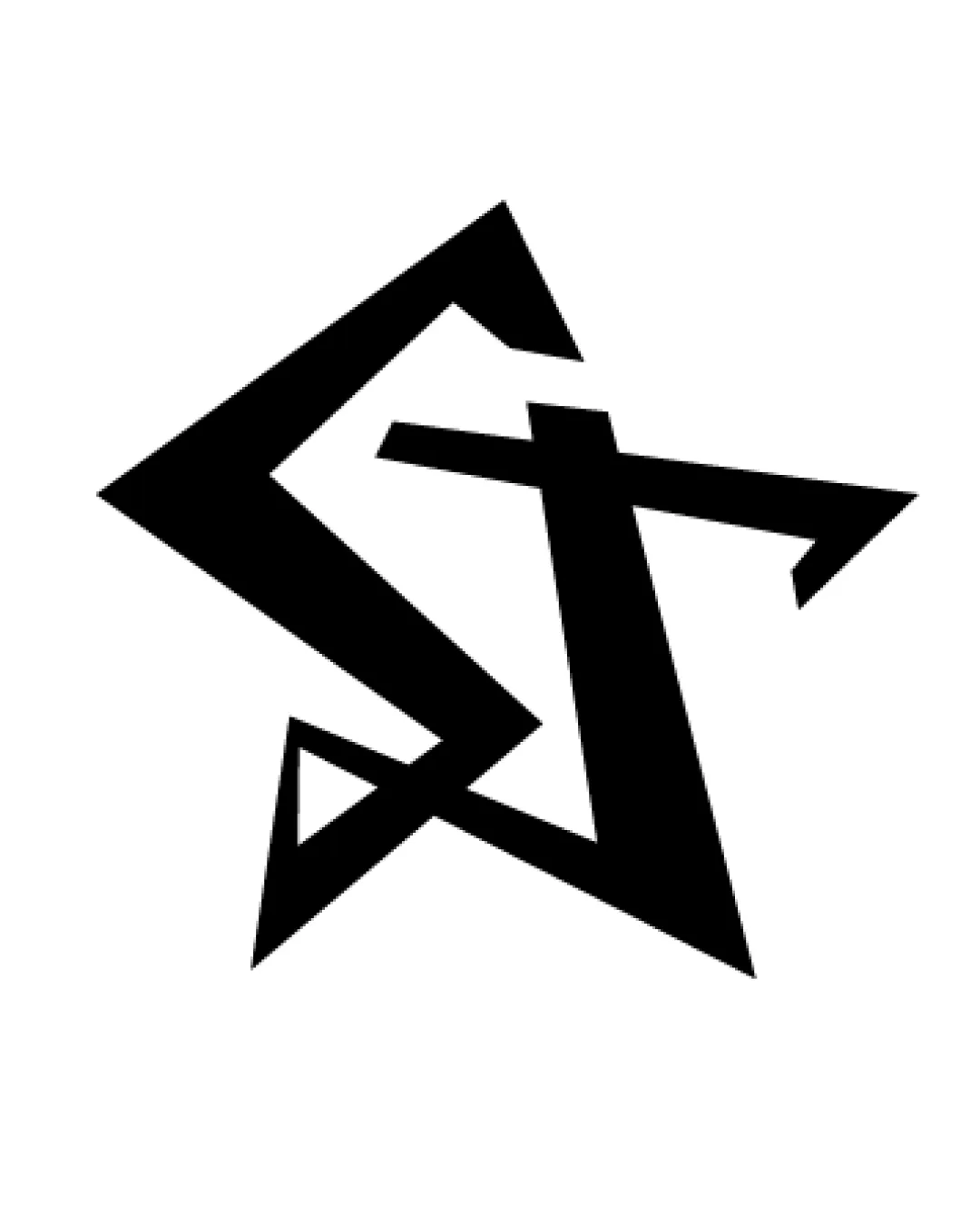
Logo review ofG, T
Review the detailed scores below to see what is working and what should be refined first.
Legibility
Originality
Misread
Balance
Scale
Detailed review
Logo performance breakdown
Legibility
![]() The 'G' and 'T' are distinguishable upon inspection.
The 'G' and 'T' are distinguishable upon inspection.![]() The angularity adds character.
The angularity adds character.
![]() The overlaps and tight angles make it difficult to quickly recognize both letters.
The overlaps and tight angles make it difficult to quickly recognize both letters.![]() At a glance, the symbol reads more as a star than clear letterforms; letter distinction is weak at first impression.
At a glance, the symbol reads more as a star than clear letterforms; letter distinction is weak at first impression.
Originality
![]() Creative integration of initials into a star forms a unique and dynamic logomark.
Creative integration of initials into a star forms a unique and dynamic logomark.![]() Uncommon angular execution avoids generic star clichés.
Uncommon angular execution avoids generic star clichés.
![]() Star shapes are overused in entertainment and sports; the differentiation relies solely on letter inclusion.
Star shapes are overused in entertainment and sports; the differentiation relies solely on letter inclusion.![]() The concept may still feel familiar due to prevalence of star motifs.
The concept may still feel familiar due to prevalence of star motifs.
Color harmony
![]() Single-color black creates maximum versatility and timelessness.
Single-color black creates maximum versatility and timelessness.![]() Logo will be easy to inverse or adapt for any brand color scheme.
Logo will be easy to inverse or adapt for any brand color scheme.
Black
#000000
White
#FFFFFF
Balance alignment
![]() Overall form is visually centered and star shape gives dynamic movement.
Overall form is visually centered and star shape gives dynamic movement.
![]() Angles are harsh and edges are uneven, causing slight visual imbalance.
Angles are harsh and edges are uneven, causing slight visual imbalance.![]() The letterforms feel cramped together, affecting harmony within the mark.
The letterforms feel cramped together, affecting harmony within the mark.

Scalability
![]() Simple, bold shapes will scale well for most print and digital uses.
Simple, bold shapes will scale well for most print and digital uses.![]() Logo is recognizable even at smaller sizes due to strong geometric silhouette.
Logo is recognizable even at smaller sizes due to strong geometric silhouette.
![]() Fine angular intersections may become muddy at extremely small sizes such as icons or embroidery.
Fine angular intersections may become muddy at extremely small sizes such as icons or embroidery.![]() Lack of clear separation between letters may affect micro-scale reproduction.
Lack of clear separation between letters may affect micro-scale reproduction.
200x250 px
100×125 px
50×62 px
Misinterpretations
![]() No inappropriate symbols or misleading imagery detected.
No inappropriate symbols or misleading imagery detected.
Try your own review
Review my logo
Wondering how your logo performs?
Get a clear logo score, key risks, and priority fix ideas before your client or audience sees it.
Keep exploring


