 View review
Logo score
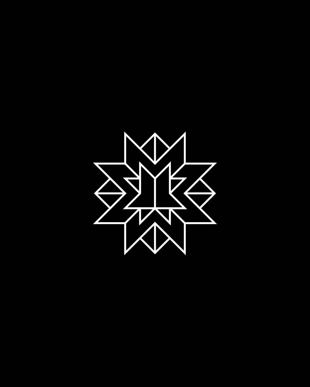
Logo review ofGeometric Starburst Or Snowflake Shape With Symmet..
Review the detailed scores below to see what is working and what should be refined first.
Originality
Misread
Balance
Scale
Detailed review
Logo performance breakdown
Originality
![]() Distinct geometric arrangement avoids basic clip-art visuals
Distinct geometric arrangement avoids basic clip-art visuals![]() Effective use of symmetry and line repetition
Effective use of symmetry and line repetition
![]() Geometric 'starburst' or 'snowflake' motifs are somewhat common in abstract branding
Geometric 'starburst' or 'snowflake' motifs are somewhat common in abstract branding![]() No clear, unique identity tie-in or negative-space revelation
No clear, unique identity tie-in or negative-space revelation
Color harmony
![]() High-contrast black and white maximizes clarity and adaptability
High-contrast black and white maximizes clarity and adaptability![]() Minimal color usage ensures universal functionality
Minimal color usage ensures universal functionality
Black
#000000
White
#FFFFFF
Balance alignment
![]() Excellent symmetry and visual balance
Excellent symmetry and visual balance![]() Centralized orientation provides strong focal point
Centralized orientation provides strong focal point

Scalability
![]() Simple line-weight adapts well to vector scaling
Simple line-weight adapts well to vector scaling![]() Monochrome color scheme works well across many applications
Monochrome color scheme works well across many applications
![]() Thin lines may get lost or break up at very small sizes, such as on a favicon or embroidery
Thin lines may get lost or break up at very small sizes, such as on a favicon or embroidery![]() Fine details get less distinct in reduced resolutions
Fine details get less distinct in reduced resolutions
200x250 px
100×125 px
50×62 px
Misinterpretations
![]() No inappropriate or accidental meanings detected
No inappropriate or accidental meanings detected![]() Well-controlled abstraction avoids suggestive forms
Well-controlled abstraction avoids suggestive forms
Try your own review
Review my logo
Wondering how your logo performs?
Get a clear logo score, key risks, and priority fix ideas before your client or audience sees it.
Keep exploring


