Wondering how your logo performs? 🧐
Get professional logo reviews in seconds and catch design issues in time.
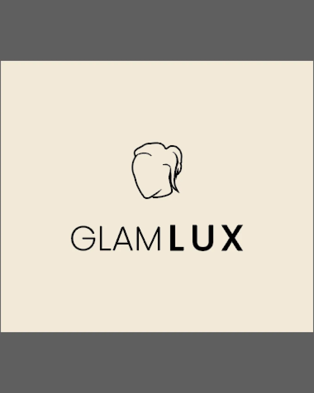
Try it Now!Logo review of GLAMLUX
 Logo analysis by AI
Logo type:
Style:
Detected symbol:
Detected text:
Business industry:
Review requested by THEDraxen
**If AI can recognize or misinterpret it, so can people.
Structured logo review
Legibility
![]() Text is highly readable and contrasts well against the light background
Text is highly readable and contrasts well against the light background![]() Font choices are clean and modern, with 'LUX' bolded for emphasis
Font choices are clean and modern, with 'LUX' bolded for emphasis
Scalability versatility
![]() Minimal detail in the symbol ensures clarity at various sizes
Minimal detail in the symbol ensures clarity at various sizes![]() Works well for packaging, signage, business cards, and social media
Works well for packaging, signage, business cards, and social media
![]() Fine linework in the icon may lose clarity at very small sizes (e.g., favicons or embroidery)
Fine linework in the icon may lose clarity at very small sizes (e.g., favicons or embroidery)
200x250 px
100×125 px
50×62 px
Balance alignment
![]() Symbol is well-centered above the wordmark creating a logical hierarchy
Symbol is well-centered above the wordmark creating a logical hierarchy![]() Weight of 'LUX' visually balances the minimalist icon
Weight of 'LUX' visually balances the minimalist icon

Originality
![]() Combination of icon and wordmark is clean and professional
Combination of icon and wordmark is clean and professional
![]() Silhouette of a woman's head is a common motif in the beauty industry and lacks distinctiveness or unique features
Silhouette of a woman's head is a common motif in the beauty industry and lacks distinctiveness or unique features![]() No clever integration between logomark and text
No clever integration between logomark and text
Logomark wordmark fit
![]() Styles feel harmonious, with both adopting a minimalist and sophisticated aesthetic
Styles feel harmonious, with both adopting a minimalist and sophisticated aesthetic![]() Size and weight relationship between text and icon is appropriate
Size and weight relationship between text and icon is appropriate
Aesthetic look
![]() Clean, uncluttered composition with an elegant and professional feel
Clean, uncluttered composition with an elegant and professional feel![]() Minimal color palette supports a high-end image
Minimal color palette supports a high-end image
![]() Faces and hair outlines are highly popular, leading to a slightly generic aesthetic
Faces and hair outlines are highly popular, leading to a slightly generic aesthetic
Dual meaning and misinterpretations
![]() No unintended or controversial double meanings are present in the mark
No unintended or controversial double meanings are present in the mark
Color harmony
![]() Monochromatic palette feels premium and is visually pleasing
Monochromatic palette feels premium and is visually pleasing![]() Excellent contrast between text/logo and background
Excellent contrast between text/logo and background
Beige
#F6EDDD
Black
#000000


