Wondering how your logo performs? 🧐
Get professional logo reviews in seconds and catch design issues in time.
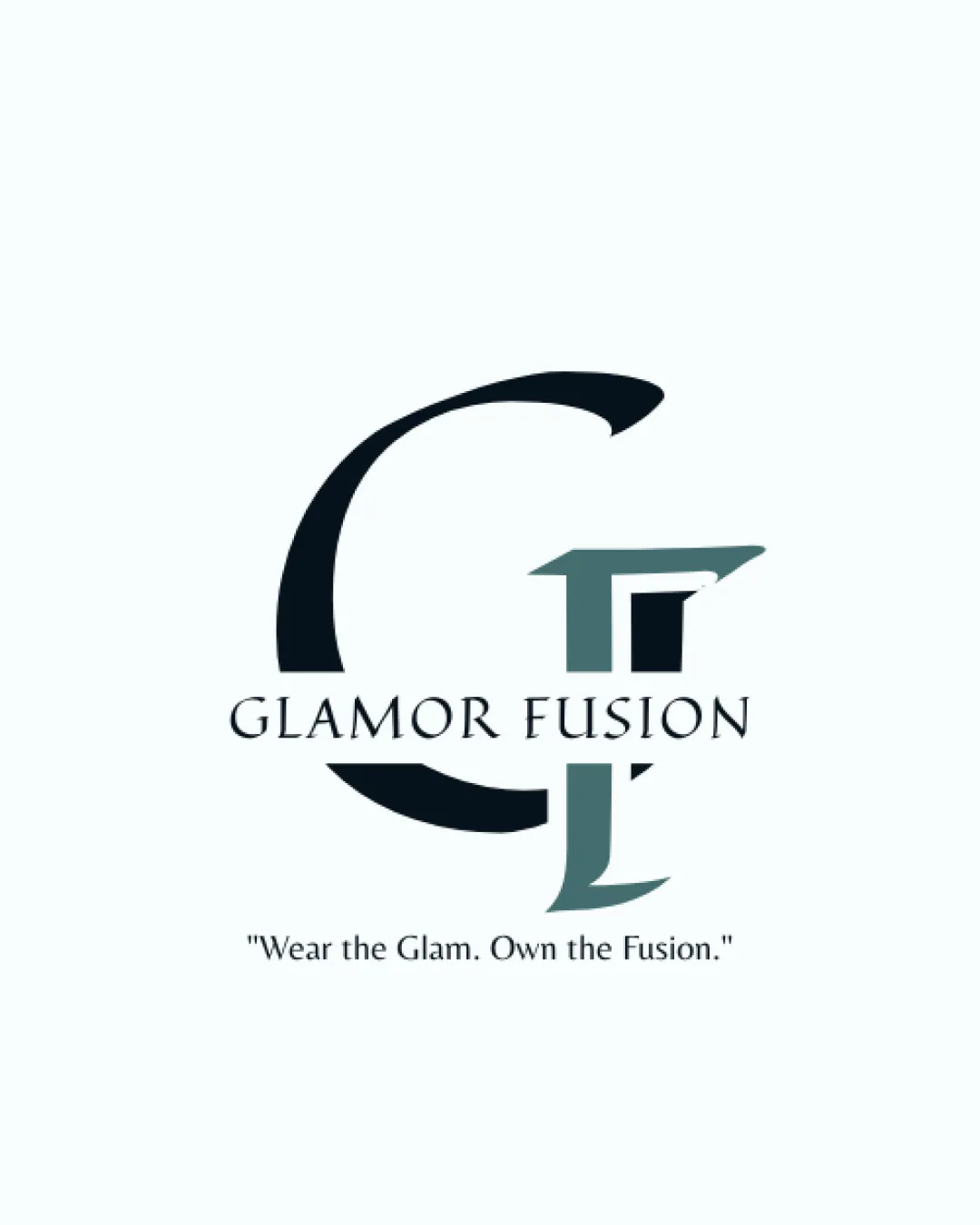
Try it Now!Logo review of Glamor Fusion
 Logo analysis by AI
Logo type:
Style:
Detected symbol:
Detected text:
Business industry:
Review requested by Aagam
**If AI can recognize or misinterpret it, so can people.
Structured logo review
Legibility
![]() Text is clear and readable.
Text is clear and readable.![]() Font choice complements the brand's stylish identity.
Font choice complements the brand's stylish identity.
![]() G and F overlap slightly, which may cause minor confusion.
G and F overlap slightly, which may cause minor confusion.
Scalability versatility
![]() Works well on business cards and apparel.
Works well on business cards and apparel.
![]() Overlapping letters may lose clarity at small sizes.
Overlapping letters may lose clarity at small sizes.![]() Complexity may hinder recognition in small applications.
Complexity may hinder recognition in small applications.
200x250 px
100×125 px
50×62 px
Balance alignment
![]() Overall design is centered.
Overall design is centered.![]() Text is well positioned below the monogram.
Text is well positioned below the monogram.
![]() Slight imbalance due to the monogram's boldness compared to the wordmark.
Slight imbalance due to the monogram's boldness compared to the wordmark.

Originality
![]() Creative integration of letters.
Creative integration of letters.
![]() Monogram style is somewhat common in the fashion industry.
Monogram style is somewhat common in the fashion industry.
Logomark wordmark fit
![]() Consistent style between wordmark and monogram.
Consistent style between wordmark and monogram.
![]() Monogram slightly overshadows the wordmark in presence.
Monogram slightly overshadows the wordmark in presence.
Aesthetic look
![]() Elegant and stylish aesthetic.
Elegant and stylish aesthetic.![]() Minimalist color palette is appealing.
Minimalist color palette is appealing.
Dual meaning and misinterpretations
![]() No misleading shapes or symbols.
No misleading shapes or symbols.
Color harmony
![]() Colors complement each other well.
Colors complement each other well.![]() Limited color use enhances sophistication.
Limited color use enhances sophistication.


