Wondering how your logo performs? 🧐
Get professional logo reviews in seconds and catch design issues in time.
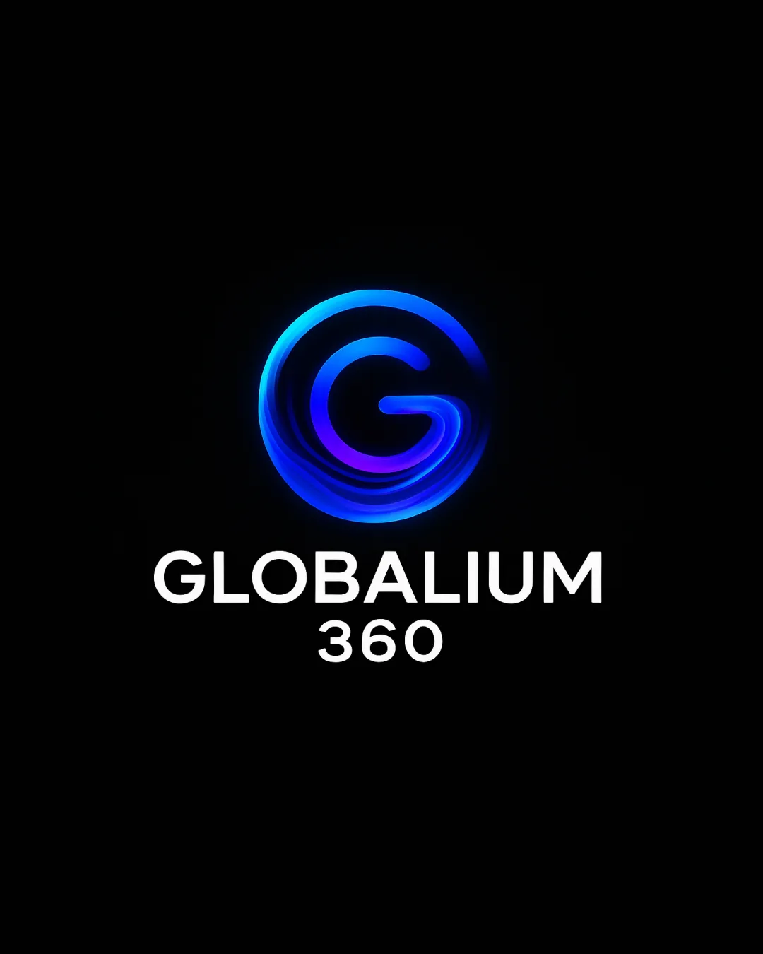
Try it Now!Logo review of GLOBALIUM 360
 Logo analysis by AI
Logo type:
Style:
Detected symbol:
Detected text:
Business industry:
Review requested by Lluiscoll
**If AI can recognize or misinterpret it, so can people.
Structured logo review
Legibility
![]() Text is highly legible even on a dark background.
Text is highly legible even on a dark background.![]() Clear sans-serif font enhances readability.
Clear sans-serif font enhances readability.![]() Contrast between text and background is excellent.
Contrast between text and background is excellent.
Scalability versatility
![]() Strong presence on digital formats.
Strong presence on digital formats.![]() Logo could work well on tech platforms, websites, and modern digital displays.
Logo could work well on tech platforms, websites, and modern digital displays.
![]() Neon effects and gradients may lose detail at small sizes (favicons, embroidery, business cards).
Neon effects and gradients may lose detail at small sizes (favicons, embroidery, business cards).![]() Swirling details in the G can become unclear when scaled down.
Swirling details in the G can become unclear when scaled down.
200x250 px
100×125 px
50×62 px
Balance alignment
![]() The logo is visually centered, and the weight distribution between the mark and the wordmark is balanced.
The logo is visually centered, and the weight distribution between the mark and the wordmark is balanced.![]() Vertically stacked text aligns well under the logomark.
Vertically stacked text aligns well under the logomark.
![]() Slight visual tension exists between the organic swirling symbol and the stark geometric text.
Slight visual tension exists between the organic swirling symbol and the stark geometric text.

Originality
![]() Custom swirling neon G gives some unique character.
Custom swirling neon G gives some unique character.![]() Gradient rendering delivers a futuristic feel.
Gradient rendering delivers a futuristic feel.
![]() Circular G monograms are common in tech, so the approach is not highly original.
Circular G monograms are common in tech, so the approach is not highly original.![]() Swirl effect is a nice touch but doesn't push creative boundaries much beyond industry conventions.
Swirl effect is a nice touch but doesn't push creative boundaries much beyond industry conventions.
Logomark wordmark fit
![]() The wordmark and logomark share modern qualities, and the stacking hierarchy is logical.
The wordmark and logomark share modern qualities, and the stacking hierarchy is logical.![]() Visual styles are well matched between glowing symbol and clean text.
Visual styles are well matched between glowing symbol and clean text.
Aesthetic look
![]() Modern, visually appealing, with an engaging light/gradient effect.
Modern, visually appealing, with an engaging light/gradient effect.![]() Appeals to tech and global/360 reference.
Appeals to tech and global/360 reference.
![]() Neon/gradient look feels slightly trendy and may not age well.
Neon/gradient look feels slightly trendy and may not age well.![]() Slightly busy compared to minimalist approaches.
Slightly busy compared to minimalist approaches.
Dual meaning and misinterpretations
![]() Clear G symbol and no accidental inappropriate shapes detected.
Clear G symbol and no accidental inappropriate shapes detected.
Color harmony
![]() Limited color palette of blue, purple, and white keeps it visually cohesive.
Limited color palette of blue, purple, and white keeps it visually cohesive.![]() Good contrast with the black background enhances vibrancy.
Good contrast with the black background enhances vibrancy.
![]() Heavily reliant on gradients; solid version may lose impact, reducing harmony and versatility.
Heavily reliant on gradients; solid version may lose impact, reducing harmony and versatility.
Black
#0A0A0A
Blue
#00AEEF
Purple
#6D36FF
White
#FFFFFF


