Wondering how your logo performs? 🧐
Get professional logo reviews in seconds and catch design issues in time.
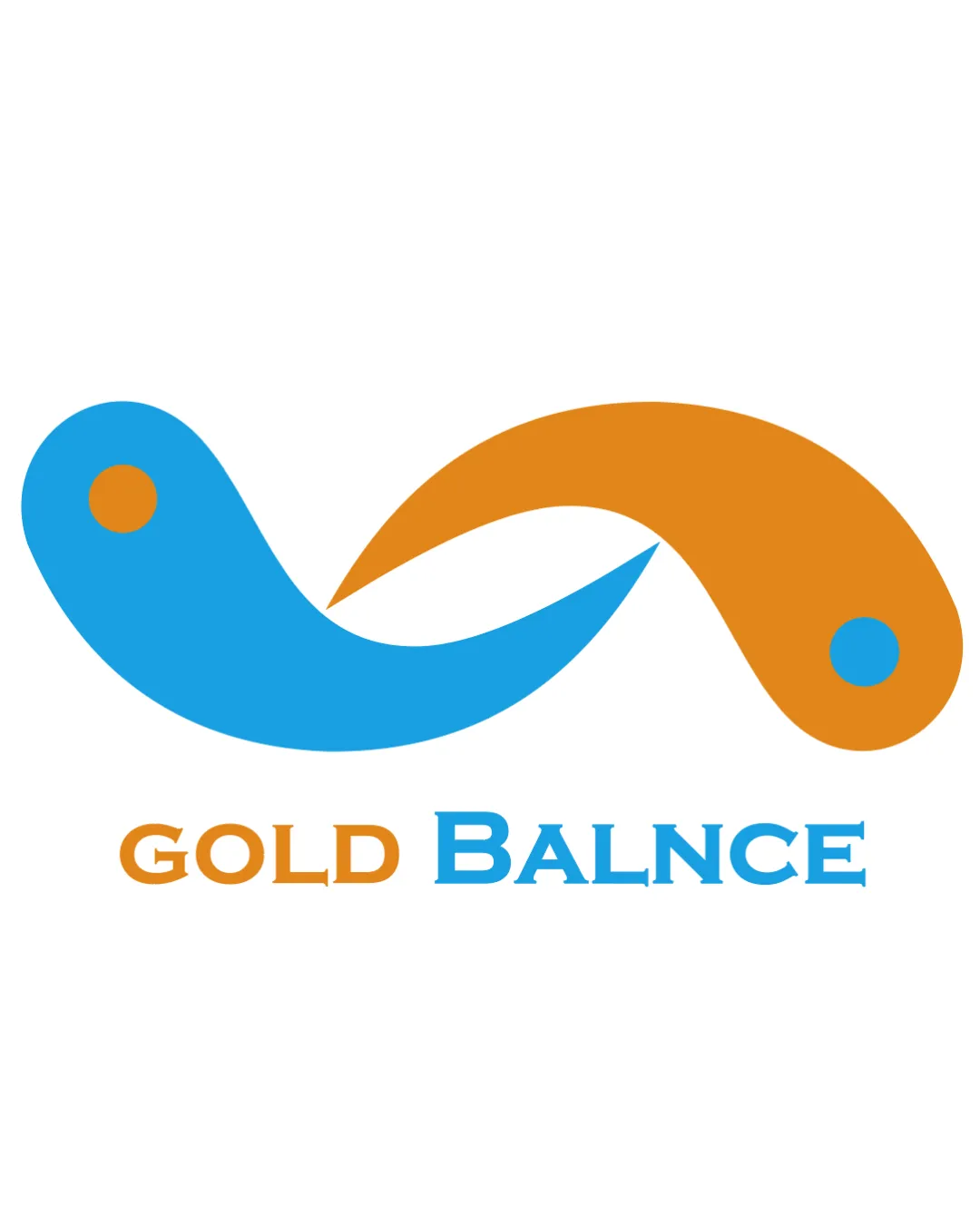
Try it Now!Logo review of GOLD BALNCE
 Logo analysis by AI
Recognized style:
Logo type:
Detected symbol:
Detected text:
Business industry:
Review requested by Betafuen
**If AI can recognize or misinterpret it, so can people.
Structured logo review
Legibility
![]() Text is large, enhancing visibility.
Text is large, enhancing visibility.
![]() The spelling 'BALNCE' appears incorrect, which may confuse viewers.
The spelling 'BALNCE' appears incorrect, which may confuse viewers.
Scalability versatility
![]() Bold and simple shapes ensure good scalability.
Bold and simple shapes ensure good scalability.
200x250 px
100×125 px
50×62 px
Balance alignment
![]() The symbol and text are well-aligned.
The symbol and text are well-aligned.

Originality
![]() Abstract design is somewhat unique.
Abstract design is somewhat unique.
![]() The elements resemble common shapes like yin-yang, reducing originality.
The elements resemble common shapes like yin-yang, reducing originality.
Logomark wordmark fit
![]() The symbol and text have a good visual fit.
The symbol and text have a good visual fit.
Aesthetic look
![]() The logo has a clean and modern aesthetic.
The logo has a clean and modern aesthetic.
![]() The combination of colors could be more harmonious.
The combination of colors could be more harmonious.
Cultural sensitivity dual meaning
![]() No apparent cultural sensitivity issues.
No apparent cultural sensitivity issues.
Color harmony
![]() The colors are vibrant.
The colors are vibrant.
![]() The orange and blue contrast can be jarring.
The orange and blue contrast can be jarring.


