Wondering how your logo performs? 🧐
Get professional logo reviews in seconds and catch design issues in time.
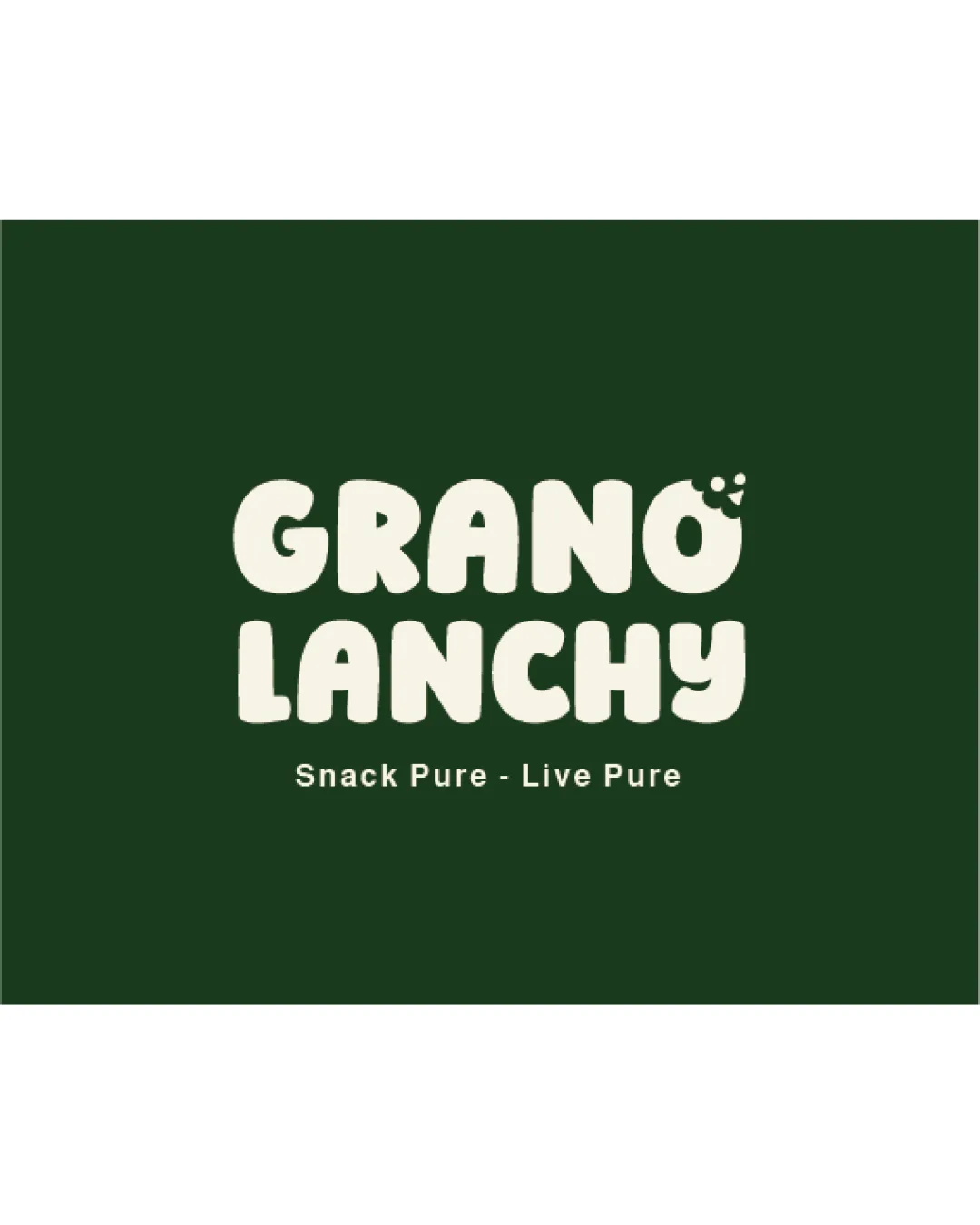
Try it Now!Logo review of GRANO LANCHY, Snack Pure - Live Pure
 Logo analysis by AI
Logo type:
Style:
Detected symbol:
Detected text:
Business industry:
Review requested by Designba23
**If AI can recognize or misinterpret it, so can people.
Structured logo review
Legibility
![]() Large, bold, and rounded letters ensure the primary name is clear from a distance.
Large, bold, and rounded letters ensure the primary name is clear from a distance.![]() Subtext tagline is aligned neatly for supplementary messaging.
Subtext tagline is aligned neatly for supplementary messaging.
![]() The playful typeface slightly reduces clarity when scaled down, especially for the tagline.
The playful typeface slightly reduces clarity when scaled down, especially for the tagline.![]() Dots incorporated above the 'O' may be misread as diacritics rather than brand cues.
Dots incorporated above the 'O' may be misread as diacritics rather than brand cues.
Scalability versatility
![]() Bold, simple shapes allow for strong scaling across moderate sizes (packaging, signage).
Bold, simple shapes allow for strong scaling across moderate sizes (packaging, signage).![]() Distinctive letterforms retain identity at smaller scales for product packaging.
Distinctive letterforms retain identity at smaller scales for product packaging.
![]() Small subtitle text ('Snack Pure - Live Pure') risks becoming illegible at sizes below business card or web favicon.
Small subtitle text ('Snack Pure - Live Pure') risks becoming illegible at sizes below business card or web favicon.![]() Integrated grain/seed symbol above 'O' may blur at micro scales or embroidery.
Integrated grain/seed symbol above 'O' may blur at micro scales or embroidery.
200x250 px
100×125 px
50×62 px
Balance alignment
![]() Wordmark's stacked alignment creates a sense of stability and friendliness.
Wordmark's stacked alignment creates a sense of stability and friendliness.![]() Overall visual weight feels consistent horizontally and vertically.
Overall visual weight feels consistent horizontally and vertically.
![]() The three-dot accent creates a minor imbalance, drawing disproportionate attention to the top right of the logo.
The three-dot accent creates a minor imbalance, drawing disproportionate attention to the top right of the logo.

Originality
![]() Incorporating seed/grain motif as part of the lettering adds a brand-centric quirk.
Incorporating seed/grain motif as part of the lettering adds a brand-centric quirk.![]() Rounded, bubbly letterforms are playful and approachable for a snack brand.
Rounded, bubbly letterforms are playful and approachable for a snack brand.
![]() Wordmark and accent are fairly safe and similar to many organic/natural food brands.
Wordmark and accent are fairly safe and similar to many organic/natural food brands.![]() Symbolic integration (dots as seeds) lacks deeper novelty and may not be memorable long-term.
Symbolic integration (dots as seeds) lacks deeper novelty and may not be memorable long-term.
Aesthetic look
![]() color palette projects natural, organic values and fits healthy snacking.
color palette projects natural, organic values and fits healthy snacking.![]() Playful typography catches the eye and offers youthful appeal.
Playful typography catches the eye and offers youthful appeal.
![]() Lack of visual hierarchy between the two lines beyond stacking—the impact could be heightened with subtle differentiation.
Lack of visual hierarchy between the two lines beyond stacking—the impact could be heightened with subtle differentiation.![]() Accent dots risk being misinterpreted due to lack of context.
Accent dots risk being misinterpreted due to lack of context.
Dual meaning and misinterpretations
![]() No inappropriate or ambiguous symbols detected.
No inappropriate or ambiguous symbols detected.![]() Concept is straightforward and relevant.
Concept is straightforward and relevant.
Color harmony
![]() Simple two-tone palette suggests natural, pure qualities.
Simple two-tone palette suggests natural, pure qualities.![]() Strong contrast enables readability and versatile reproduction.
Strong contrast enables readability and versatile reproduction.
Deep Green
#223D24
Off White
#F3F0E8


