 View review
Logo score
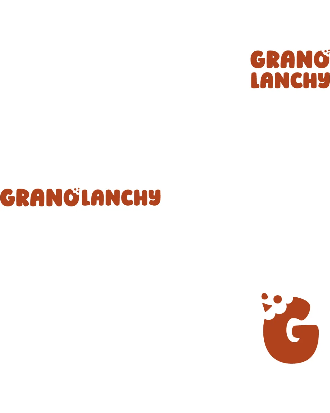
Logo review ofGranolanchy
Review the detailed scores below to see what is working and what should be refined first.
Legibility
Originality
Misread
Balance
Scale
Detailed review
Logo performance breakdown
Legibility
![]() Bold, rounded letters make the brand name easy to read.
Bold, rounded letters make the brand name easy to read.![]() Brand name stands out clearly against white background.
Brand name stands out clearly against white background.
![]() The umlaut/seed mark above the 'O' could be misinterpreted or look cluttered at small scales.
The umlaut/seed mark above the 'O' could be misinterpreted or look cluttered at small scales.
Originality
![]() Combining a 'G' with chicken features creates a memorable and industry-relevant symbol.
Combining a 'G' with chicken features creates a memorable and industry-relevant symbol.![]() Custom playful type enhances uniqueness.
Custom playful type enhances uniqueness.
![]() Animal mascots within letterforms are increasingly common; still, this is handled more creatively than average.
Animal mascots within letterforms are increasingly common; still, this is handled more creatively than average.
Color harmony
![]() Restrained two-color palette ensures good contrast and harmony.
Restrained two-color palette ensures good contrast and harmony.![]() Color fits earthy, natural food branding.
Color fits earthy, natural food branding.
Rust
#A34B1C
White
#FFFFFF
Balance alignment
![]() Balanced type arrangement in both stacked and horizontal formats.
Balanced type arrangement in both stacked and horizontal formats.![]() Logomark and logotype are properly sized and aligned relative to each other.
Logomark and logotype are properly sized and aligned relative to each other.

Scalability
![]() Simple, bold forms maintain clarity on various packaging sizes.
Simple, bold forms maintain clarity on various packaging sizes.![]() Logomark (chicken/G) is distinct and recognizable in isolation.
Logomark (chicken/G) is distinct and recognizable in isolation.
![]() Details in the chicken face may blur at very small sizes (e.g., favicon, embroidery on small surfaces).
Details in the chicken face may blur at very small sizes (e.g., favicon, embroidery on small surfaces).
200x250 px
100×125 px
50×62 px
Misinterpretations
![]() No inappropriate or misinterpretable forms detected.
No inappropriate or misinterpretable forms detected.
Symbol & text fit
![]() Playful style is consistent across symbol and typeface.
Playful style is consistent across symbol and typeface.
![]() Color and roundness unify both elements.
Color and roundness unify both elements.
Try your own review
Review my logo
Wondering how your logo performs?
Get a clear logo score, key risks, and priority fix ideas before your client or audience sees it.
Keep exploring


