Wondering how your logo performs? 🧐
Get professional logo reviews in seconds and catch design issues in time.
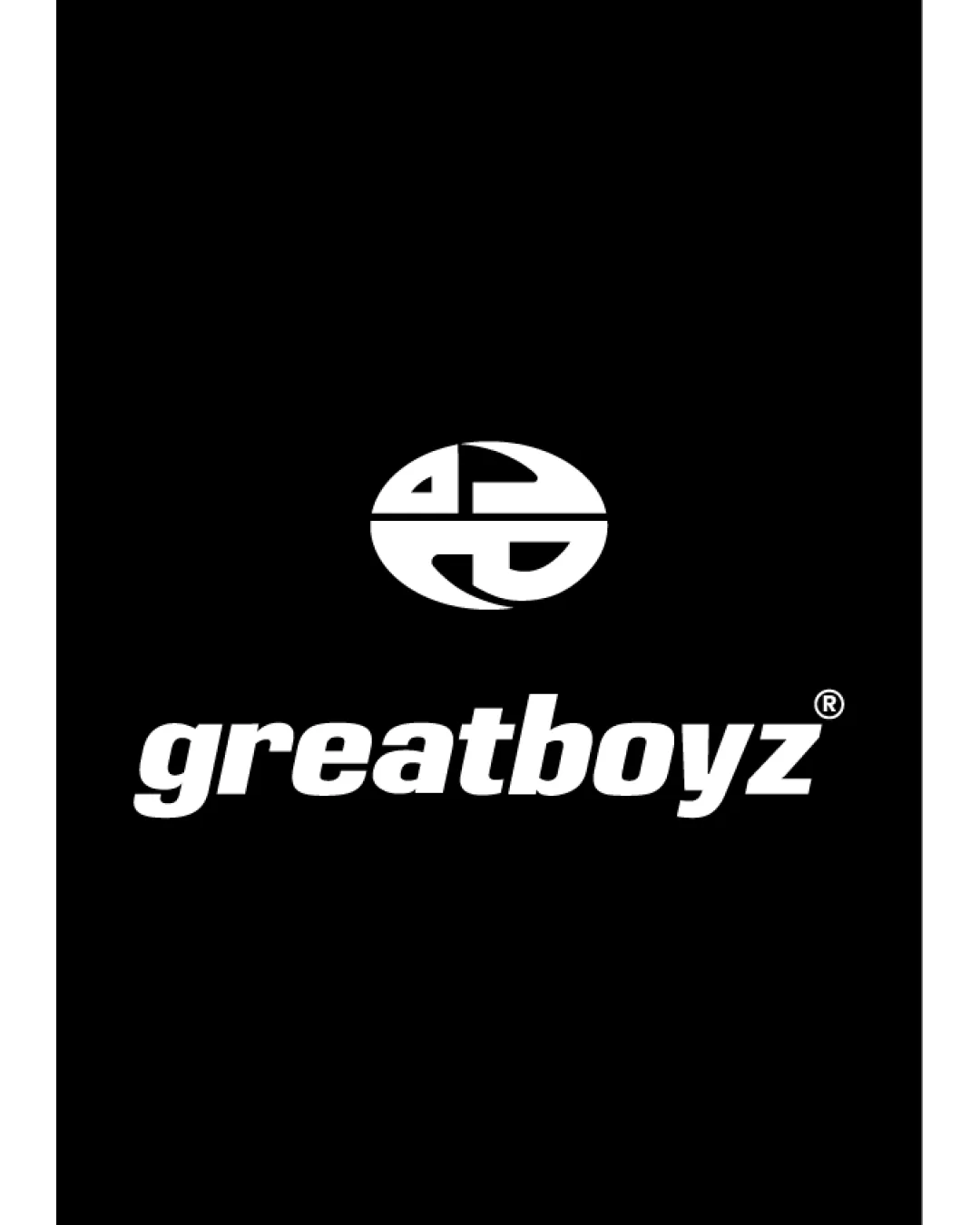
Try it Now!Logo review of greatboyz
 Logo analysis by AI
Logo type:
Style:
Detected symbol:
Negative space:
Detected text:
Business industry:
Review requested by Vinnify.id
**If AI can recognize or misinterpret it, so can people.
Structured logo review
Legibility
![]() Wordmark is clear and easy to read.
Wordmark is clear and easy to read.![]() High contrast between text and background.
High contrast between text and background.
![]() The italicized, bold typeface can sometimes reduce sharpness in smaller sizes.
The italicized, bold typeface can sometimes reduce sharpness in smaller sizes.![]() Lowercase 'g' and 'z' may not stand out as unique among other brands.
Lowercase 'g' and 'z' may not stand out as unique among other brands.
Scalability versatility
![]() Single-color design ensures it works in black-and-white and monochrome applications.
Single-color design ensures it works in black-and-white and monochrome applications.![]() Simple geometric mark scales well on large formats like signage.
Simple geometric mark scales well on large formats like signage.
![]() Monogram may lose recognition at very small sizes due to intricate negative space.
Monogram may lose recognition at very small sizes due to intricate negative space.![]() Wordmark may not be legible as a favicon or on small apparel embroidery.
Wordmark may not be legible as a favicon or on small apparel embroidery.
200x250 px
100×125 px
50×62 px
Balance alignment
![]() Centrally aligned logomark and wordmark create a cohesive visual flow.
Centrally aligned logomark and wordmark create a cohesive visual flow.![]() Even spacing and consistent thickness contribute to visual harmony.
Even spacing and consistent thickness contribute to visual harmony.

Originality
![]() Custom monogram integrating the brand initials exhibits some creativity.
Custom monogram integrating the brand initials exhibits some creativity.![]() Integrated negative space usage shows design thought.
Integrated negative space usage shows design thought.
![]() Circular initial-based monograms are popular in fashion/lifestyle, lessening distinctiveness.
Circular initial-based monograms are popular in fashion/lifestyle, lessening distinctiveness.![]() Logo mark does not introduce a unique conceptual twist beyond letter fusion.
Logo mark does not introduce a unique conceptual twist beyond letter fusion.
Logomark wordmark fit
![]() Bold, rounded shapes in logomark and typeface are stylistically consistent.
Bold, rounded shapes in logomark and typeface are stylistically consistent.![]() Proportion between logomark and wordmark is visually pleasing.
Proportion between logomark and wordmark is visually pleasing.
Aesthetic look
![]() Visually clean, bold, and modern look.
Visually clean, bold, and modern look.![]() Minimal use of elements creates a professional aesthetic.
Minimal use of elements creates a professional aesthetic.
![]() Somewhat generic in overall impression due to formulaic geometric monogram.
Somewhat generic in overall impression due to formulaic geometric monogram.
Dual meaning and misinterpretations
![]() No unintentional or inappropriate imagery observed.
No unintentional or inappropriate imagery observed.
Color harmony
![]() Minimalist black and white palette offers strong visual impact.
Minimalist black and white palette offers strong visual impact.![]() Color scheme is timeless and versatile for fashion/lifestyle industry.
Color scheme is timeless and versatile for fashion/lifestyle industry.
White
#FFFFFF
Black
#000000


