 View review
Logo score
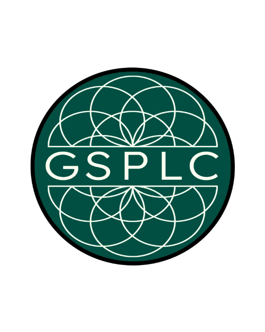
Logo review ofGsplc
Review the detailed scores below to see what is working and what should be refined first.
Legibility
Originality
Misread
Balance
Scale
Detailed review
Logo performance breakdown
Legibility
![]() Text 'GSPLC' is highly legible against the background due to strong contrast and simple sans-serif typeface.
Text 'GSPLC' is highly legible against the background due to strong contrast and simple sans-serif typeface.![]() Letter spacing is even, making each letter clear and distinct.
Letter spacing is even, making each letter clear and distinct.
Originality
![]() Use of geometric, mandala-inspired patterns is less common in financial logos, providing some distinctiveness.
Use of geometric, mandala-inspired patterns is less common in financial logos, providing some distinctiveness.![]() Integration of emblem and wordmark is clean.
Integration of emblem and wordmark is clean.
![]() Overlapping circle/mandala motifs are widely used across many industries, making the overall impression feel somewhat generic.
Overlapping circle/mandala motifs are widely used across many industries, making the overall impression feel somewhat generic.![]() No unexpected twists or hidden meanings in the iconography.
No unexpected twists or hidden meanings in the iconography.
Color harmony
![]() Minimal color palette with excellent contrast.
Minimal color palette with excellent contrast.![]() Colors are professional and sophisticated.
Colors are professional and sophisticated.
Evergreen
#154B43
White
#FFFFFF
Black
#000000
Balance alignment
![]() Text is horizontally centered and divides the emblem into two visually balanced sections.
Text is horizontally centered and divides the emblem into two visually balanced sections.![]() Circular geometric pattern is symmetrical, maintaining visual equilibrium.
Circular geometric pattern is symmetrical, maintaining visual equilibrium.
![]() Upper and lower geometric portions feel moderately heavy compared to the text band, creating subtle vertical imbalance.
Upper and lower geometric portions feel moderately heavy compared to the text band, creating subtle vertical imbalance.

Scalability
![]() Central text and simplified emblem layout retain visibility in moderately reduced sizes.
Central text and simplified emblem layout retain visibility in moderately reduced sizes.![]() The strong border helps define shape against various backgrounds and on signage.
The strong border helps define shape against various backgrounds and on signage.
![]() Intricate overlapped circle pattern could lose clarity and become muddled or appear as visual noise at small sizes, such as on a business card or app icon.
Intricate overlapped circle pattern could lose clarity and become muddled or appear as visual noise at small sizes, such as on a business card or app icon.![]() Very fine lines may not reproduce well on embroidery or low-quality prints.
Very fine lines may not reproduce well on embroidery or low-quality prints.
200x250 px
100×125 px
50×62 px
Misinterpretations
![]() No inappropriate, ambiguous, or misleading shapes detected in the iconography.
No inappropriate, ambiguous, or misleading shapes detected in the iconography.
Symbol & text fit
![]() Text integrates cleanly with geometric mark, both sitting comfortably inside the emblem.
Text integrates cleanly with geometric mark, both sitting comfortably inside the emblem.
![]() Style and color are harmonious between elements.
Style and color are harmonious between elements.
![]() Slight disconnect in visual density—pattern feels much more detailed than the minimalist type.
Slight disconnect in visual density—pattern feels much more detailed than the minimalist type.
Try your own review
Review my logo
Wondering how your logo performs?
Get a clear logo score, key risks, and priority fix ideas before your client or audience sees it.
Keep exploring


