Wondering how your logo performs? 🧐
Get professional logo reviews in seconds and catch design issues in time.
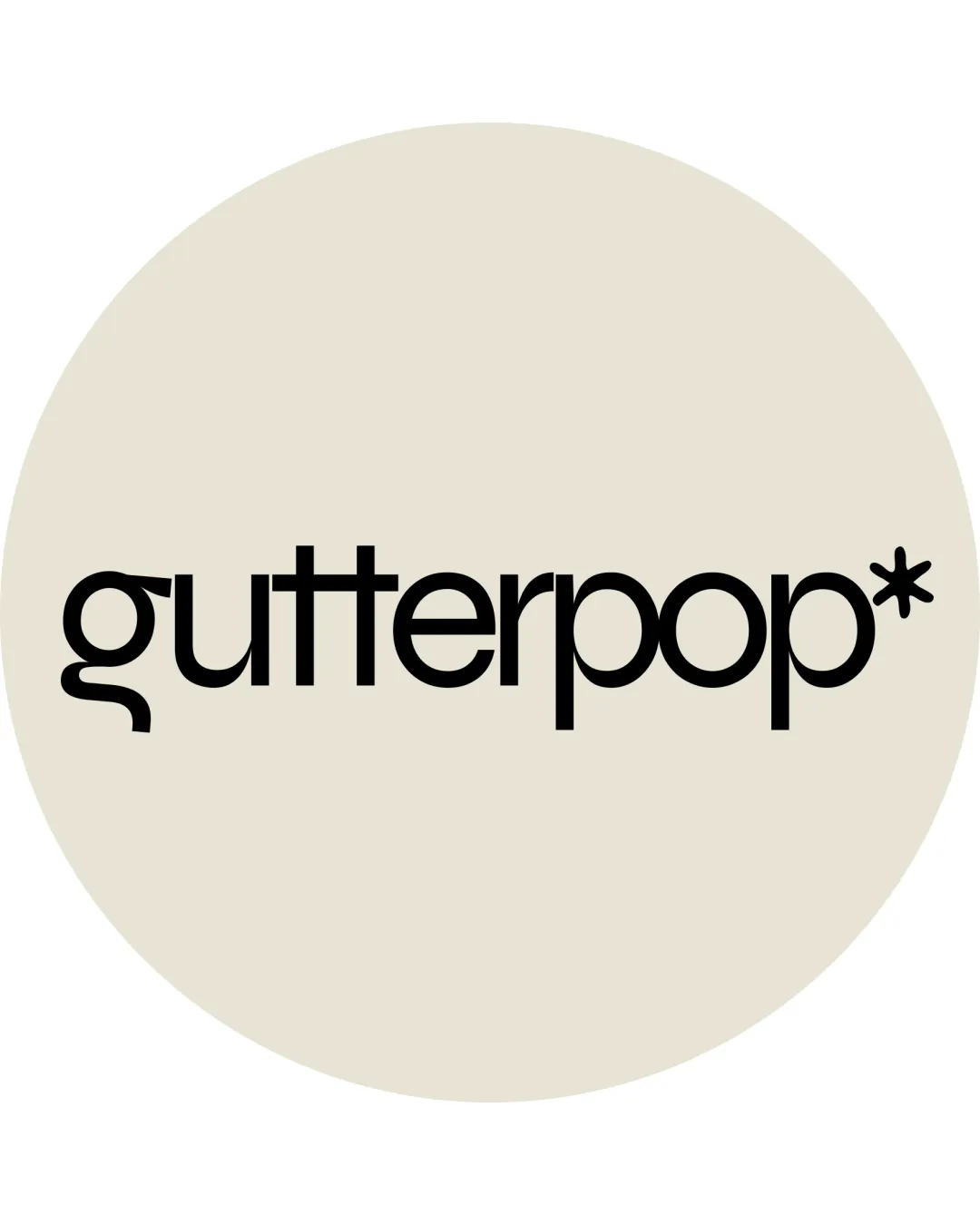
Try it Now!Logo review of gutterpop*
 Logo analysis by AI
Logo type:
Style:
Detected symbol:
Detected text:
Business industry:
Review requested by PizzaWithSalami
**If AI can recognize or misinterpret it, so can people.
Structured logo review
Legibility
Text is mostly clear and easy to read.
Consistent font weight creates visual uniformity.
The stylized lowercase ‘g’ and tight kerning in ‘pop’ may reduce clarity, especially at smaller sizes.
The lowercase geometric style could challenge quick recognition for some viewers.
Scalability versatility
Simple color scheme ensures adaptability on various backgrounds.
Likely performs well on signage, packaging, and web applications.
Asterisk symbol and unique letterforms may lose detail at very small sizes (e.g., favicons, business cards).
Monoline weight may suffer in embroidery or low-resolution print.

200x250 px

100×125 px

50×62 px
Balance alignment
Good horizontal alignment and visual stability across the wordmark.
Spacing is mostly consistent throughout the design.
Asterisk at the end feels slightly detached, impairing overall balance.
The extended stem of the ‘g’ interrupts a smooth baseline flow.


Originality
Modern type customization, particularly the extended 'g' and asterisk symbol, adds unique flair.
Combination of stylized elements creates distinction.
Asterisk is a somewhat common accent; its use here does not reinvent the genre.
Wordmark-only concepts are common and require standout touches for true distinctiveness.
Aesthetic look
Clean, contemporary aesthetic with strong visual appeal.
Minimal and uncluttered presentation fits modern brand sensibilities.
Some might find the design slightly sterile due to lack of secondary visual elements.
The single color approach can come off as too simple for brands seeking a more dynamic look.
Dual meaning and misinterpretations
No apparent inappropriate or misleading visual implications.
Color harmony
Excellent restraint with harmonious black on a neutral background.
Almond
#EBE4D6
Black
#000000

