Wondering how your logo performs? 🧐
Get professional logo reviews in seconds and catch design issues in time.
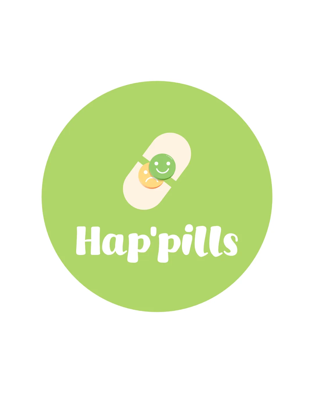
Try it Now!Logo review of Hap'pills
 Logo analysis by AI
Recognized style:
Logo type:
Detected symbol:
Detected text:
Business industry:
Review requested by Nana
**If AI can recognize or misinterpret it, so can people.
Structured logo review
Legibility
![]() I assume the business name is Hap'pills, clearly readable.
I assume the business name is Hap'pills, clearly readable.
Scalability versatility
![]() Simple design and single color structure enhance scalability.
Simple design and single color structure enhance scalability.
![]() The smiley detail may lose clarity at very small sizes.
The smiley detail may lose clarity at very small sizes.
200x250 px
100×125 px
50×62 px
Balance alignment
![]() The pill is well-centered over the text, creating balanced alignment.
The pill is well-centered over the text, creating balanced alignment.

Originality
![]() The use of smiley faces within a pill is a creative touch.
The use of smiley faces within a pill is a creative touch.
![]() The pill symbol is common in pharmaceutical logos.
The pill symbol is common in pharmaceutical logos.
Aesthetic look
![]() The playful look is appealing and aesthetically pleasing.
The playful look is appealing and aesthetically pleasing.
Cultural sensitivity dual meaning
![]() No cultural sensitivity issues detected.
No cultural sensitivity issues detected.
Color harmony
![]() The green background is calming and complements the theme.
The green background is calming and complements the theme.


