Wondering how your logo performs? 🧐
Get professional logo reviews in seconds and catch design issues in time.
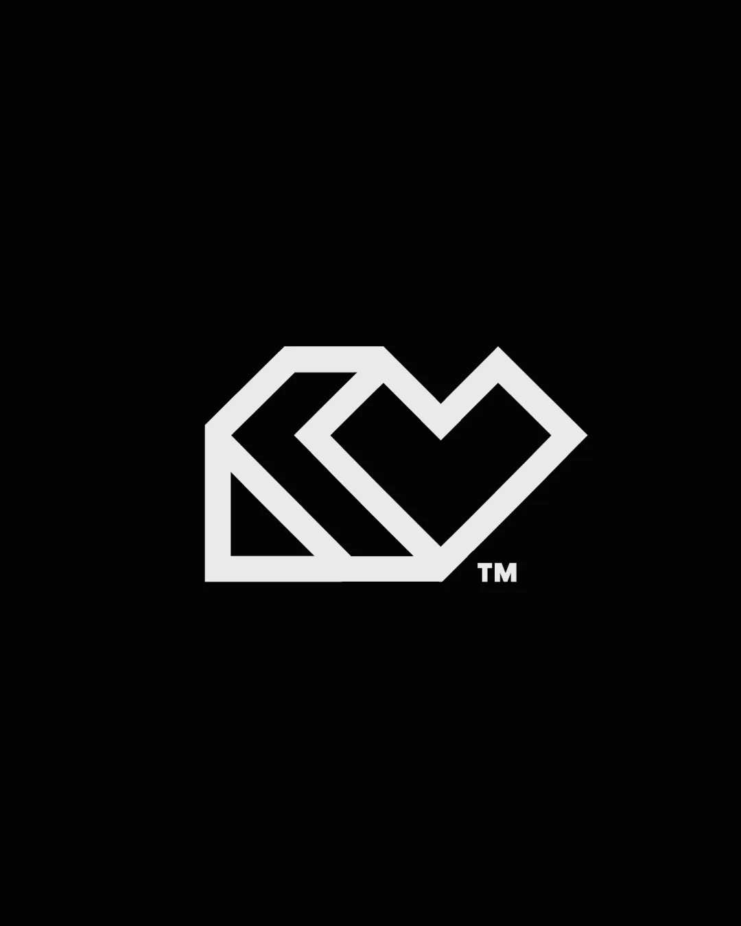
Try it Now!Logo review of Heart and geometric lines
 Logo analysis by AI
Recognized style:
Logo type:
Detected symbol:
Business industry:
Review requested by Madebyknight
**If AI can recognize or misinterpret it, so can people.
Structured logo review
Scalability versatility
![]() The simple design ensures great scalability and versatility across different media.
The simple design ensures great scalability and versatility across different media.
200x250 px
100×125 px
50×62 px
Balance alignment
![]() The logo's elements are well-balanced and aligned, giving a harmonious look.
The logo's elements are well-balanced and aligned, giving a harmonious look.

Originality
![]() The combination of a heart shape with geometric lines is unique.
The combination of a heart shape with geometric lines is unique.
![]() The heart shape is a common symbol, slightly reducing originality.
The heart shape is a common symbol, slightly reducing originality.
Aesthetic look
![]() The logo looks aesthetic, with a sleek and professional appearance.
The logo looks aesthetic, with a sleek and professional appearance.
Cultural sensitivity dual meaning
![]() No cultural sensitivity issues detected.
No cultural sensitivity issues detected.
Color harmony
![]() The monochromatic color scheme maintains a professional and modern look.
The monochromatic color scheme maintains a professional and modern look.


