Wondering how your logo performs? 🧐
Get professional logo reviews in seconds and catch design issues in time.
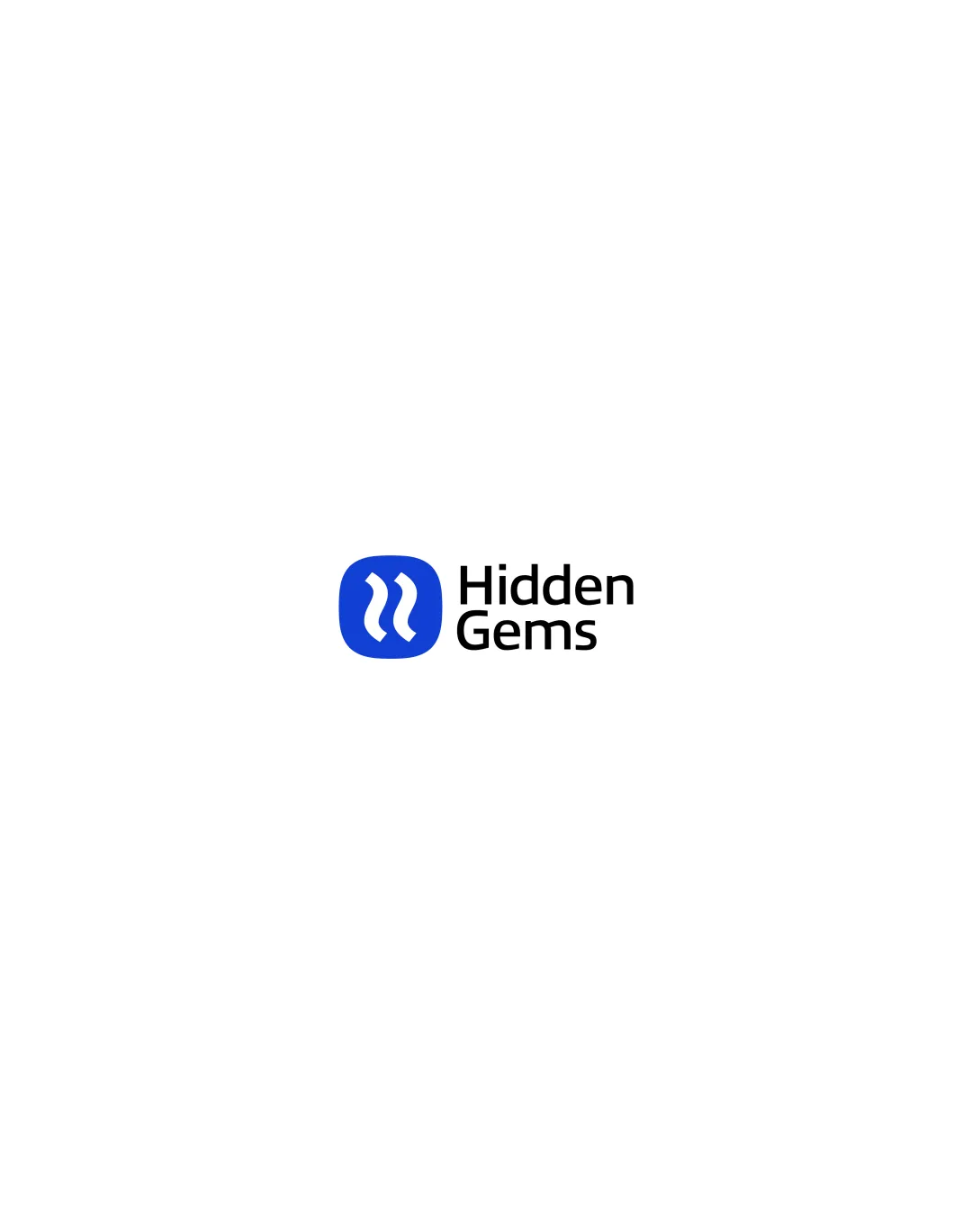
Try it Now!Logo review of Hidden Gems
 Logo analysis by AI
Recognized style:
Logo type:
Detected symbol:
Detected text:
Business industry:
Review requested by Ahmed8hasnh
**If AI can recognize or misinterpret it, so can people.
Structured logo review
Legibility
![]() The text 'Hidden Gems' is clear and easy to read.
The text 'Hidden Gems' is clear and easy to read.
Scalability versatility
![]() The logo's simplicity enhances versatility across various applications.
The logo's simplicity enhances versatility across various applications.
![]() The fine lines in the symbol could pose issues at small sizes.
The fine lines in the symbol could pose issues at small sizes.
200x250 px
100×125 px
50×62 px
Balance alignment
![]() The symbol and wordmark are well-aligned, maintaining balance.
The symbol and wordmark are well-aligned, maintaining balance.

Originality
![]() The wave-like symbol provides a unique twist.
The wave-like symbol provides a unique twist.
![]() The abstract nature might not strongly convey the brand identity.
The abstract nature might not strongly convey the brand identity.
Logomark wordmark fit
![]() The symbol and text complement each other nicely.
The symbol and text complement each other nicely.
Aesthetic look
![]() The logo has a clean and professional appearance.
The logo has a clean and professional appearance.
Cultural sensitivity dual meaning
![]() No cultural sensitivity issues detected.
No cultural sensitivity issues detected.
Color harmony
![]() The use of blue is effective and harmonious with the design.
The use of blue is effective and harmonious with the design.


