Wondering how your logo performs? 🧐
Get professional logo reviews in seconds and catch design issues in time.
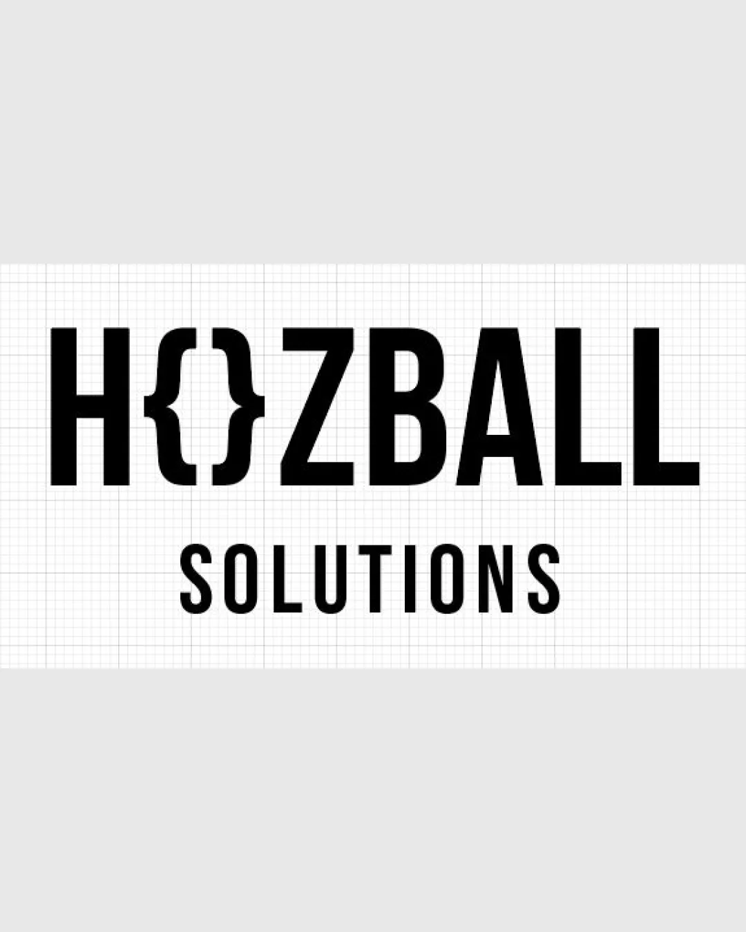
Try it Now!Logo review of HOZBALL SOLUTIONS
 Logo analysis by AI
Logo type:
Style:
Detected symbol:
Detected text:
Business industry:
Review requested by Orfe
**If AI can recognize or misinterpret it, so can people.
Structured logo review
Legibility
![]() All letters except for the O are clearly readable.
All letters except for the O are clearly readable.![]() Strong, bold sans-serif provides good clarity.
Strong, bold sans-serif provides good clarity.
![]() Curly bracket symbol substituting the O could be misread by those unfamiliar with programming iconography.
Curly bracket symbol substituting the O could be misread by those unfamiliar with programming iconography.![]() Possible minor confusion at first glance as the O is replaced by a symbol.
Possible minor confusion at first glance as the O is replaced by a symbol.
Scalability versatility
![]() Simple, bold lines ensure readability at various sizes.
Simple, bold lines ensure readability at various sizes.![]() Works well on digital applications and moderately well on print media like business cards and packaging.
Works well on digital applications and moderately well on print media like business cards and packaging.
![]() Thin lines of the curly bracket may lose clarity on very small scales (favicons, embroidery, small merchandise).
Thin lines of the curly bracket may lose clarity on very small scales (favicons, embroidery, small merchandise).
200x250 px
100×125 px
50×62 px
Balance alignment
![]() Clean, grid-based alignment ensures orderly visual flow.
Clean, grid-based alignment ensures orderly visual flow.![]() Wordmark and subtext are well centered.
Wordmark and subtext are well centered.
![]() Curly bracket feels slightly heavier in visual weight than a typical letter O, causing a slight imbalance in the wordmark.
Curly bracket feels slightly heavier in visual weight than a typical letter O, causing a slight imbalance in the wordmark.

Originality
![]() Curly bracket symbol is a smart nod to coding and technology.
Curly bracket symbol is a smart nod to coding and technology.![]() Integrated element within the wordmark shows creative thinking.
Integrated element within the wordmark shows creative thinking.
![]() Use of curly brackets in tech branding is increasingly common, slightly reducing uniqueness.
Use of curly brackets in tech branding is increasingly common, slightly reducing uniqueness.
Aesthetic look
![]() Minimalist and modern design fits industry standards.
Minimalist and modern design fits industry standards.![]() Effective use of negative space and straightforward color scheme.
Effective use of negative space and straightforward color scheme.
![]() Visual weight of the bracket breaks the clean line of the wordmark, introducing minor visual tension.
Visual weight of the bracket breaks the clean line of the wordmark, introducing minor visual tension.
Dual meaning and misinterpretations
![]() No inappropriate or misleading visual associations detected in the mark.
No inappropriate or misleading visual associations detected in the mark.
Color harmony
![]() Monochromatic palette ensures maximum versatility and timelessness.
Monochromatic palette ensures maximum versatility and timelessness.![]() High contrast between black text and white background offers strong legibility.
High contrast between black text and white background offers strong legibility.
Black
#000000
White
#FFFFFF


