Wondering how your logo performs? 🧐
Get professional logo reviews in seconds and catch design issues in time.
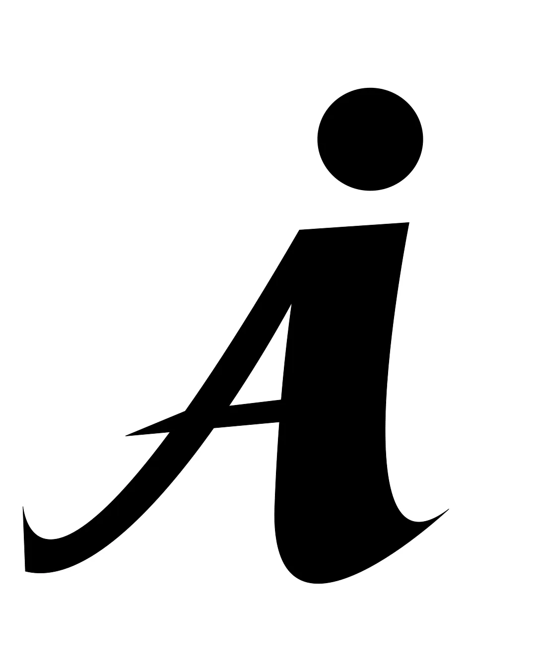
Try it Now!Logo review of i
 Logo analysis by AI
Recognized style:
Logo type:
Detected symbol:
Detected text:
Review requested by Ashish
**If AI can recognize or misinterpret it, so can people.
Structured logo review
Legibility
![]() The letter 'i' is stylized but remains recognizable.
The letter 'i' is stylized but remains recognizable.
![]() Some might misinterpret the elongated shape.
Some might misinterpret the elongated shape.
Scalability versatility
![]() Simple design ensures clarity at any size.
Simple design ensures clarity at any size.
200x250 px
100×125 px
50×62 px
Balance alignment
![]() The curve and dot create an interesting visual balance.
The curve and dot create an interesting visual balance.
![]() The exaggerated height could make it top-heavy in some contexts.
The exaggerated height could make it top-heavy in some contexts.

Originality
![]() Unique take on a common letter enhances memorability.
Unique take on a common letter enhances memorability.
![]() The design might be too abstract for some interpretations.
The design might be too abstract for some interpretations.
Aesthetic look
![]() The design is clean and modern.
The design is clean and modern.
![]() Might be perceived as overly simplistic by some audiences.
Might be perceived as overly simplistic by some audiences.
Cultural sensitivity dual meaning
![]() No cultural sensitivity issues detected.
No cultural sensitivity issues detected.
Color harmony
![]() Black is versatile and timeless.
Black is versatile and timeless.
![]() Limited color palette may lack vibrancy.
Limited color palette may lack vibrancy.


