 View review
Logo score
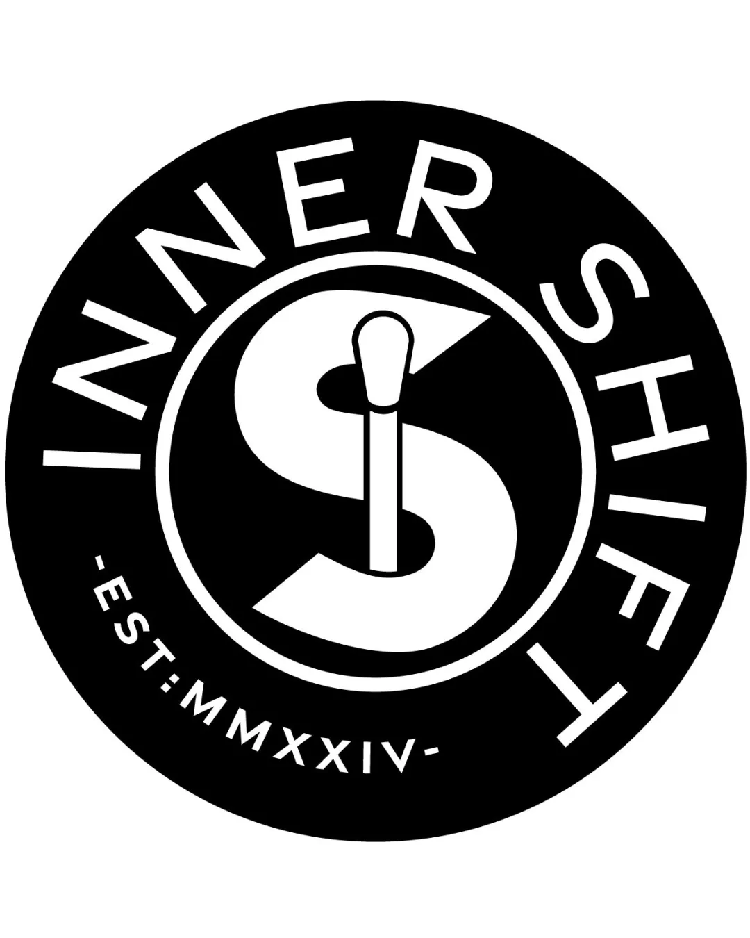
Logo review ofInner Shift Est:mmxxiv
Review the detailed scores below to see what is working and what should be refined first.
Legibility
Originality
Misread
Balance
Scale
Detailed review
Logo performance breakdown
Legibility
![]() All text is clear and distinguishable
All text is clear and distinguishable![]() Strong contrast between text and background ensures readability
Strong contrast between text and background ensures readability
![]() Curved text could be challenging to read quickly, especially on smaller sizes
Curved text could be challenging to read quickly, especially on smaller sizes
Originality
![]() Clever integration of a makeup brush into the 'S' for dual meaning
Clever integration of a makeup brush into the 'S' for dual meaning![]() Distinctive overall shape compared to generic beauty logos
Distinctive overall shape compared to generic beauty logos
![]() Circular emblem style is somewhat common in badge-style logos
Circular emblem style is somewhat common in badge-style logos
Color harmony
![]() Monochrome scheme ensures maximum clarity and timelessness
Monochrome scheme ensures maximum clarity and timelessness![]() No clashing or excessive use of colors
No clashing or excessive use of colors
White
#FFFFFF
Black
#000000
Balance alignment
![]() Circular form provides a sense of wholeness and symmetry
Circular form provides a sense of wholeness and symmetry![]() Central 'S' and brush are well-aligned in the middle
Central 'S' and brush are well-aligned in the middle
![]() The EST date's angled placement breaks symmetry and slightly disrupts the balance
The EST date's angled placement breaks symmetry and slightly disrupts the balance

Scalability
![]() Strong black-and-white contrast holds up at various sizes
Strong black-and-white contrast holds up at various sizes![]() Simple emblem form will work on packaging and labels
Simple emblem form will work on packaging and labels
![]() Thin lines within the brush and text may lose fidelity at small icon sizes (e.g., favicon, embroidery)
Thin lines within the brush and text may lose fidelity at small icon sizes (e.g., favicon, embroidery)![]() Circular badge may not adapt as well to horizontal layout needs (e.g., website header)
Circular badge may not adapt as well to horizontal layout needs (e.g., website header)
200x250 px
100×125 px
50×62 px
Misinterpretations
![]() Makeup brush clearly represents the beauty industry
Makeup brush clearly represents the beauty industry![]() No obvious risk of inappropriate interpretations
No obvious risk of inappropriate interpretations
Symbol & text fit
![]() The wordmark curves naturally around the logomark, creating visual unity
The wordmark curves naturally around the logomark, creating visual unity
![]() Typography style matches the simplicity and modernity of the symbol
Typography style matches the simplicity and modernity of the symbol
Try your own review
Review my logo
Wondering how your logo performs?
Get a clear logo score, key risks, and priority fix ideas before your client or audience sees it.
Keep exploring


