Wondering how your logo performs? 🧐
Get professional logo reviews in seconds and catch design issues in time.
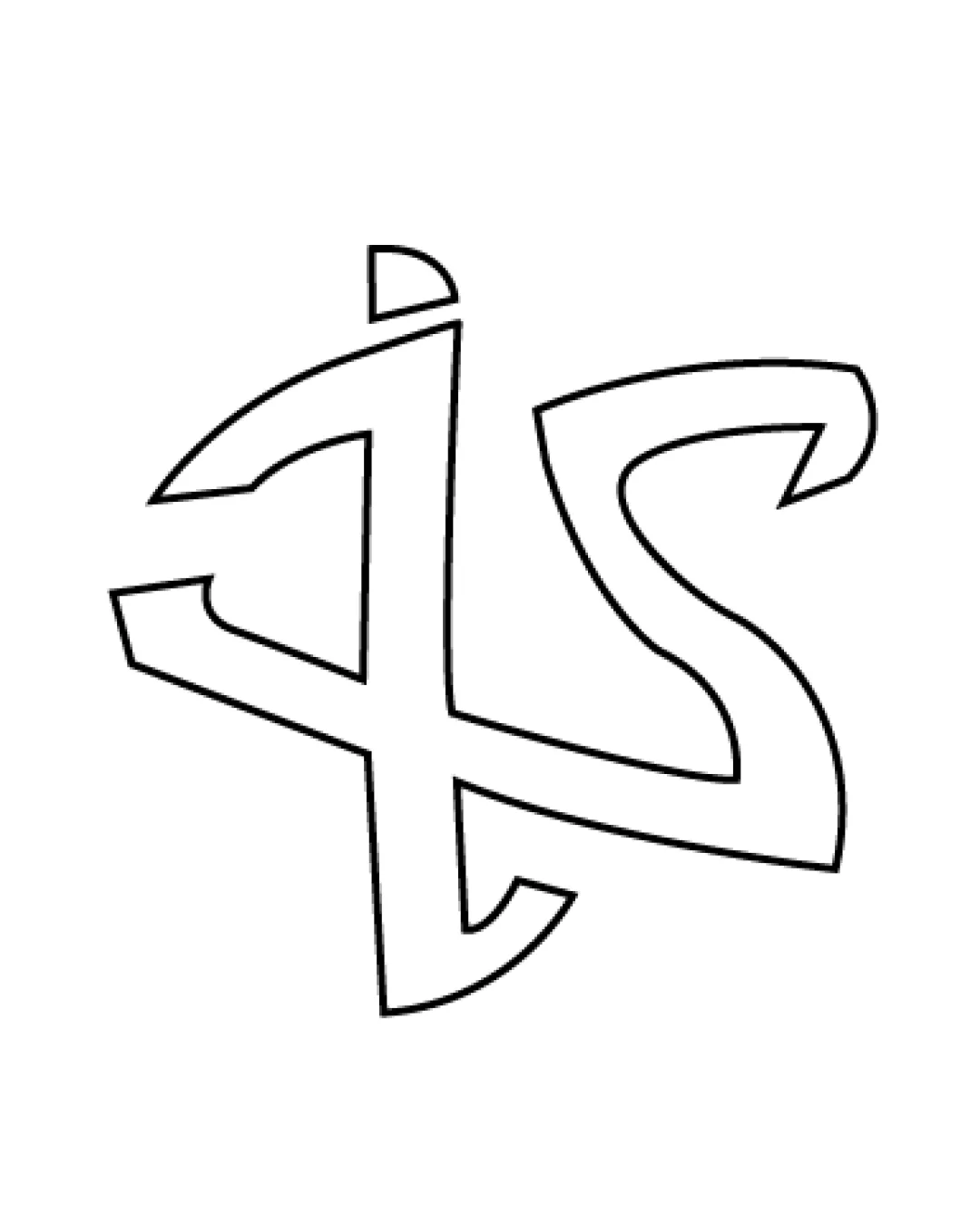
Try it Now!Logo review of IS
 Logo analysis by AI
Logo type:
Style:
Detected symbol:
Detected text:
Business industry:
Review requested by Sumeyyenur
**If AI can recognize or misinterpret it, so can people.
Structured logo review
Legibility
![]() The letters I and S can eventually be identified with effort.
The letters I and S can eventually be identified with effort.
![]() Letterforms are heavily stylized, making them difficult to decipher at first glance.
Letterforms are heavily stylized, making them difficult to decipher at first glance.![]() Overlapping and abstract line structure reduces instant recognition.
Overlapping and abstract line structure reduces instant recognition.![]() The thickness inconsistency and jagged curves further hinder readability.
The thickness inconsistency and jagged curves further hinder readability.
Scalability versatility
![]() Simple outline ensures that the design could scale without losing technical details.
Simple outline ensures that the design could scale without losing technical details.
![]() Thin outlines may disappear or break up at small sizes, losing integrity on business cards or favicons.
Thin outlines may disappear or break up at small sizes, losing integrity on business cards or favicons.![]() Hand-drawn unevenness may not translate well to embroidery or laser etching.
Hand-drawn unevenness may not translate well to embroidery or laser etching.![]() The abstract form does not adapt well to all industry applications.
The abstract form does not adapt well to all industry applications.
200x250 px
100×125 px
50×62 px
Balance alignment
![]() The concept of interlocking letters provides visual interest.
The concept of interlocking letters provides visual interest.
![]() The 'I' and 'S' integration feels forced and unbalanced.
The 'I' and 'S' integration feels forced and unbalanced.![]() Heavy weight and large open space on the right (S) compared to the left (I) causes visual weight imbalance.
Heavy weight and large open space on the right (S) compared to the left (I) causes visual weight imbalance.![]() Misalignments in line meeting points make the composition feel crude and unfinished.
Misalignments in line meeting points make the composition feel crude and unfinished.

Originality
![]() Abstract fusion approach is uncommon and non-generic.
Abstract fusion approach is uncommon and non-generic.
![]() The rough, hand-drawn execution lacks polish.
The rough, hand-drawn execution lacks polish.![]() No additional symbolic meaning or clever negative space.
No additional symbolic meaning or clever negative space.![]() Does not elevate the concept beyond a basic hand-drawn monogram.
Does not elevate the concept beyond a basic hand-drawn monogram.
Aesthetic look
![]() The freeform, artistic approach gives a unique personality.
The freeform, artistic approach gives a unique personality.
![]() Jagged, uneven lines makes the logo look amateur and incomplete.
Jagged, uneven lines makes the logo look amateur and incomplete.![]() Poor symmetry and non-uniform line weight detracts from visual appeal.
Poor symmetry and non-uniform line weight detracts from visual appeal.![]() Feels cluttered and awkward due to overlapping and unusual proportions.
Feels cluttered and awkward due to overlapping and unusual proportions.
Dual meaning and misinterpretations
![]() No inappropriate or ambiguous symbols detected.
No inappropriate or ambiguous symbols detected.
Color harmony
![]() Simple black and white color scheme avoids any color discord.
Simple black and white color scheme avoids any color discord.![]() Outline-only design keeps it versatile for various backgrounds.
Outline-only design keeps it versatile for various backgrounds.
White
#FFFFFF
Black
#000000


