 View review
Logo score
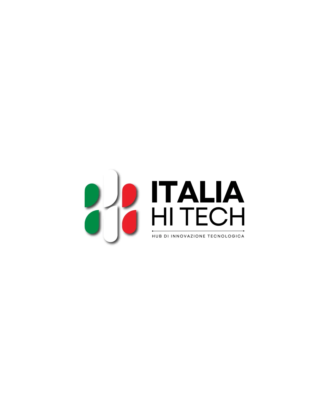
Logo review ofItalia Hi Tech
Review the detailed scores below to see what is working and what should be refined first.
Legibility
Originality
Misread
Balance
Scale
Detailed review
Logo performance breakdown
Legibility
![]() Text is fully legible with clear font choice
Text is fully legible with clear font choice![]() Ample spacing between words enhances readability
Ample spacing between words enhances readability
Originality
![]() Incorporates national colors in a modern geometric style
Incorporates national colors in a modern geometric style![]() Abstract mark suggests innovation and Italy
Abstract mark suggests innovation and Italy
![]() Geometric flag-based motifs are commonly used in tech and Italian branding, resulting in some loss of uniqueness
Geometric flag-based motifs are commonly used in tech and Italian branding, resulting in some loss of uniqueness
Color harmony
![]() Color scheme is purposeful and ties directly to the Italian identity
Color scheme is purposeful and ties directly to the Italian identity![]() High color contrast ensures readability
High color contrast ensures readability
Green
#008C45
White
#FFFFFF
Red
#CD212A
Black
#000000
Balance alignment
![]() Mark and wordmark are visually balanced on the horizontal axis
Mark and wordmark are visually balanced on the horizontal axis![]() Spacing between symbol and text creates a harmonious layout
Spacing between symbol and text creates a harmonious layout
![]() Minor vertical misalignment where the top edge of the logomark appears slightly higher than the cap height of ITALIA
Minor vertical misalignment where the top edge of the logomark appears slightly higher than the cap height of ITALIA

Scalability
![]() Bold shapes and simple lines in the symbol aid scalability on medium-to-large formats like web headers and signage
Bold shapes and simple lines in the symbol aid scalability on medium-to-large formats like web headers and signage
![]() Gradient/soft shadow effects and thin text line on tagline may not reproduce well in small sizes or embroidery
Gradient/soft shadow effects and thin text line on tagline may not reproduce well in small sizes or embroidery![]() The thin tagline is likely to vanish at reduced scale (e.g. business cards, favicons)
The thin tagline is likely to vanish at reduced scale (e.g. business cards, favicons)
200x250 px
100×125 px
50×62 px
Misinterpretations
![]() No inappropriate or confusing secondary imagery
No inappropriate or confusing secondary imagery
Symbol & text fit
![]() Modern, bold sans-serif font complements the geometric symbol
Modern, bold sans-serif font complements the geometric symbol
![]() Consistent overall design language
Consistent overall design language
![]() Tagline font feels slightly less bold, which could create a subtle stylistic disconnect
Tagline font feels slightly less bold, which could create a subtle stylistic disconnect
Try your own review
Review my logo
Wondering how your logo performs?
Get a clear logo score, key risks, and priority fix ideas before your client or audience sees it.
Keep exploring


