Wondering how your logo performs? 🧐
Get professional logo reviews in seconds and catch design issues in time.
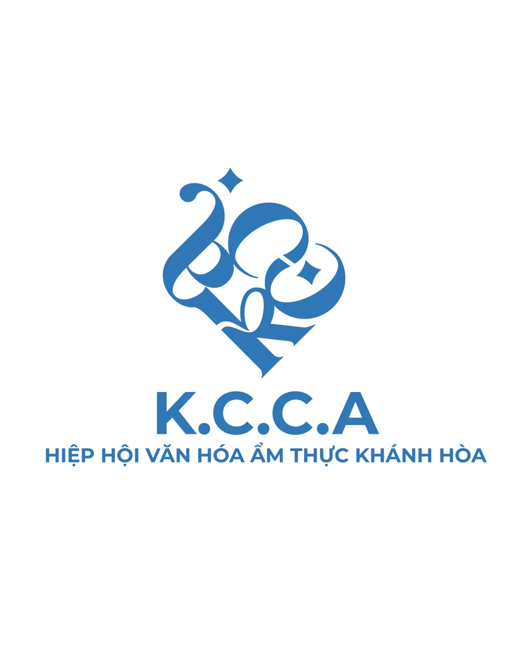
Try it Now!Logo review of K.C.C.A, Hiệp Hội Văn Hóa Ẩm Thực Khánh..
 Logo analysis by AI
Recognized style:
Logo type:
Detected symbol:
Detected text:
Business industry:
Review requested by Brandee
**If AI can recognize or misinterpret it, so can people.
Structured logo review
Legibility
![]() Main text 'K.C.C.A' is clear and readable.
Main text 'K.C.C.A' is clear and readable.
![]() The calligraphic symbol may be difficult to interpret.
The calligraphic symbol may be difficult to interpret.
Scalability versatility
![]() Simple color scheme supports diverse applications.
Simple color scheme supports diverse applications.
![]() Complexity of the symbol may pose scaling issues.
Complexity of the symbol may pose scaling issues.
200x250 px
100×125 px
50×62 px
Balance alignment
![]() Text and symbol appear well balanced.
Text and symbol appear well balanced.

Originality
![]() Unique calligraphic style enhances originality.
Unique calligraphic style enhances originality.
Logomark wordmark fit
![]() The styles match harmoniously.
The styles match harmoniously.
Aesthetic look
![]() Elegant and professional aesthetic.
Elegant and professional aesthetic.
Cultural sensitivity dual meaning
![]() No cultural sensitivity issues detected.
No cultural sensitivity issues detected.
Color harmony
![]() Monochromatic palette ensures harmony.
Monochromatic palette ensures harmony.


