 View review
Logo score
Logo review ofKalm, Specialty Caphe
Review the detailed scores below to see what is working and what should be refined first.
Legibility
Originality
Misread
Balance
Scale
Detailed review
Logo performance breakdown
Legibility
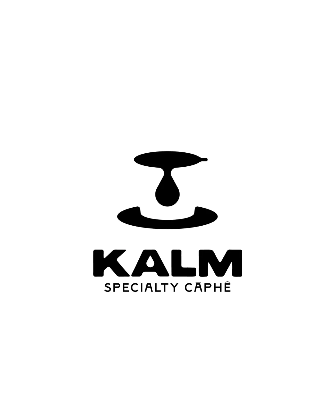
![]() KALM is bold, clear, and very easy to read.
KALM is bold, clear, and very easy to read.![]() The supporting line 'SPECIALTY CAPHE' is spaced out, contributing to legibility.
The supporting line 'SPECIALTY CAPHE' is spaced out, contributing to legibility.
![]() 'CAPHE' may confuse some viewers unfamiliar with the word, due to the diacritical mark and less common spelling.
'CAPHE' may confuse some viewers unfamiliar with the word, due to the diacritical mark and less common spelling.![]() Slightly less readability on 'SPECIALTY CAPHE' at extremely small sizes due to thinner letters.
Slightly less readability on 'SPECIALTY CAPHE' at extremely small sizes due to thinner letters.
Originality
![]() The abstraction of a coffee dripper and drop is less cliché than a classic coffee cup.
The abstraction of a coffee dripper and drop is less cliché than a classic coffee cup.![]() Unique enough to stand out in the specialty coffee space.
Unique enough to stand out in the specialty coffee space.
![]() The circular base and drop motif are common shapes in coffee branding, though executed here with some uniqueness.
The circular base and drop motif are common shapes in coffee branding, though executed here with some uniqueness.
Color harmony
![]() Monochrome palette delivers maximum contrast and clarity.
Monochrome palette delivers maximum contrast and clarity.![]() Color choice is timeless and suitable for a wide range of backgrounds and brand applications.
Color choice is timeless and suitable for a wide range of backgrounds and brand applications.
Black
#000000
White
#FFFFFF
Balance alignment
![]() Good vertical alignment with central symmetry between the logomark and wordmark.
Good vertical alignment with central symmetry between the logomark and wordmark.![]() Spacing between elements is well-proportioned.
Spacing between elements is well-proportioned.

Scalability
![]() Simple shapes ensure the logo is sharply recognizable at larger and medium sizes.
Simple shapes ensure the logo is sharply recognizable at larger and medium sizes.![]() Works well for signage, coffee packaging, merchandise, and digital media.
Works well for signage, coffee packaging, merchandise, and digital media.
![]() At very small sizes, the subtext 'SPECIALTY CAPHE' could become illegible.
At very small sizes, the subtext 'SPECIALTY CAPHE' could become illegible.![]() The abstract symbol might lose meaning if reduced to a favicon size.
The abstract symbol might lose meaning if reduced to a favicon size.
200x250 px
100×125 px
50×62 px
Misinterpretations
![]() No inappropriate or ambiguous visual symbolism detected.
No inappropriate or ambiguous visual symbolism detected.![]() The logo’s abstract form is safe in general markets.
The logo’s abstract form is safe in general markets.
Symbol & text fit
![]() Both the wordmark and logomark share a bold visual language.
Both the wordmark and logomark share a bold visual language.
![]() Styles and weights are complementary.
Styles and weights are complementary.
![]() The purely abstract nature of the symbol may not immediately connect with the wordmark without coffee context.
The purely abstract nature of the symbol may not immediately connect with the wordmark without coffee context.
Try your own review
Review my logo
Wondering how your logo performs?
Get a clear logo score, key risks, and priority fix ideas before your client or audience sees it.
Keep exploring