 View review
Logo score
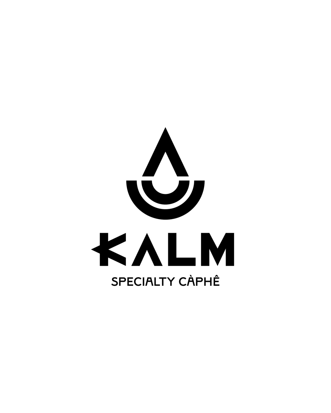
Logo review ofKalm Specialty Càphê
Review the detailed scores below to see what is working and what should be refined first.
Legibility
Originality
Misread
Balance
Scale
Detailed review
Logo performance breakdown
Legibility
![]() The logotype is bold and mostly easy to read.
The logotype is bold and mostly easy to read.![]() Clear hierarchy between brand name and tagline.
Clear hierarchy between brand name and tagline.
![]() The customized 'K' may cause a brief hesitation in recognition due to its unusual construction; the arrow-like left stroke might be mistaken for a symbol, making the beginning of the word less clear.
The customized 'K' may cause a brief hesitation in recognition due to its unusual construction; the arrow-like left stroke might be mistaken for a symbol, making the beginning of the word less clear.
Originality
![]() Abstract droplet symbol is visually distinctive, especially with concentric arcs implying a cup or ripple, which is relevant to the beverage industry.
Abstract droplet symbol is visually distinctive, especially with concentric arcs implying a cup or ripple, which is relevant to the beverage industry.![]() Custom letterforms, particularly for the 'K' and 'A', add uniqueness.
Custom letterforms, particularly for the 'K' and 'A', add uniqueness.
![]() The droplet/cup motif is moderately common among coffee and beverage brands, so it’s not completely one-of-a-kind.
The droplet/cup motif is moderately common among coffee and beverage brands, so it’s not completely one-of-a-kind.
Color harmony
![]() Black and white palette is timeless, versatile, and highly legible.
Black and white palette is timeless, versatile, and highly legible.![]() No unnecessary use of multiple colors, keeping the system professional.
No unnecessary use of multiple colors, keeping the system professional.
Black
#000000
White
#FFFFFF
Balance alignment
![]() Strong vertical and horizontal alignment creates a harmonious composition.
Strong vertical and horizontal alignment creates a harmonious composition.![]() Icon sits well above the centered text, making the layout visually stable.
Icon sits well above the centered text, making the layout visually stable.![]() Good proportion between symbol, wordmark, and tagline.
Good proportion between symbol, wordmark, and tagline.

Scalability
![]() Simple, bold shapes allow for easy scaling across most applications.
Simple, bold shapes allow for easy scaling across most applications.![]() Logo works well in monochrome, suitable for product packaging and signage.
Logo works well in monochrome, suitable for product packaging and signage.
![]() The fine gap details within the icon and the wordmark's custom letterforms may lose clarity at very small sizes, such as in a favicon or embroidery.
The fine gap details within the icon and the wordmark's custom letterforms may lose clarity at very small sizes, such as in a favicon or embroidery.
200x250 px
100×125 px
50×62 px
Misinterpretations
![]() No obvious inappropriate or accidental secondary imagery.
No obvious inappropriate or accidental secondary imagery.
Symbol & text fit
![]() Geometric style of the logomark matches the modern, angular wordmark.
Geometric style of the logomark matches the modern, angular wordmark.
![]() Appropriate sizing; neither element overwhelms the other.
Appropriate sizing; neither element overwhelms the other.
Try your own review
Review my logo
Wondering how your logo performs?
Get a clear logo score, key risks, and priority fix ideas before your client or audience sees it.
Keep exploring