Wondering how your logo performs? 🧐
Get professional logo reviews in seconds and catch design issues in time.
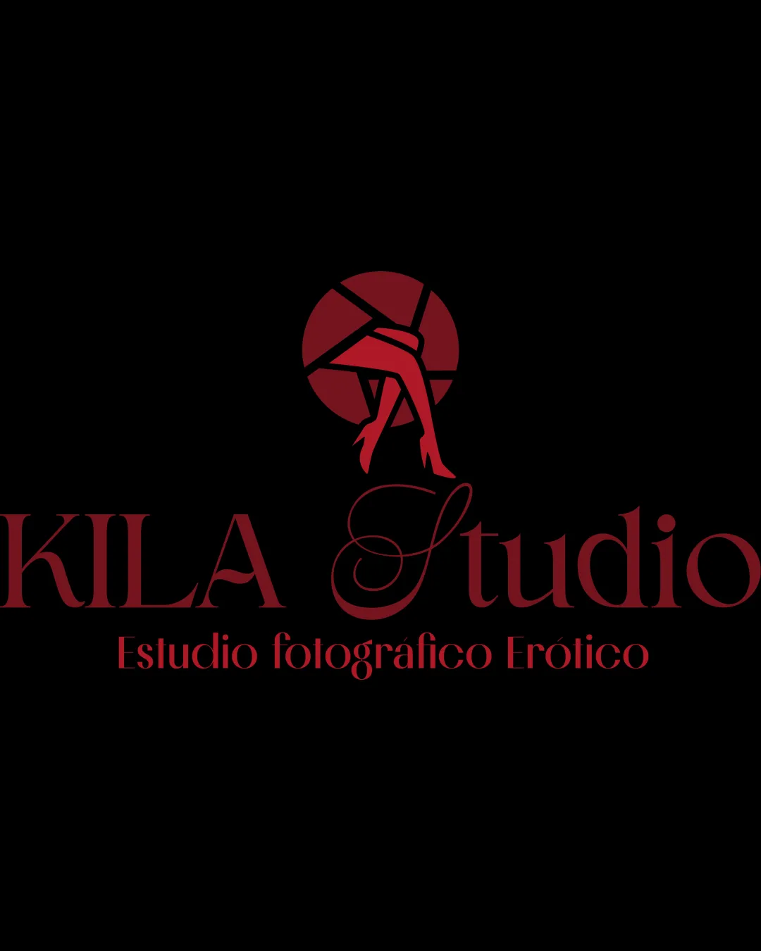
Try it Now!Logo review of KILA Studio, Estudio fotográfico Erótico
 Logo analysis by AI
Logo type:
Style:
Detected symbol:
Detected text:
Business industry:
Review requested by Milkaaudrey
**If AI can recognize or misinterpret it, so can people.
Structured logo review
Legibility
![]() Main text is readable
Main text is readable
![]() Script font used for 'Studio' may reduce readability
Script font used for 'Studio' may reduce readability
Scalability versatility
![]() Bold colors enhance visual impact
Bold colors enhance visual impact
![]() Detailed design may not scale well to small sizes
Detailed design may not scale well to small sizes
200x250 px
100×125 px
50×62 px
Balance alignment
![]() Good visual balance between text and symbol
Good visual balance between text and symbol

Originality
![]() Unique combination of camera element and legs
Unique combination of camera element and legs
Aesthetic look
![]() Cohesive color palette
Cohesive color palette
![]() Could be perceived as overly decorative
Could be perceived as overly decorative
Dual meaning and misinterpretations
![]() Legs might convey unintended messages beyond the intended industry focus
Legs might convey unintended messages beyond the intended industry focus
Color harmony
![]() Consistent and harmonious use of red and black
Consistent and harmonious use of red and black


