 View review
Logo score
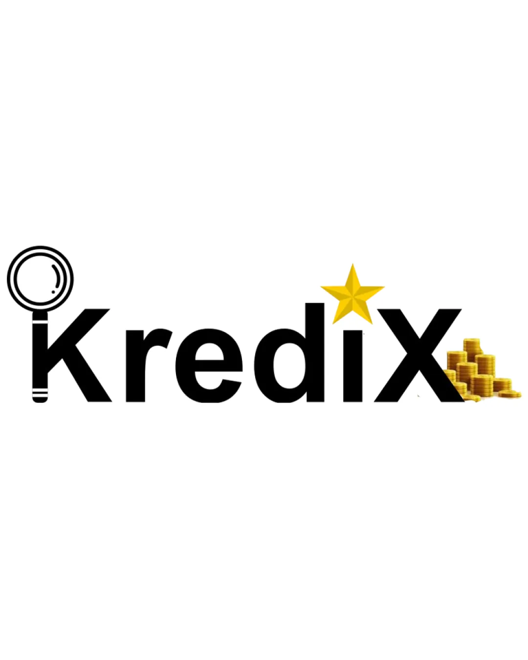
Logo review ofKredix
Review the detailed scores below to see what is working and what should be refined first.
Legibility
Originality
Misread
Balance
Scale
Detailed review
Logo performance breakdown
Legibility
![]() Text is generally clear and easily readable.
Text is generally clear and easily readable.![]() Font is bold and well-suited for digital display.
Font is bold and well-suited for digital display.
![]() Magnifying glass could make the 'K' less recognizable to some viewers.
Magnifying glass could make the 'K' less recognizable to some viewers.![]() Busy design near the 'X' due to coins may detract from instant legibility.
Busy design near the 'X' due to coins may detract from instant legibility.
Originality
![]() Customized elements representing finance and credit checking add some uniqueness.
Customized elements representing finance and credit checking add some uniqueness.![]() Integration of the magnifying glass into the 'K' shows partial creative effort.
Integration of the magnifying glass into the 'K' shows partial creative effort.
![]() Usage of finance clichés (star, coins, magnifying glass) is fairly common in industry.
Usage of finance clichés (star, coins, magnifying glass) is fairly common in industry.![]() Combining three separate symbols makes the concept feel overdone rather than innovative.
Combining three separate symbols makes the concept feel overdone rather than innovative.
Color harmony
![]() Limited color palette enhances focus on core concept.
Limited color palette enhances focus on core concept.
![]() Slight mismatch in visual style between flat black letters and shiny gold coins.
Slight mismatch in visual style between flat black letters and shiny gold coins.
Black
#000000
Gold
#FFD700
White
#FFFFFF
Your palette is close. Explore sharper color combinations with Colorfly.design before updating the logo.
Explore palettesBalance alignment
![]() Typeface provides a strong baseline alignment.
Typeface provides a strong baseline alignment.
![]() Left side (magnifying glass) is heavy and visually disconnected from remaining letters.
Left side (magnifying glass) is heavy and visually disconnected from remaining letters.![]() Star and coin stack disrupt vertical and horizontal alignment, causing a lack of harmony.
Star and coin stack disrupt vertical and horizontal alignment, causing a lack of harmony.

Scalability
![]() Bold typography supports larger displays like signage or banners.
Bold typography supports larger displays like signage or banners.
![]() Thin lines of magnifying glass and small coin details will likely get lost at small sizes (e.g., favicons or embroidery).
Thin lines of magnifying glass and small coin details will likely get lost at small sizes (e.g., favicons or embroidery).![]() Multiple decorative elements add complexity that reduces effectiveness in small formats.
Multiple decorative elements add complexity that reduces effectiveness in small formats.
200x250 px
100×125 px
50×62 px
Misinterpretations
![]() No inappropriate or confusing alternate symbols detected.
No inappropriate or confusing alternate symbols detected.
Symbol & text fit
![]() Attempt to integrate financial symbols with text.
Attempt to integrate financial symbols with text.
![]() Magnifying glass in the 'K' and coin stack near 'X' are not stylistically matched.
Magnifying glass in the 'K' and coin stack near 'X' are not stylistically matched.
![]() Elements feel forced onto the wordmark instead of creating a cohesive identity.
Elements feel forced onto the wordmark instead of creating a cohesive identity.
Try your own review
Review my logo
Wondering how your logo performs?
Get a clear logo score, key risks, and priority fix ideas before your client or audience sees it.
Keep exploring


