Wondering how your logo performs? 🧐
Get professional logo reviews in seconds and catch design issues in time.
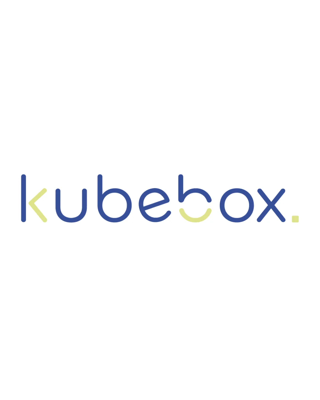
Try it Now!Logo review of kubebox.
 Logo analysis by AI
Logo type:
Style:
Detected symbol:
Detected text:
Business industry:
Review requested by Orane
**If AI can recognize or misinterpret it, so can people.
Structured logo review
Legibility
![]() Text is mostly clear and uses a modern, coherent typeface.
Text is mostly clear and uses a modern, coherent typeface.![]() Good color contrast between the text and background.
Good color contrast between the text and background.
![]() The stylized 'e' and 'o' can momentarily interrupt legibility, especially at smaller sizes.
The stylized 'e' and 'o' can momentarily interrupt legibility, especially at smaller sizes.![]() Letter 'k' may be misread due to its unconventional form.
Letter 'k' may be misread due to its unconventional form.
Scalability versatility
![]() Clean, simple lines allow reduction for mediums such as business cards, app icons, and letterheads.
Clean, simple lines allow reduction for mediums such as business cards, app icons, and letterheads.![]() Minimalistic approach helps with resizing without much loss in clarity.
Minimalistic approach helps with resizing without much loss in clarity.
![]() Thin line weights may disappear when shrunk for embroidery or small promotional items.
Thin line weights may disappear when shrunk for embroidery or small promotional items.![]() Subtle color differences might be lost in black-and-white or single-color scenarios.
Subtle color differences might be lost in black-and-white or single-color scenarios.
200x250 px
100×125 px
50×62 px
Balance alignment
![]() Consistent baseline across letters maintains visual balance.
Consistent baseline across letters maintains visual balance.![]() Spacing and rhythm between glyphs are well-calibrated.
Spacing and rhythm between glyphs are well-calibrated.

Originality
![]() Unique customization of several letterforms, especially 'k', 'e', 'o', 'x', and dot.
Unique customization of several letterforms, especially 'k', 'e', 'o', 'x', and dot.![]() Soft geometric style sets it apart from most generic tech wordmarks.
Soft geometric style sets it apart from most generic tech wordmarks.
![]() The rounded geometric sans-serif wordmark trend is common, so the base concept is not highly original.
The rounded geometric sans-serif wordmark trend is common, so the base concept is not highly original.![]() No distinctive standalone symbol or monogram for brandmark versatility.
No distinctive standalone symbol or monogram for brandmark versatility.
Aesthetic look
![]() Pleasant modern minimalism.
Pleasant modern minimalism.![]() Color pairing is soft and clean, contributing to a calm and contemporary look.
Color pairing is soft and clean, contributing to a calm and contemporary look.
![]() Color accents on individual letters might feel inconsistent or arbitrary to some viewers.
Color accents on individual letters might feel inconsistent or arbitrary to some viewers.
Dual meaning and misinterpretations
![]() No inappropriate or confusing secondary shapes detected.
No inappropriate or confusing secondary shapes detected.
Color harmony
![]() Limited and well-matched palette of two core hues and white background.
Limited and well-matched palette of two core hues and white background.![]() Colors reinforce the fresh, approachable personality.
Colors reinforce the fresh, approachable personality.
Faded Blue
#465BA8
Pale Yellow Green
#E1EAA8
White
#FFFFFF


